Have you ever thought about why a specific brand can have a lasting effect just through its name? That is the charm of a wordmark logo. The design style concentrates just on typography, using the brand name to craft a striking brand identity. There are no striking icons or symbols—only the optimized combination of font, spacing, and style that conveys a powerful impression.
In this guide, you will learn everything there is to know about wordmark logos. Understanding this clean and powerful design approach can be advantageous whether you are starting a new business or just looking for professional logo design. Let’s investigate why wordmarks still enchant the design scene.
What is a Wordmark Logo?
A wordmark logo represents a style of logo design that comprises simply a brand’s identity, presented in an eye-catching font or typeface. Representing a brand’s identity in a powerful way is what a simple method does. Unlike logos that comprise both an image and a wordmark, or lettermark logos that utilize a stylized brand initial, wordmark logos center entirely on the presented text.
How to Create a Powerful Wordmark Logo Design for Your Brand?
Creating a wordmark logo that stands out requires a blend of creativity, simplicity, and strategy. Start by choosing a typeface that reflects your brand’s identity. For example, a modern brand might use a sleek, sans-serif font, while a more traditional brand could opt for a serif style. The font you select should be easy to read and recognizable at different sizes.
Next, play with spacing and letter arrangement to make the design visually appealing. Don’t hesitate to experiment with bold or italic variations to highlight key aspects of your brand. Colors also play a crucial role—choose shades that convey your brand’s values and personality.
Finally, test your logo across different mediums, like business cards, websites, and packaging, to ensure it remains effective everywhere. With the right combination of typography, colors, and spacing, your wordmark logo will leave a lasting impression on your audience.
Why Wordmark Logos Are Trending in 2024?
Wordmark logos are seeing a comeback in popularity during 2024. The attractiveness of simplicity, versatility, and timeless charm draws businesses of every size. Here’s why wordmarks are trending:
Clean and Modern Aesthetic
Modern and contemporary audiences usually find wordmarks to be visually clean and appealing.
Versatility
Wordmarks perform effectively on a variety of platforms and applications without reducing their impact.
Timeless Appeal
Unlike logos showcasing elaborate designs, wordmarks are able to remain present and significant for quite a while.
Strong Brand Recognition
An adeptly designed wordmark might evolve into a memorable feature, supporting the development of brand recognition and continuous loyalty.
Focus on the Brand Name
An emphasis on the brand’s name is characteristic of wordmarks, which is frequently the most important feature of a powerful brand identity.
The Evolution of Wordmark Logos: From Classic to Modern
Wordmark logos have evolved significantly over the years, transitioning from traditional, elaborate designs to sleek, modern fonts that resonate with today’s minimalist trends. In fact, according to a 2023 study by Design Council, 62% of businesses now prefer clean, typography-based logos over more intricate logos that include symbols or mascots. This shift highlights the growing demand for simplicity and brand clarity in an era where digital presence is key.
Another statistic by Logomaker shows that brands with simple wordmark logos are 13% more likely to be remembered by consumers, compared to those with complex designs. This is because a clean, font-focused logo allows businesses to keep their brand name at the forefront, making it more recognizable across platforms.
As companies continue to prioritize mobile and online branding, the rise of wordmark logos shows no signs of slowing down. The trend is particularly popular among tech startups and luxury brands, where understated elegance and clarity are valued.
Examples of Famous Wordmark Logos You Know and Love
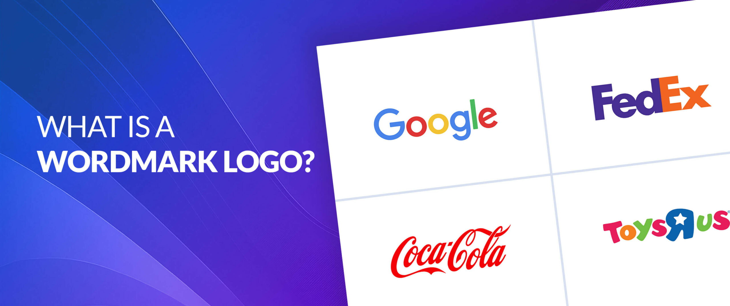
Coca-Cola
The globally recognizable wordmark of Coca-Cola is its famous script. The combination of the Spencerian style and cushioned script calls to mind both conventionality and warmth, and the red color indicates both thrill and a rush of energy.
The straightforward, sans-serif design of Google represents its promise to follow a current design that is easy to execute and straightforward. A happy and identifiable feeling comes from combining the colors blue, green, yellow, red, and blue.
Disney
Everyone is familiar with the recognizable whimsical, handwritten style of the Disney wordmark. The letters, combined with an enjoyable font, project a sense of endearment and wonder.
FedEx
FedEx’s wordmark is a tricky illustration of the design technique called negative space. A representation of speed, efficiency, and moving forward, you will find it between the ‘E’ and the ‘x’.
Facebook (Meta)
The wordmark of Facebook’s modern logo design (today known as Meta), a simple sans-serif typeface, has progressed over time. The new, tidy design represents the company’s emphasis on linking people.
Best Tools for Designing a Professional Wordmark Logo
Canva
Great for creating a Wordmark logo, Canva is an easy-to-use graphic design tool. This tool features a large selection of fonts along with easily customizable templates that promote simple experimentation with various styles. Courtesy of drag-and-drop features, it’s a breeze to change colors and layouts to reflect the individual character of your brand. No matter what your skill level is as a designer, the simple interface of Canva makes it possible to bring your logo idea to life without requiring advanced design skills.
Adobe Illustrator
Adobe Illustrator is a strong vector graphic design program commonly used by experts. It comprises improved qualities for the design of custom Wordmark logos, including graphics and typography features that scale. With each letter being adjustable, you can try out spacing and merge unique design elements to strengthen your logo. In spite of having a larger learning curve, the results are usually worth the financial outlay, making it an indispensable capability for dedicated logo designers.
Looka
Looka is a solution that makes use of AI to streamline logo design. To begin, you can enter your brand name and choose from the styles and colors you want. Looka constructs multiple logo options, adding Wordmark options that you can continue to personalize. The platform gives you the ability to understand how your logo will appear on different items and marketing materials, affording you a sweeping view of its possible significance. Looka is an ideal platform for those entrepreneurs in need of a quick yet sophisticated logo, regardless of their design experience.
DesignEvo
DesignEvo is a platform for making logos that emphasizes both simplicity and ease of use. It features thousands of templates, including a template dedicated to Wordmark logos. Thanks to a large array of fonts and design features, it’s easy to produce a logo that represents your brand’s identity. You are able to personalize the selections of logo sizes, colors, and layouts with the tool to create your preferred appearance. Classified as an intuitive interface, the design of DesignEvo makes it easy for anyone—from small business owners to hobbyists—to generate professional Wordmark logos in mere minutes.
Get a professional Wordmark Logo today—start now!
Our expert designers can help you design the best logo that reflects your brand’s personality and values
Wordmark Logos vs Logotypes: What’s the Best Fit for Your Brand?
In order to make a wise decision for your logo, knowing the distinctions between Word mark logos and alternative types is important. As its label indicates, a Wordmark logo concentrates solely on the brand name and uses typography to signal personality and identity. This simplicity increases brand recognition, allowing customers to simply remember your identity.
In opposition, symbol or icon logos make use of imagery to embody the brand. Even when they can appear to be visually striking, they don’t often provide clear visibility for the brand name, leading to the potential for confusion. Merging text and symbols leads to the flexible combination logotype, but it requires careful balancing to achieve a sense of clarity.
At the end of the day, your brand’s objectives will determine whether to choose a Wordmark or another type of logo. Choosing a Wordmark logo is a great way to amplify your name and generate quick recognition. Have a look at this short table on wordmark vs. other logo Types.
| Logo Type | Description | Examples |
| Wordmark | Consists solely of the brand’s name in a distinctive font. | Coca-Cola, Google, Disney |
| Combination Mark | Combines a wordmark with a visual element. | Nike, Apple |
| Lettermark | Uses the initials of the company’s name. | IBM, HP |
| Emblem Logo | Enclosed within a shape, often a shield or circle. | Harley-Davidson, Starbucks |
| Mascot Logo | Features a recognizable character or animal. | McDonald’s, Tony the Tiger |
The Key Elements of a Successful Wordmark Logo
- Improves brand awareness with easily readable fonts.
- Demonstrates a combination of professionalism and simplicity.inspiration
- Simple to personalize in order to showcase the brand’s unique identity.
- Performs effectively on different platforms and sizes.
- Avoids misunderstandings by clearly showing the name of the brand.
- Aids in establishing a company and unified brand image.
- Suitable for use in both print and digital formats.
- A design that is classic and versatile enough to evolve with current trends.
Conclusion
Wordmark logos represent a powerful and successful way to illustrate your brand identity. Because of their simplicity, versatility, and timeless allure, they represent an attractive choice for enterprises of all dimensions. Awareness of the essential parts of wordmark design, along with consideration of the advantages it offers, helps you form a logo that associates with your audience and points out your brand from the competition.
Whether you’re a veteran designer or launching your creative career, the universe of wordmark logos is rich with possibilities. Having the proper tools, , and a correct awareness of your brand’s identity allows you to create a logo that will have an impression that endures.
Still choosing the right logo design company?
Get a quick, expert review. No pitch, just clarity on what fits your stage, budget, and growth.
