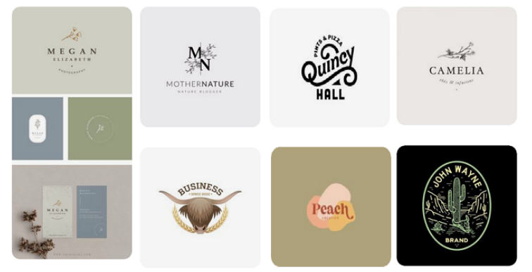
Remember your childhood toys, school, neighborhood, and favorite food? Revisiting the old memories induces a nostalgic charm, and the vibe never fades. The timeless appeal of those memories hits your thought process differently, unlike any other thing. It is what brands capitalize on through vintage logo designs. A classic logo will do wonders for you if you run a business, especially one with a historical origin or traditional goods. So here we address all the concerns with sample vintage logos for inspiration, ideas, and tips to design a Retro logo.
What is Considered Vintage?
A vintage item is generally anything over 20 years old or something from the past century. However, this definition limits its implications on different age brackets and market segments. So, any item can be vintage if it has an old origin, familiarity, or usage back in the day. No matter which year, decade, or century it belongs to, something vintage doesn’t need to qualify for a specific period. Its reference to a past era, group, or location with significant value sets it apart. Review the famous vintage logos for inspiration and ideas to uniquely marque your businesses.
What is a Vintage Logo?
A vintage or retro logo reflects a business, company, or brand using vintage font, image, objects, or visuals. It aims to appeal to and influence the target audience by reviving their past memories to establish an emotional connection. In other words, vintage company logos attract the audience’s attention using old-fashioned visuals or old logos styling. Old Western typography, 70s music or pop culture trends, and images of past utensils or buildings define retro logos.
Why Choose a Vintage Logo?
A vintage design captures the audience’s attention by embedding an emotional appeal in the visuals. You should choose a vintage logo if your business has a historical origin, deep cultural roots, or an inspiring story. Also, classic logos would be perfect if you have traditional or cultural products. Even if a business is nothing of that sort, retro words in its vintage logo design are still a good decision. Use a retro font generator or AI image generator to include classic aesthetics.
There are many benefits of using classic styling and retro visuals in a brand logo. Branding a company, business, or product relies on establishing a relationship that’s profitable and lasting. It is, therefore, of great value to add a reflection of the era people perceive as valuable. The following benefits highlight the advantages of retro visuals in brand logos.
- Eye Catching visuals that are noticeable and distinct
- Attracts the audience by stimulating their curiosity and emotions
- Sets forth the foundation of an Inspiring Brand Identity
- Easily memorable by establishing a connection with their past
- Cuts through the marketing clutter with its unique features
- Encourages prospects to engage and interact with the brand
- Generates and converts more leads by aligning brand objectives
![]()
Is It Possible to Time Travel?
Well, we are not talking about the time machine and time travel in a physical sense. Yes, it is possible on a mental level, but only in one direction, that is past. You can take a trip down memory lane or dive deep into the vast sea of flashes that make you happy. If you are a graphic design student, entrepreneur, or marketer, you can use (not alter) the past to reshape the future.
Conspiracy theories aside, you can always extract the memories of the intended audience to deliver a brand message. It helps prospects grasp the message with higher retention and greater appeal because they can relate to the visual. It associates with their emotional desires and inclines their buying decisions in your brand’s favor. No need to change the past to modify the present; change the present to shape a better future.
How Can a Branding Agency Help?
A branding company beautifies a retro logo design with vintage words and retro trends to leverage emotional marketing appeal. Likewise, any retro graphic design employs fonts, images, and visuals for vintage designs of web pages and apps. You can try out a vintage logos maker that would suit your vintage badge logo, but it lacks user-centric appeal. A branding agency can implement your classic branding consistently across all organizational platforms and channels.
It also understands your target market needs and demographic distribution to formulate layouts accordingly. For instance, an antique store logo or vintage store logo must appeal to mid-age buyers by using 70s fashion trends or 80s design. Inspiration from 1940s logos or 1950s logos might urge the next generation or admirers of that era’s legends. A branding company utilizes knowledge and research to craft vintage labels vectors to elevate branding and promotions.
Moreover, the success of vintage store logos highly depends on the 70s logo styling and 80s graphic design inspiration. Many 80s logos used neon light patterns or handwritten calligraphic typefaces that were famous back then. The same is visible in the modern brand logos with neon color choices, calligraphic fonts, and imperfect textures or patterns. A branding agency adds retro vibes to your brand assets and visuals by imitating the style choices of the past era.
How to Create a Logo with Vintage Inspiration?
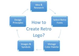
If you want to begin the graphic design endeavor, here’s a list of steps in the logo design process. It would help you precisely embed the most appealing features in your layout.
1. Logo Ideas and Research
You probably already have a logo idea; if not, try an online logo maker for a starting point. You can search online for business logo ideas or enter business details on any AI logo maker platform. Draft the initial concept and research the target audience to select the most appealing features. List your brand objectives and try incorporating visuals that support their attainment. Investigate the motivators that could stimulate prospects to take the necessary action. AI-generated business logo ideas need fine-tuning, which leads you to the next step.
2. Selection of Retro Font
A classic font resembling handwritten scripts or old writing styles can convert any emblem into vintage. Using a vintage font not only enhances the retro feel of the emblem but also addresses the audience effectively. Bold and heavyweight letters intrigue the professional and middle-aged audience, while cursive styles click with youth. Classic style fonts may use dim color fills or partial hues with ink marks, but adding too much is unnecessary.
3. Vintage Color Palette
In a classic emblem, a vintage color palette plays a significant role in reflecting the emotions and charm of that era. You can choose the bright colors resembling the neon light signs or the minimal tint of grey, black, and brown. Explore the contrasts and color schemes of the specific era you want to portray and use them in your layout. Remember, that era’s print or paint efficiency might not be as perfect as today; use that to your leverage.
4. Images and Symbols
Images and objects in a trademark symbol are central to the viewers’ sight, no matter where they are. Do a thorough image search to find an image that clicks with prospects’ old memories and reminds them of the past. You can use an AI image generator or take inspiration from an old university seal, public document, copyright symbol, or signage. Old utensils and crafts can also do the job if they are famous and hold a significant value in audience perceptions.
5. Design Principles
Coming over to the challenging part, you must comply with the design principles and basics to unify all elements. Preliminary research in this domain will help you refine the visual by focusing on the graphic design best practices. How do we maintain contrast, balance, and hierarchy of features? How do you set alignment, proximity, and proportion? How do we incorporate rhythm, pattern, and symmetry? All such questions will allow you to design with professional prowess.
Tips for Creating a Classic Logo
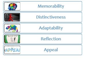
After the design process, let’s visit the territory of a timeless logo to ensure a classic emblem creation. Following are the parameters that prevent your visuals from the effects of time.
1. Memorability
There’s no point in having a retro logo that’s difficult to memorize, recall, and recognize. Building too many features or complex pictures in retro logos threatens their memorability. Using a minimalistic design approach with simple images and objects is better. Add texture but avoid adding minute details to keep the design modern yet classic.
2. Distinctiveness
Many old logos use the same patterns and colors to display their vintage design. Use fresh ideas and a custom retro font generator to radiate a distinct brand identity and avoid confusion. Retro words are mainstream for vintage logo design, so think of other distinct options. Remember that you want a unique custom font that uses inspiration to produce outstanding visuals.
3. Adaptability
Even the most classic logos have different background colors and print or digital media, so they must be adaptable. The indifference of a retro logo design to its background, surroundings, and available size adds to its versatility. It must remain as attractive on the roadside billboard as on a packaging or website. Using vintage words won’t benefit if we shrink the size for a favicon.
4. Reflection
Think of a retro graphic design or a vintage badge logo momentarily. Do they reflect an industry, company, or audience? Do they resemble the 70s fashion, 80s design, or any 80s logos? How do you create an antique store logo with vintage labels vectors or a vintage color palette? Answering these questions lets you embed the necessary details in your logo ideas without a creative block.
5. Appeal
Adding appeal to business logo ideas takes more than vintage logos maker, 80s graphic design, and classic font choice. It entails the process of combining influential customer-centric visuals that aid in attaining your brand objectives. AI image generator can produce thousands of images, but adding charm necessitates hiring a graphic designer with expertise and experience. You can try using visuals that relate to the interests and preferences of your target market.
Modern Brands with Classic Logos
We present the famous vintage company logos to reference all the details in this blog. You might be thinking of the 1940s logos and 1950s logos as outdated or obsolete. The following brands use their vintage designs in the digital era while being among the top vintage store logos.
Starbucks
The globally recognized 70s logo was a bare siren holding her twin tails, with a black and white palette. Starbucks logo has undergone many modifications until now, using the same cropped visual as a vintage store logo. The trademark symbol inspires various entrepreneurs while serving millions of customers worldwide. Its strong appeal and influence have gained it a high reputation.
Coca Cola
The wordmark of the famous brand uses the same vintage font since the end of the 19th century. One significant feature of its copyright symbol is its cursive font with round edges. The brand has been a favorite soft drink, selling a whopping 1.9 billion daily servings. For people who question the effectiveness of classic logos and retro fonts, the Coca-Cola logo is an absolute answer.
Harley Davidson
With the popular logo emerging in the 1960s, Harley Davidson used other variants of different styles and shapes. A quick image search will produce many results on its old and new logos. However, we find the choice of a retro layout of a bar and shield or a Viking Axe (Does it?) unique. Building appeal in a logo entails efficient branding and promotion strategies that mark an impact.
Conclusion
Every brand has unique aesthetics that are only visible if you look beyond the traditional visual design approach. To provide vintage inspirations and tips for reviving the classic logo aesthetic, we begin by addressing your fundamental concerns. With retro vibes, you can create a logo that serves as a magnificent eye candy to your audience. The sample vintage logos for inspiration allow us to analyze the implication of guidelines in a modern way. Classic logos with a modern touch are what a branding company could provide with an edge.
Please visit Our Design Blog


