Your brand’s face is represented by your logo. It’s the initial impact you have on potential customers, an emblem that remains memorable to them even long after their first encounter. However, given the abundance of logo design choices available, how can you select the most suitable one?
This blog is your complete guide to the 11 most commonly used logo styles. We will explore the Pros and Cons of each, from the simple and clean design of letter marks to the fun and engaging appeal of mascots. You will also find examples of famous brands using these logo styles in real-life situations and understand how to choose the right one for your brand’s individual identity.
What is a Logo?
A logo serves as a visual foundation in the vast landscape of branding. It is a distinct symbol or pattern that serves as a quick way to represent your company, brand, or organization. Logos may consist of text (wordmarks), symbols (pictorial marks), or a mix of the two (combination marks). They can be found in a range of designs, from the simple elegance of lettermarks such as NASA’s to the fun mascot of a neighborhood bakery.
These types of logos, also known as logo styles or brand symbols, can be extremely varied. Consider the famous swoosh of Nike, the intertwined double C’s of Chanel, or the cheerful Twitter bird. These company logos are easily identifiable and serve as strong tools for brand recall and retention.
Why Your Brand Needs a Logo
A powerful logo is now essential, not just a nice-to-have feature. It is the visual representation that welcomes potential clients, making a memorable initial impact. Your brand needs a well-designed logo for these reasons:
A logo serves as the identity of your brand, making it simple for customers to recognize you in a competitive market. It promotes brand retention, making sure your business is remembered when a situation requires it.
If you want the perfect logo that suits your brand identity, contact Logo Design Valley. Our expertise lies in creating logos that surpass simple recognition. We develop memorable associations that align with your target audience and reflect your brand’s core beliefs.
Find Your Perfect Logo Type Match!
Discover the different logo styles and choose the one that best represents your brand.
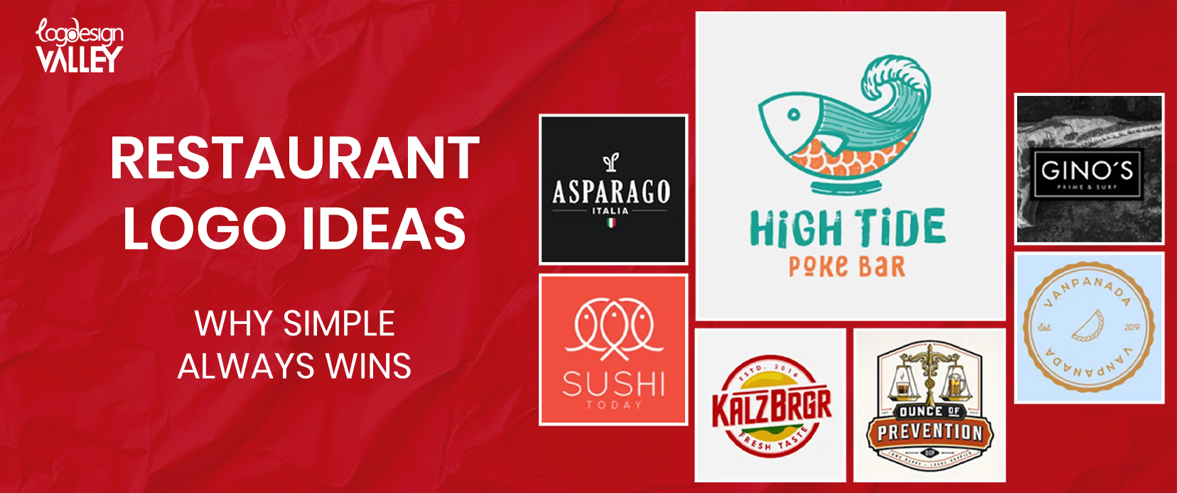
11 Different Types of Logos Design
Initials such as those of NASA are ideal for well-known and established companies. Logos based on words, such as Coca-Cola, are perfect for highlighting a distinctive brand name. To grab attention visually quickly, use straightforward symbols such as Apple or the bird from Twitter.
Logos can also take on a more abstract form by utilizing shapes to evoke emotions, as seen with Adidas’ three stripes. Numerous brands, such as Lacoste and Starbucks, also merge text and symbols. This is simply an accessible sample of the diversity. The important thing is to extract the ideal match for your brand’s character. Here are some examples of top logos you should definitely check out.
Lettermark or Monogram Logo
These logos utilize letters, which are frequently taken from the name of the company, in order to achieve a sleek and contemporary appearance. Consider the famous NASA emblem, where the connected letters immediately symbolize the space organization. A lettermark can be a strong asset in building brand awareness for brands with high name recognition.
Companies such as FedEx and HBO exemplify this, as their logos clearly convey their identity. The versatility of a lettermark logo is enhanced by its simplicity. It can be readily adjusted and copied for different uses, from small business cards to large billboards. If your brand has a recognizable name and desires a contemporary look, a lettermark logo could be ideal.
Wordmark or Logotype Logo
Let the words speak for themself! A wordmark, also referred to as a logotype logo, highlights your brand’s name. This logo design is perfect for highlighting a distinct and unforgettable company name.
Consider the vibrant red font of Coca-Cola or the sleek design of Visa’s logo. These logos do not depend on extra images; their strength lies in the unique typography that becomes connected to the brand. A skillfully designed wordmark logo has great flexibility. Selecting the appropriate font and design components enables you to communicate your brand’s identity and beliefs.
Pictorial Mark or Logo Symbol
The defining feature of a pictorial mark or logo symbol is its simplicity but significant impact. These corporate logos depend on an icon or symbol to visually embody the brand. The strength of this logo lies in its capacity to establish an immediate brand identity. When you eat an apple, you immediately associate it with the company Apple. Spotting a bluebird evokes thoughts of Twitter.
These visual symbols have become so deeply integrated into our thinking that they go beyond language obstacles, which makes them perfect for worldwide brands. Pictorial symbols are also very flexible. They are versatile for different uses and can be integrated with text to make a logo more complete. Therefore, if you are in search of a logo that effectively conveys a clear visual message, opting for a pictorial mark could be the best choice.
Abstract Logo
Abstract logos move away from direct representations, utilizing shapes and forms to evoke feelings and concepts. These logos can serve as a strong tool in designing a distinctive and memorable brand symbol that sets itself apart.
Consider the famous three stripes of Adidas, which symbolize the brand’s emphasis on performance and motion. The Pepsi swoosh, with its dynamic shape, is also a powerful symbol of vitality and rejuvenation. Abstract logos enable a high level of creativity and have the potential to be interpreted in various ways by those who see them.
Combination Mark Logo
The union of text and symbol! A combination logo mixes a wordmark or lettermark with a pictorial element, as the name implies. This logo type combines the brand recognition of text with the visual impact of an icon, offering the best of both worlds. Consider the famous Lacoste crocodile skillfully incorporated into the brand’s logo.
Think about the Starbucks mermaid symbol, which brings a hint of character and legend to the coffee chain’s emblem. Combination marks are highly flexible and can be customized to fit a variety of brands. They are a favored option for businesses that have a long-standing reputation but also aim to establish a strong visual brand. If you desire a logo that provides both clarity and memorability, a combination mark might be the ideal choice.
Mascot Logo
Are you searching for a welcoming and easily approachable representative for your brand? There is no need to search beyond the mascot logo! These examples of logos use a drawn character to symbolize your business. This character frequently represents the brand’s characteristics and beliefs in a way that is relatable and interesting.
Consider the fun-loving Michelin Man, known instantly and connected with the tire company’s dedication to dependability and security. Alternatively, think about Colonel Sanders, the well-known symbol of KFC, who brings a sense of comfort and recognition to the fast-food brand.
Emblem Logo
Filled with traditional and cultural significance, emblem logos create a feeling of reliability and power. These logo designs frequently include crests, badges, or shields, integrating symbols, text, and even mottos.
Consider the famous Harley-Davidson logo, which boldly showcases the brand’s name with its distinctive wings. Alternatively, think about the symbol of Harvard University, which represents its extensive history and outstanding academic reputation. Emblem logos are commonly chosen by companies in well-established industries, educational institutions, and government organizations. They give off an impression of professionalism and staying power, making them ideal for brands seeking to exude a sense of stability and dependability.
Letters Inside a Shape Logo
Searching for a method to establish a structure for your brand? Letters contained within logos that are shaped perform that exact function. These logos design logos with names inside a shape like a circle, square, or triangle. The form can contribute a distinctive visual aspect and strengthen the brand’s recognition.
Consider the famous Chanel symbol with the intertwined C’s enclosed within a dual square. Alternatively, take into account the BBC logo, in which the letters are skillfully incorporated into a geometric container. Including letters in logos that are in the shape of the letters can elevate your brand identity with elegance and organization. Their clean and modern appearance is favored by businesses in different sectors, making them a popular option.
Negative Space Logo
Negative space logos are all about the art of hidden meaning. These types of logos use the negative space in a design to form a second image. This could be a smart and surprising method to enhance the complexity and interest of your brand image.
Consider the famous FedEx logo, where the empty space between “E” and “X” creates an arrow in a clever way. This subtly indicates the brand’s emphasis on rapidity and effectiveness. Designing negative space logos requires a skilled designer’s know-how, but the result could be an exceptional and memorable brand emblem. They can spark interest and inspire viewers to engage with your logo on a deeper level. If you want a logo that is visually appealing and encourages deep reflection, think about using a negative space logo as an option.
Dynamic Mark Logo
Welcome the strength of mobility! Dynamic mark logos, also referred to as animated logos, exceed the limitations of static images. These corporate logos use gentle animations or transitions to enhance the visual appeal for viewers.
Consider the NBC peacock, which elegantly displays its feathers. Alternatively, think about the logo of the Association of (ACCA), in which the interconnected circles constantly change and develop. Using dynamic marks can be an excellent method to inject some personality and contemporary style into your brand. They can also be successful in capturing interest and leaving a long lasting impact in the digital era. It is vital to make sure the animation is discrete and does not take away from the logo’s overall clarity.
Letterform Logo
Taking a letter to the next level – that’s the essence of a letterform logo. These logos transform one letter from your brand name into a special and creative design. This is an effective method for designing a unique and memorable logo, particularly for brands that have brief names.
Consider the famous CNN logo, in which the prominent “C” is changed into an ongoing worldwide news circle. Alternatively, think about the Yves Saint Laurent logo, which features the intertwined “Y” and “S,” forming a monogram with a hint of Parisian style. Letterform logos call for a unique design strategy, yet the outcome may serve as a striking and unforgettable branding symbol.
How to Choose the Right Logo
Selecting a logo can be overwhelming due to the abundance of choices available. Take into account your brand’s fundamental beliefs and ideal audience to limit the options for custom logo designs. Your logo branding needs to integrate perfectly with your website and social media presence to ensure a unified brand experience.
Consider Logo Design Valley as your logo designing partner who has skilled designers who concentrate on creating business logos that mirror your brand’s fundamental principles and match perfectly with your branding strategy.
Conclusion
Your logo is crucial in creating your brand’s identity. There are numerous options to choose from, and it is seriously overwhelming to select the right one. Consider the key characteristics of your brand and the target audience to limit the options. Your logo needs to integrate perfectly with your overall branding in order to establish a unified experience. A well-designed logo makes a lasting impression and is strongly associated with your brand.