Fonts act as the foundational elements of design. They are the forms that create the words we see in text. Similar to how various bricks can be used to construct various types of houses, different fonts can evoke different emotions. A strong, thick font can yell, whereas a graceful, cursive font can murmur. Selecting the correct font is akin to selecting the appropriate outfit – it can either enhance or detract from your appearance.
Let’s investigate the various kinds of fonts available. We will discuss the different situations in which to use each one and the ways to blend them together to make stunning designs. Understanding fonts is crucial when it comes to creating visually appealing work such as posters, websites, or emails with a sophisticated touch.
The Different Types of Fonts
Fonts act as various vocal tones. Some people are outspoken and confident, while others are quiet and kind. There are various fonts available, each with its unique character. So whether you are looking for a font for your custom logo design or any other purpose this guide will explain everything in detail. Let’s examine a few popular ones and discover what sets them apart.
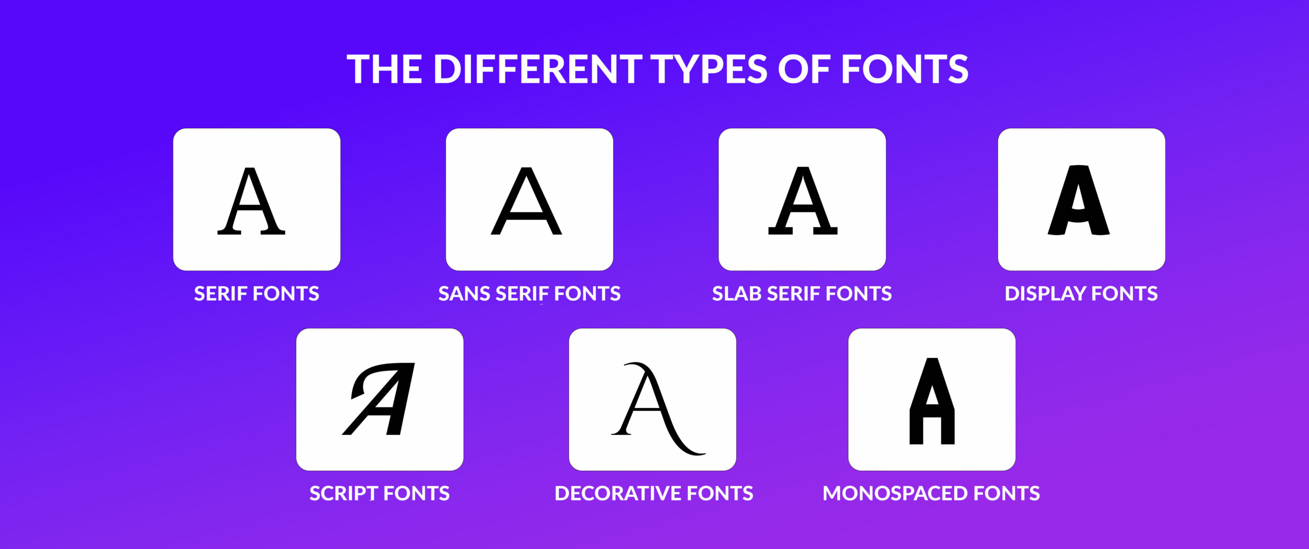
Serif Fonts
Serif fonts remain the traditional option for a variety of designs. These font styles, identifiable by the small lines or feet at the end of each letter, have been in existence for many centuries. They provide a feeling of customary and sophistication. Consider serif fonts as the elegantly attired guests at a fancy gathering.
Frequently used serif typeface titles are Times New Roman, Garamond, and Georgia. These styles of fonts are frequently utilized in books, magazines, and newspapers as they are simple to read in extended passages of text. Although serif fonts are adaptable, they may seem overly formal for contemporary designs at times. Nonetheless, if they are implemented properly, they can enhance a project with a sense of refinement and elegance.
Sans Serif Fonts
Sans serif fonts are the contemporary equivalent of serif fonts. They are neat, straightforward, and lack the tiny lines that typically follow each letter. This typeface is commonly linked with simplicity and modern aesthetics. Consider sans serif fonts as the naturally stylish individuals in the room.
Common sans serif font options are Helvetica, Arial, and Roboto. These styles of fonts are commonly utilized in digital design, including websites, apps, and interfaces. Their reputation lies in their clarity on screens and their capacity to achieve a sleek and contemporary appearance. Sans serif fonts offer flexibility for a range of projects, from eye-catching titles to understated body paragraphs.
Slab Serif Fonts
Slab serif typefaces offer a contemporary and daring interpretation of the traditional serif design. Rather than having thin, elegant serifs, they have bold, bulky ones, creating a sturdy, geometric appearance. Consider them to be the bold, self-assured individuals in the font group.
Examples of commonly used slab serif fonts are Rockwell, Clarendon, and Courier. These types of fonts are commonly utilized for headings, captions, and brief passages of text owing to their powerful visual effect. These can enhance your designs with a hint of industrial chic or retro charm. Even though they can be utilized for body text, their strong style may be too intense for extended passages.
Choose the Perfect Font for Your Brand
Find the font that best represents your brand’s personality.
Display Fonts
Show fonts are the divas of the font universe. Their purpose is to catch the eye and convey a message. There are numerous styles of font types available, ranging from fun and whimsical to bold and extravagant. They resemble the flashy personalities seen in a film.
Display fonts are commonly utilized for titles, brand marks, and promotional materials. They can be mixed with other font styles to create contrast and add visual appeal. Nevertheless, it is crucial to utilize them in moderation, as an excessive amount of display fonts can overpower a design. Examples of popular display fonts are Blackletter, Art Deco, and Comic Sans. Keep in mind that even though these fonts are visually appealing, they may not be suitable for body text because of their frequently low readability.
Script Fonts
Fonts that imitate handwriting mimic the look of personal and elegant script. They range from calm and sleek to sophisticated and ornate. Think of script typefaces as the graceful ballet dancers of the font world.
Cursive, calligraphy, and signature are all well-liked script font styles. These fonts are commonly used for special events like invitations and wedding items. They can elevate your designs with a touch of sophistication and charm. However, be careful when using script fonts in large quantities for body text, as they can create readability issues.
While script fonts may be visually appealing, it is important to pair them with a more readable font for the main text.
Decorative Fonts
Decorative Fonts are the unpredictable elements in typography. They are available in a myriad of designs, ranging from fun and quirky to daring and elaborate. They resemble the colorful personas in a film, intended to stand out and express a message.
These styles of fonts are commonly utilized for headers, brand icons, and advertisements. They can be mixed with different font types to create contrast and add visual appeal. Nevertheless, it is crucial to use them in moderation because an excess of decorative fonts may overpower a design. Examples of popular decorative fonts include Blackletter, Art Deco, and Comic Sans. Keep in mind, although these fonts are visually appealing, they may not be suitable for body text because the width of each letter varies.
Monospaced fonts
Monospaced fonts have the special feature that each character, regardless of its complexity, occupies an equal amount of horizontal space. This generates a consistent, typewriter-esque look.
Courier and Consolas are typical monospaced fonts that are commonly seen. These types of fonts are widely used in areas such as coding, programming, and technical documentation where accurate alignment and readability of code are important.
Although monospaced fonts provide a neat and uniform appearance, they may not be ideal for large portions of text. Proportional fonts can be easier to read than fixed spacing fonts in certain situations. Nevertheless, their uniform spacing can be beneficial in certain design scenarios, such as making tables or code excerpts.
These font types are ideal for achieving a consistent and exact look. If you want a font suggestion for your logo design you should go with any of them. These fonts suit all logo types.
Vintage Fonts vs Modern Fonts
Vintage Fonts serve as time capsules, preserving the spirit of bygone periods. They frequently showcase intricate embellishments, decorations, and a feeling of longing for the past. Consider the graceful handwriting of a Victorian invitation or the striking, geometric designs of Art Deco posters. These fonts bring out a sense of heritage and customs, enhancing the personality and attractiveness of any design.
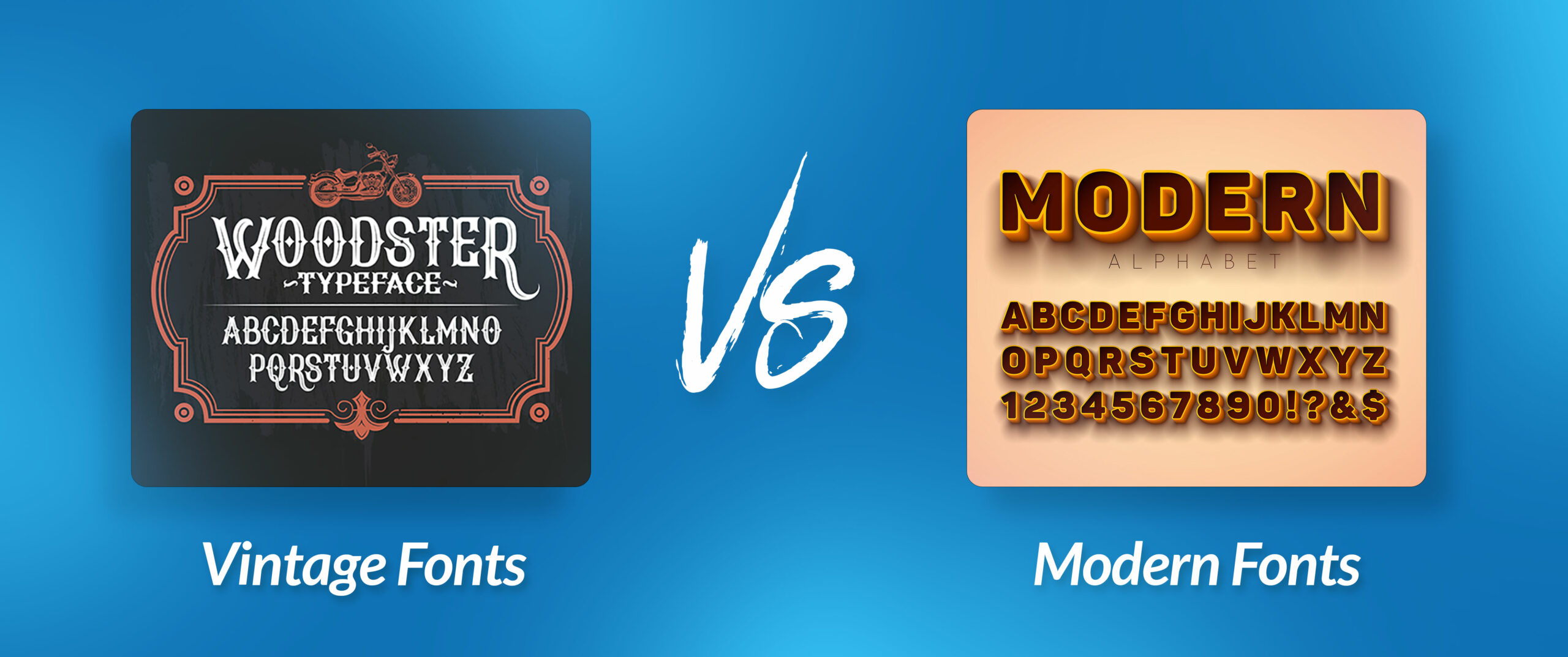
Modern Fonts embody a clean, sleek, and modern style. They place importance on being easy to read and adaptable, typically showcasing uncomplicated, geometric forms. Consider the simple sans-serif fonts seen in tech and fashion company logos. These typefaces convey a feeling of modernity and effectiveness, making them ideal for digital platforms and modern designs. Here is a short table on Vintage Fonts vs. Modern Fonts.
| Feature | Vintage Fonts | Modern Fonts |
| Appearance | Ornate, decorative, with flourishes | Clean, simple, geometric |
| Feel | Nostalgic, classic, traditional | Contemporary, minimalist, futuristic |
| Examples | Old English, Art Deco, Script | Sans Serif, Geometric, Sans Serif |
| Best Used For | Creating a retro or elegant vibe | Modern, tech-focused designs |
How to Select the Best Font?
Selecting the correct font can be as challenging as finding a needle in a haystack. There are endless variations of fonts, each possessing their own unique personality and design. However, with some guidance, you can discover the ideal font for your project, so don’t fret.
Choosing the perfect font can be a daunting task, with an abundance of options available. However, do not fret, by following a few suggestions you can discover the ideal one for your project.
Initially, consider the emotion you aim to evoke. Is it daring and contemporary, or traditional and sophisticated? Picture a rock concert flyer – a bold, simple font could be effective. For a wedding invite, opt for a design that is elegant and has a fluid appearance.
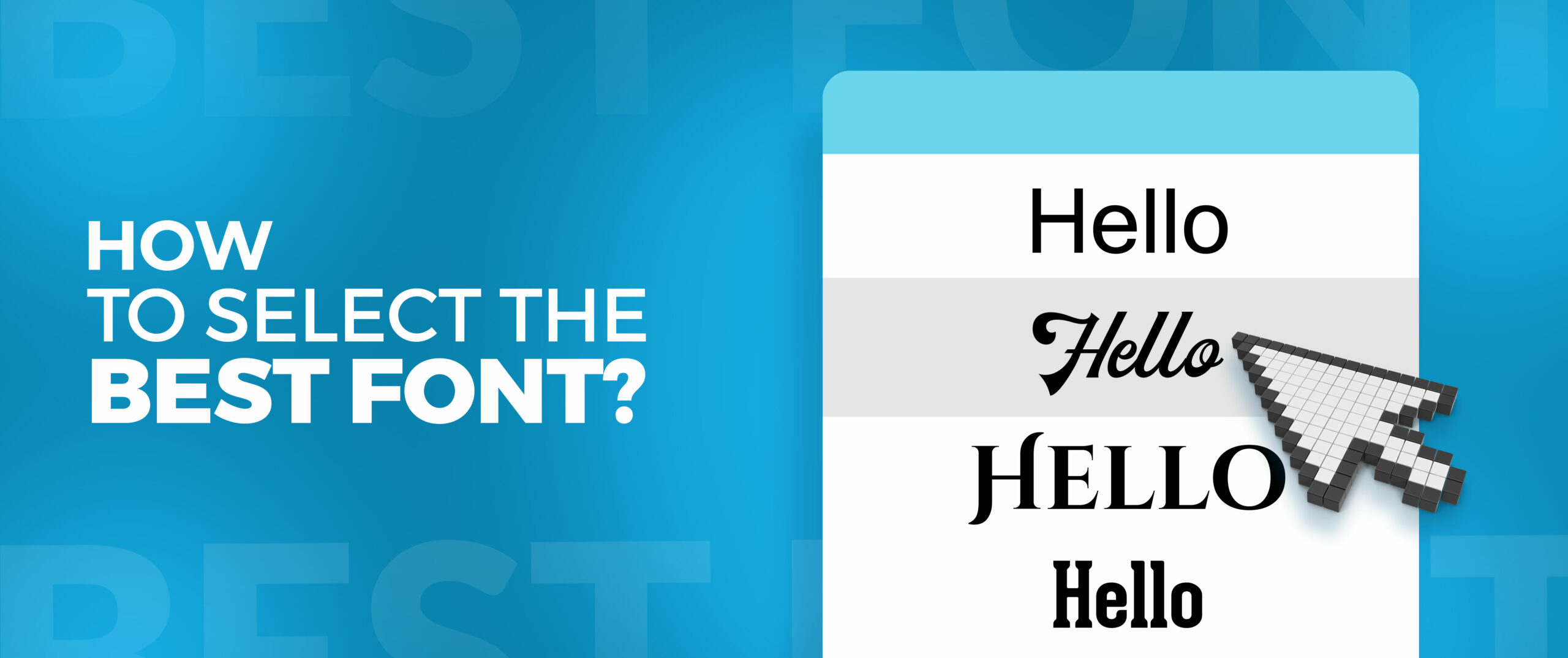
Next, think about the readability of the content. For large amounts of text, choose something that is visually comfortable. Fonts with serifs have small lines at the end of the letters that can aid in reading, whereas sans-serif fonts are more suitable for digital text due to their cleaner appearance.
Experiment with combining different fonts! This is an excellent method to create visual interest in your design. One option is to utilize a bold sans-serif font for the headline and a softer serif font for the body text. If you are stuck finding the best font for your logo design simply hire a logo designer who will choose the best font and make the best logo out of it.
Keep in mind, the optimal font choice is the one that perfectly enhances your message and design.
Where can I download free fonts?
The realm of typography is extensive and thrilling, providing numerous choices to improve your designs. There is a font style available for every project, ranging from traditional serifs to contemporary sans serifs. Where can one locate these various fonts available for free download? Let’s discover some well-liked websites on the internet.
Google Fonts
Google Fonts is a widely recognized platform for accessing free fonts. It provides a carefully selected variety of top-notch font styles, ranging from traditional to innovative. You can easily navigate through various font styles, font names, and even preview them in different text sizes. Google Fonts is an excellent resource for both novice and seasoned designers.
Font Squirrel
Font Squirrel is also a great resource. This site specializes in free fonts that are suitable for commercial purposes, making it a trustworthy option for designers and companies. They provide a range of font styles, such as serif, sans serif, script, and decorative choices. Font Squirrel offers tools to assist in locating the ideal font for your project.
To discover more font options, it is recommended to check out DaFont. Even though there is a wide range of free fonts available, it is crucial to carefully review the licensing details for each font. Certain fonts could have limitations when it comes to being used for commercial purposes. DaFont is a goldmine for individuals seeking distinctive and uncommon font suggestions.
Keep in mind that although free fonts are good for trying out and discovering your style, it is essential to think about the quality and licensing terms before incorporating them into commercial projects. Make sure to always verify the font’s license to ensure you are following the terms of use.
Conclusion
Fonts play a crucial role in design by subtly influencing our perception of information. Knowing the various font styles and mastering their proper usage can take your designs from average to exceptional. Through your exploration of serifs, sans serifs, slabs, scripts, and decorative fonts, you have developed a strong understanding of typography.
Keep in mind, the secret to using fonts effectively is knowing your audience, the message you aim to communicate, and the overall aesthetic of your design. Try out various mixtures, but focus on readability and visual balance above all else. Through practice and trying different options, you will enhance your ability to choose the ideal font for each project. Therefore, when you begin a design project again, rely on fonts as your loyal allies. By utilizing their strength, you can produce stunning visual creations that make a long-lasting impact.


