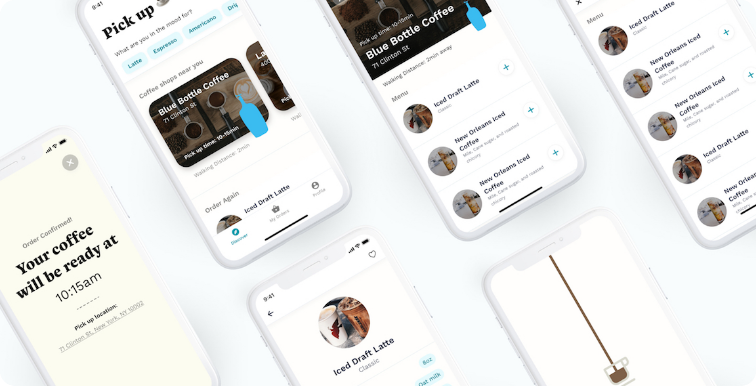
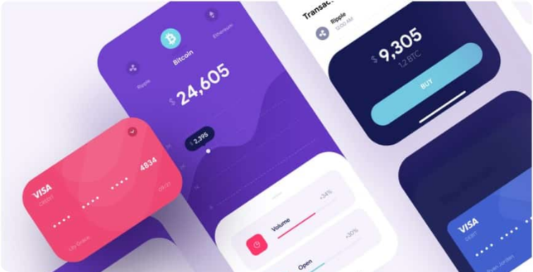
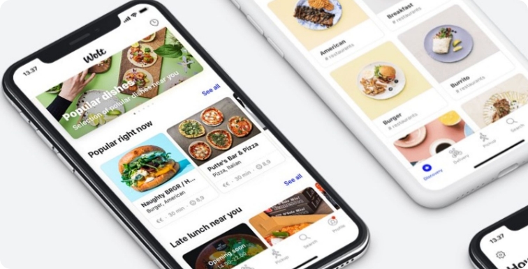
The design is a silent ambassador for your business – It is that first impression that can give it a hit or miss at a glance. Since the design is an integral part of the mobile application, we believe that from logo to your mobile application interface design should never be compromised. Therefore in this era where a copy of the same ideas comes in a row of mobile app stores, you need to make users believe it was initiated by you (if that person is you)
Simplicity is Smart!
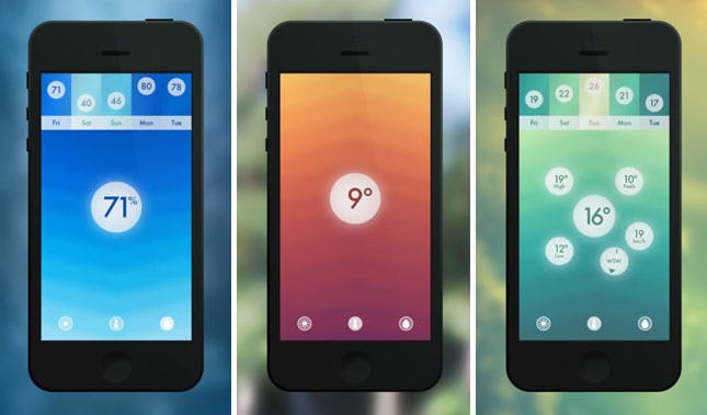
YES! First, it doesn’t confuse the users, secondly why not? IF things getting done more simply then why should we make unadorned imperil like this? Therefore, flow, texture, feel and experience as modest and uncomplicated. By simple design we mean to keep user-friendly and just smooth as ABC. With a minimal design, username, password and login details instead of making a detailed oriented form to fill that somewhat frustrate users today.
Clear Navigation
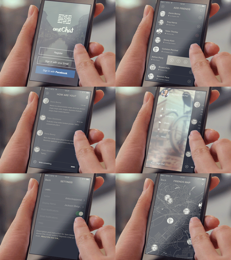
We are apparently not expecting to make your app Time Square where people come by with jaw-dropping amusements. However, it should please them, captivate them somewhat like that only. So, to clear out all the dead ends a distinctive persona for mobile app design should be designed. Therefore, create different scenarios and use simulating experience to understand how potential users too.
Difficult Tapping
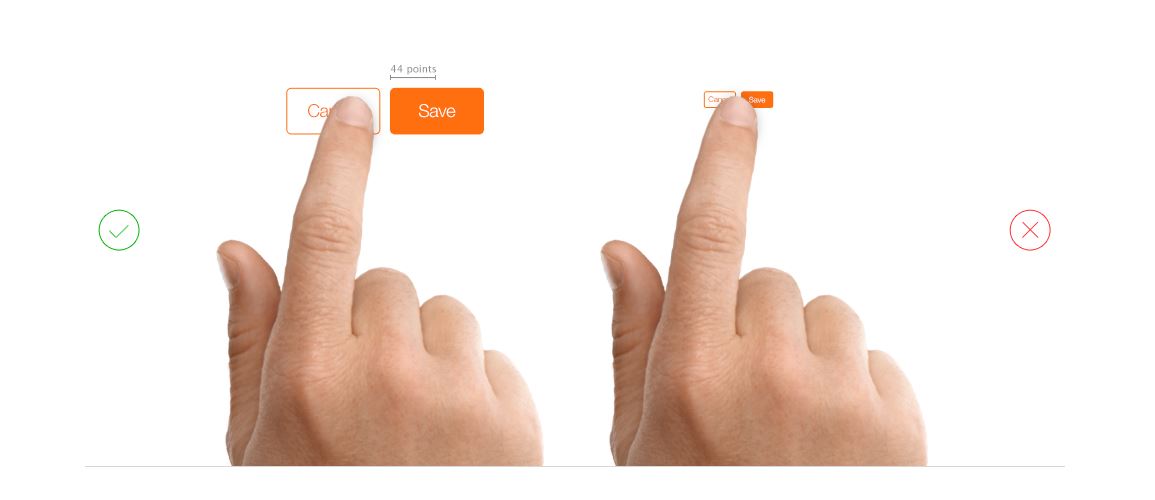
Your application should qualify to stress test as it has to response taps by almost all sizes of the thumbs it goes along with. So, if you are working to get all the thumbs ups, then you need to think about keeping the right actions with the right size. It is recommended to keep the controls approachable. By positioning command in an appropriate size (not too big not too small) allow users to feel comfortable with core controls of your app.
Wire Frame /Prototyping
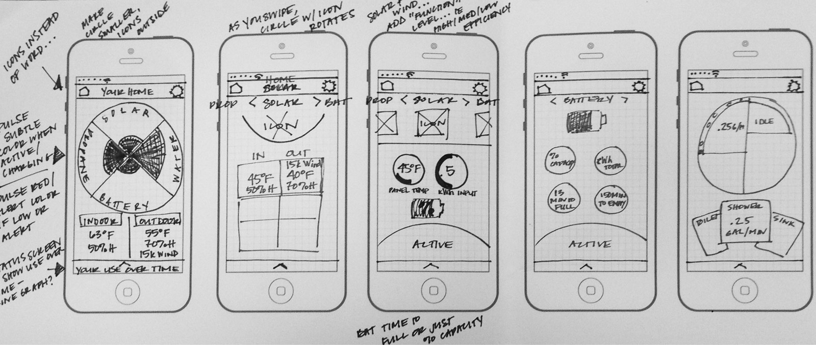
These are the most common terminologies mobile app design agency use to be more precise about the direction. However, what important for you is to know the wireframe purpose first. When it comes to demonstrating your app idea, speak what developers can understand clearly. For this use of simple design by drawing the primary and essential image of your application “idea” without having to explain a lot about the attributes. This brief diagram sort of presentation referred as wireframing – a higher and intense, complicated version of your app explanations is called prototyping that works point to point pixel to pixel to organize application flow, design, and functionalities accurately.


