The marketing world never misses to amaze us. It is full of lessons for every learner belonging to any field. Iconic brands and famous companies around the globe provide motivating, inspirational, and thoughtful lessons. Designers, entrepreneurs, business managers, and other professionals can learn a lot from reading about the history of leading businesses.
Managing a business requires the creation of demand rather than fulfilling a basic need. Imagine if Coca-Cola has been a water supplier since the very beginning. Or if it didn’t employ a logo design agency to design its present iconic logo. What attracts us to soft drinks is not solely thirst. It is thirst driven by the desire to find a visible business offering a product other than water. That’s how the big companies get where they are, providing opportunities and inspiration.
We might find the product, promotion, packaging, and campaigns attractive, but what is common among all these media? The logo. Investing in a logo design is like investing in a power generation source. Once it completes, it energizes all areas of the business, including marketing and sales. Let’s discuss the story of the famous company started by two teenagers with $100 financing.
United Parcel Service (UPS)
UPS is an American multinational company offering supply chain management services to its worldwide clients. The company originally started operations as American Messenger Company in Seattle. The company is now a famous shipping and courier giant and a Fortune 500 company with stores, facilities, and operations in almost every country of the world. The company’s revenue in 2022 stood at around $100.3 billion, which is more than the GDP of most countries.
The company even surpassed FedEx and DHL in 2022 in revenues, with a staggering employee count of 534,000 in 2022. It is among the largest private employers in the US, paying more average salary to employees than its rivals. Who would have thought that the teenagers are laying the foundation of the world’s largest supply chain company? Let’s look at the humble beginning of the company and its journey to becoming a global magnate.
History of UPS – American Messenger Company
In 1907, James E. Casey and his friend Claude Ryan borrowed $100 from Ryan’s uncle to establish a messenger company with a bicycle and a phone. The telegraph company started in a saloon’s basement in Seattle, Washington. In the 1900s, Seattle’s population grew to around 200,000, with a few homes having telephones and two telephone companies operating in isolation.
The United State Postal Service was not established, and the city relied on messenger and horse carriages for communications and parcel deliveries. Casey has been working as a messenger since he was 11 years old, and with the help of Ryan’s uncle, Charley Jones, Casey and Ryan started the American Messenger Company on 28th August 1907. The boys used red and white posters to advertise their round-the-clock messenger services, reading “Best Service at Lowest Prices”.
The startup employed a handful of teenagers, including Casey’s brother, George. The boys delivered most parcels on foot, using bicycles for longer routes and wearing uniforms. By 1912, the company had 100 employees and a reputation for quick and reliable deliveries. The US Post Office was the largest client of the company.
A Brief History of Business Expansion
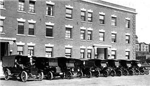
In 1913, phones were becoming common, so the business shifted focus to package movement. It merged with McCabe’s Motorcycle Delivery Service renaming the business to Merchant’ Parcel Delivery, and started using motorcycles. It bought the first delivery car, Model T Ford, with a truck bed back. More carriers were added to the fleet with few more cars.
In 1919, the acquisition of Motor Parcel Delivery helped expand the business in Oakland, California, and adopted the current name United Parcel Service (UPS). It bought a Los Angeles company in 1922, which offered many services related to returns, cheque collections, and order pickups. The company grew to a national level by 1927, operating in all big cities on the Pacific Coast. In 1930, the expansion to the East Coast fueled its growth, and by the end of 1950, the company was operating across the US. It became a rival to the US Post Office, facing legal issues.
Casey retired from the business in the 1960s and switched to philanthropy with his siblings, laying the foundation of the Annie E. Casey Foundation. The foundation offered various services to children in foster care in Seattle. The legend died in 1983, passing all belongings to the foundation. In 1985, UPS Next Day Air started operations across the United States. The same year the intercontinental air services between the US and Europe were operational.
1988 marked the addition of a UPS aircraft to its fleet, serving the Middle East, Africa, and the Pacific rim by the end of 1989. The company moved its headquarters to Atlanta in 1994, and the website of the brand was live. The company became public in 1999 with a special focus on global commerce and entered the world of retail services in 2001 through The UPS Store.
The UPS Store
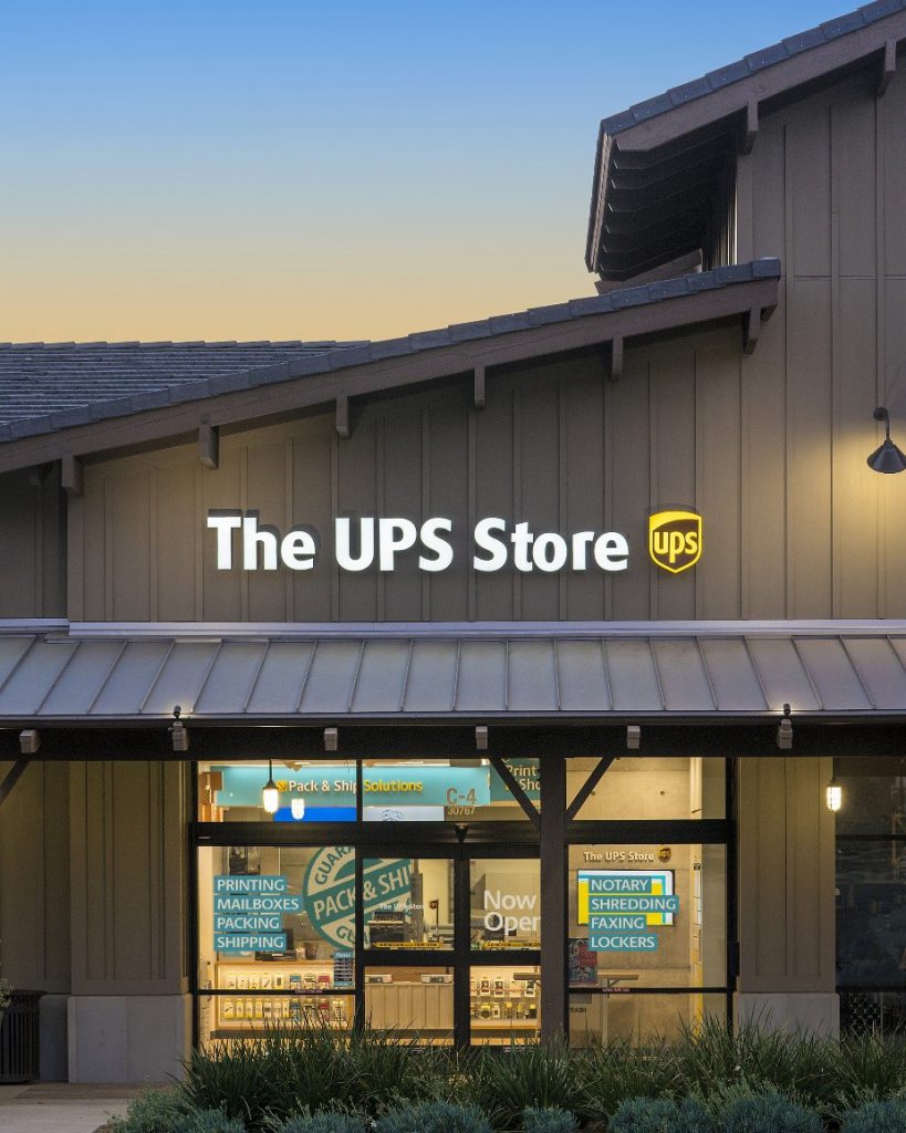
In March 2001, UPS overtook the company formerly known as Mail Boxes Etc., founded in 1980. With over 2000 facilities and franchises, UPS rebranded them as The UPS Store offering shipping, shredding, printing, fax, and mailbox services to individual and business customers. There are over 5000 UPS Stores across the US and Canada. According to Entrepreneur Magazine, the UPS Store ranked fifth among the top franchise brands. Click to download The UPS Store Logo.

The UPS Store Logo, Credit: The UPS Store
Evolution of the UPS Logo
The logo is the visual representation of a company, reflecting its story, purpose, or customer interests. It helps promote a positive image of the brand while attracting its target audience and appealing to them to transact. The logos of famous brands are an inspiration to logo designers and graphic designers. The history, evolution, and design elements of the UPS Logo vector are discussed in the subsequent sections.
Just like the brand’s history, the UPS logo also evolved over time and is a hot topic of discussion, offering valuable insight and inspiration to designers. The Ups logo vector as we see it today is a product of the many modifications that the emblem has undergone throughout history. A quick review of the history will help understand the changes that fueled the growth of UPS.
UPS Logo Designer
In 1916, Casey felt the need for a logo representing swift and reliable delivery services. The first logo was designed by James Casey, the cofounder, focusing on speed, efficiency, and performance. Since then, the logo sign has gone through modifications by some designers and a logo design agency. The famous designer Paul Rand was the UPS logo designer to come up with a minimalist design in 1961 and the UPS font type. He paved the way for the present logo that we see today. However, the credit for introducing the shield in the logo goes to Casey.
1916 to 1937

Casey chose an eagle silhouette to represent the brand carrying a package with a bronze shield in the background with a bold outline. The words ‘Safe, Fast, and Reliable’ were written on the parcel box, representing the service quality. It remained the visual mark of the company until the first modification in 1937, which started the use of the brand’s name.
1937 to 1961

The expansion of the company in the 1930s to major US cities stressed a visually appealing logo with the brand’s name. Therefore, in 1937, the emblem dropped the eagle silhouette and adopted the company name’s abbreviation with small letters on the shield. The brown color was used on the parcel fleet vehicles in the beginning, so it became the new logo color. It gave clues to the service and clientele hoarding its legacy by the “Since 1907” tag.
1961 to 2003

The logo was modified majorly in 1961; the shield shape contained the abbreviation with a white color palette and a box above the shield with a bow knot ribbon. Paul Rand gave priority to simplicity in the logo design, taking on only the key elements from the prior logo. He used the brown text and outline in the logo emblem as the official color of the brand. The logo remained the face of the brand till 2003.
2003 to 2014

The minimal logo was plain and simple, but the advancing electronic media screens were gaining more public attention. The colors were again added in the logo with a dark brown color in the shield outlined by a more golden brown lighter shade. The dark color was slightly curved on the left upper corner, and the font used the same outline color. A shine was added to make the logo appear 3D, lively, and attractive. The font was also modified using the custom UPS Sans developed by Paul Rand for the brand.
2014 to Present

The logo that we see today is another modification of the 2003 logo when the designers removed the shine and shadows. The logo is now flat and more two-dimensional, with only two colors in it. The dark brown color was darkened, and the golden brown shade was changed to golden yellow. The new logo influences a mass audience and attracts customers to the brand.
Design Elements in the UPS Logo
It is essential to discuss the design elements of the UPS logo to learn best practices. The symbol has been a hallmark of trust and reliability for over a century attracting global clientele. The elements of the logo have undergone many variations with the addition and removal of many of them, but one thing remained prevalent throughout its evolution history – The Shield.
Design
The design of the current UPS logo uses a minimal design approach with limited design elements. The top left curvature in the inner design reflects an artistic touch in the logo, while the outer design uses a different color. The design only contains the abbreviation of the brand name.
Shape
The shape of the iconic classical shield of the UPS brand portrays strength and reliability. The inner shape is more of a unique design that contains a single color and the initial letters of the brand name. Many modifications in the logo design were made at different times, but the shape of the shield didn’t change in any of the designs. The shield hero is a powerful asset of the UPS logo.
Color
The choice of colors in the UPS logo represents the value proposition of the brand. Designers use only two colors in the logo design, a critical factor in most famous brands. The dark brown color was inspired by the Pullman Company and their sleeping compartment carriages, which were a symbol of prestige. Moreover, the golden yellow color represents the noble service quality of the brand. The font used the same outer color, managing the balance of the color scheme.
Font
The font of the well-known UPS logo is unique as the designer Paul Rand, the creator of the 1961 logo, developed a UPS sans serif font for the brand. The choice of small letters was prevailing at that time since 1937. The font styling is bold and solid, highlighting the prestige and heritage of the brand. The font’s soft curves and plain texture make the name appear friendly and trustable.

Design Process of Logo Design Valley, Credits: www.logoesignvalley.com
Design Inspiration
Many designers may think, “Graphic design is my passion”. What defines a graphic designer is not the artistic ability but the ability to get inspired and use inspiration as leverage. The shape, design, font, and color scheme of famous logo signs are good sources of inspiration for designers. Designers must also study the latest logo design trends and the history of appealing brands like the Nike Swoosh and Puma logo evolution for producing iconic designs.
UPS has been delivering the best quality services along with adopting effective branding strategies to empower its logo sign. Two factors in the UPS vector logo have remained common; the shield and the color brown. This consistency stresses adopting shapes and design that has the flexibility to comply with the different campaigns as well as be globally recognizable. The effects of cultural and regional backgrounds are another thing to consider while designing.
It is also important to study the branding strategies of the most famous companies to gain a better understanding of the role of audience preferences. Thoroughly researching the audience’s interests allows us to add elements that attract relevant prospects. For those who claim “Graphic design is my passion”, we suggest reading case studies and learning from the greatest designers through books and documentaries (LINK DOCUMENTARY BLOG).
Conclusion
The UPS vector logo has inspired many startups, businesses, designers, and professionals. The history of the company provides many insights into managing, growing, and promoting the business to its maximum potential. The humble start of UPS didn’t affect its growth and fame due to its high service quality and perfect branding. Logo design and branding go hand-in-hand to empower the identity of the brand.
Initially, it was the value proposition that energized the logo, but now, it’s the logo that’s supporting the campaigns and boosting revenues. Learners from every profession must consult such case studies to utilize the elements that make such growth possible. The two boys were a symbol of determination and commitment. The branding arena is full of great lessons, focusing on ethics and business practices while emphasizing the importance of a logo design agency.
It is essential to hire professional expertise that understands the target market. Professionals help follow the best practices while avoiding mistakes that can hurt a brand’s reputation. The services of a logo design agency enhance your branding and boost the brand’s revenues.


