
The Tesla logo symbolizes the concepts of innovation, change, and the future in sustainable energy. The fearless ambition to renew the automotive industry has continually been a characteristic of Tesla’s brand identity. But in what way did a basic ‘T’ transition into an enormously influential symbol around the world today? This road of the Tesla logo symbolizes the way a brand may grow while staying true to its vital mission.
Tesla demonstrates it leads not only in electric vehicles but also in its unique skill to distinct its brand in a saturated market. And as Elon Musk has said: “The first step is to establish that something is possible; then probability will occur.”
A Brief History of Tesla Motors
Tesla Motors’ intention from the start was to encourage sustainable energy for advancing the world. In 2003, Marc Tarpenning and Martin Eberhard founded Tesla, intent on being a minor player with resonance. An additional promotion to fresh heights for the company in 2004 resulted from presenting Elon Musk as its public face. The release of the Roadster automobile by the company in 2008 demonstrated to the public that electric cars aren’t only fast but also attractive.
What is The Actual Meaning Behind Tesla Logo?
At a first look, we may see the Tesla logo as a stylized ‘T,’ but there’s more to it than that. The cool design is not only for visual beauty. The top part of the ‘T’ stands for a piece of an electric motor, reflecting Nikola Tesla’s achievements in the electricity domain. The curved line beneath stands for the direction of electric energy, which represents the primary element of Tesla’s technology.
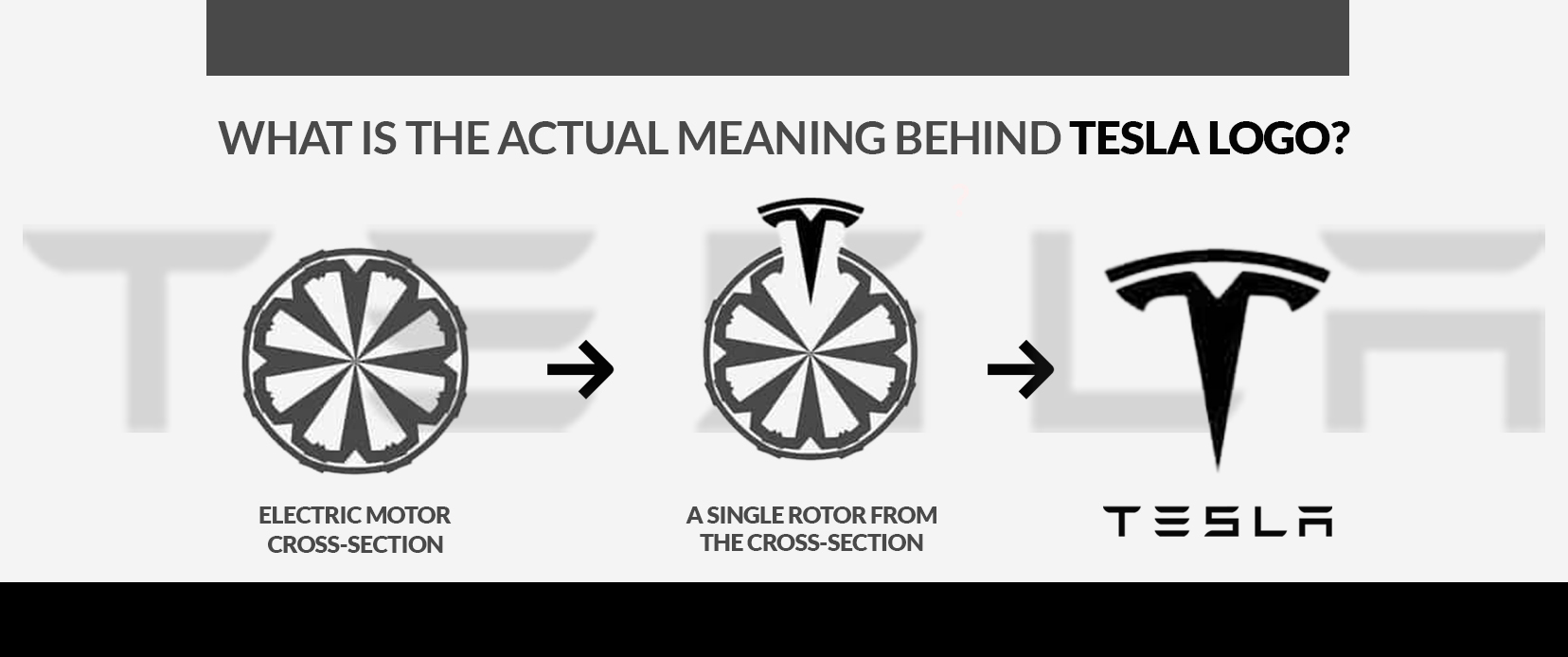
In addition to its technical motivation, the logo illustrates both progress and movement. To match its leading mission for automotive technology, Tesla was on the lookout for something modern and forward-thinking. All facets of the logo reflect a pledge to sustainable technology and the future of transportation. This isn’t just a logo; it illustrates Tesla’s genetic code.
Why Tesla’s Logo is More than Just a “T”
More than simply a letter, Tesla’s logo has deeper significance. It is a representational sign of innovation and chaos. Though it has a minimalistic design, the logo’s simple nature communicates a great deal. The success illustrates Tesla’s talent to navigate through tough issues and deliver simple, future-oriented solutions. The design reveals how Tesla uses minimalism to realize innovative technological solutions.
During this digital era, the logo is easily recognized, regardless of whether it’s on a car or a charging station. It has turned into a worldwide symbol for sustainability alongside quality and innovation. What makes Tesla’s logo an important element in its brand evolution is its capability to create something visually attractive that also reflects its mission. It serves as a regular reminder that, for Tesla, making cars is just a fraction of what they do; it’s the future they are really pursuing.
Get a Free Logo Consultation
Let our experts help you create a powerful logo for your brand.
The Evolution of the Tesla Logo
The logo of Tesla has changed into a symbol for innovation, elegance, and sustainability. Still, it wasn’t always as efficient as it is now. Tesla started and worked towards designing a logo that reflects its mission to advance clean energy along with cutting-edge technology. In the course of time, the logo has subtly yet meaningfully developed. All versions have clarified Tesla’s commitment to current and sophisticated design. It’s not just about design with the Tesla logo journey; it’s about showing the company’s core values.
The changes observed in Tesla’s design reflect an ability in minimalism and symbolic style, attracting both people who appreciate technology and those worried about environmental issues. The development of the Tesla logo evidenced an important case of the brand’s ongoing innovation and its growth.
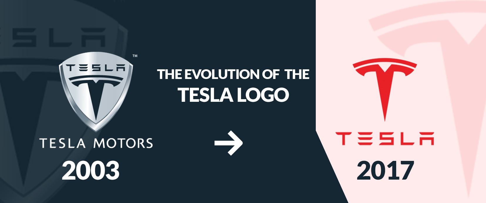
2003 – The Original Tesla Logo
The company launched its initial logo in 2003 which reflected its modern and progressive character. This design illustrated a stylized ‘T’ enclosed in a red oval which embodied the cross-section of an electric motor and a protective element. By achieving this design intent Tesla sought to differentiate from routine car brands and suggest its dedication to innovations in technology.
Electric vehicles represented a bold and innovative choice for a new company. While simple in design this logo conveyed Tesla’s goal to confront traditional standards and highlight sustainable energy as the future direction. As a logo and more than that; the ‘T’ stood for Tesla’s desire to redefine transportation with modern technology and promote sustainable energy.
2017 – Present Logo
Tesla presented the logo that we see today in 2017 as a finer version of the first design. The minimal ‘T’ represents itself independently separated from the former oval form and shows a refined modern logo design that corresponds with Tesla’s brand image. This updated design kept the essential meaning of the electric motor symbolizing the company’s commitment to creativity and adopting a minimalist style.
This updated logo represents more than a brand mark; it acts as a cultural emblem. The design captures the pride and sophistication of a firm that has risen to dominate the electric car sector. At present individuals proudly wear the Tesla logo on garments and motor vehicles to highlight its significance. In 2017 the Tesla ‘T’ symbol changed to represent innovation and awareness of the environment along with new transportation concepts while highlighting Tesla’s position as a global technology leader.
Here are some tips to design a professional logo design like Tesla:
Making a professional logo like Tesla’s entails a combination of innovation, practicality, and a clear association with what the brand stands for. As more than a symbol, the logo of Tesla represents creativity, technology, and a guarantee of sustainability. When creating a logo, thinking about connection with the audience and lasting power is of great importance.
A strong logo should provide versatility, be identifiable, and match your company’s mission objectives. The right application of minimalism by Tesla reveals a striking end result. The essential action is to emphasize designing something that is attractive as well as meaningful. Maintain clean design, and do not include any excessive information. Just like Tesla, let the signature of your logo be an indication of what makes your brand special.
Below are some key points to keep in mind when you are creating a logo like Tesla:
- A simple, uncluttered design has a more powerful effect.
- Plan your design thinking ahead, skipping transient trends.
- Make sure that all aspects represent your brand’s purpose.
- Make sure the logo works effectively across digital and physical arenas, from business cards to billboards.
- Looking professional and polished is a strength of a logo that’s well-proportioned.
- Make the logo stand out and be quickly recognizable in contrast with rivals.
- Ensure that the logo size looks good at all dimensions, ranging from app icons to signs.
- Have your logo reflect the narrative of your brand and emotionally build a connection with your audience.
Conclusion
The evolution of the Tesla logo shows that a brand can adapt while rigorously respecting its central values of innovation and sustainability. The simple design of Tesla’s logo powerfully embodies the company’s effort to change both the automotive and energy sectors. Tesla’s logo is an example of how a professional logo needs to depend on simplicity, meaningful relevance, and the versatility to work across multiple platforms.
Still choosing the right logo design company?
Get a quick, expert review. No pitch, just clarity on what fits your stage, budget, and growth.