Some simple forms have turned into recognizable emblems for major global companies. However, Every square logo has a story behind it – a creative, strategic, and meaningful journey. From big players in technology to leading figures in fashion, these squares are now easily identifiable symbols. Let’s reveal the hidden truths of these design marvels and delve into the fascinating creators behind them.
12 Most Popular Square Logos
These 12 logos have grabbed our focus and turned into iconic symbols. Let’s explore square logos and understand why they have remained popular for so long.
Microsoft
Microsoft’s square logo represents not just a design but also signifies a particular period in time. Launched in 1987, the logo signified a move from text-centered computing to the era of visual representation. The four vibrant squares inside the main square were originally thought to symbolize the company’s four main products: hardware, software, consumer electronics, and personal computers. Nevertheless, as time passed, the logo transformed into a more comprehensive depiction of the company’s wide range of products and services.
The design’s simplicity is very noticeable. It’s a logo that is easily identifiable, even when reduced in size. The once vibrant colors have subtly evolved over time to mirror the company’s development and advancement. The square design is a reference to the grid layout of computer screens, which strengthens Microsoft’s affiliation with the digital realm. Even though the technology industry has evolved significantly, Microsoft’s square logo still represents innovation and leadership.
Lego
The Lego symbol demonstrates the effectiveness of simplicity. A design featuring the classic Lego brick at its center, evoking feelings of childhood happiness and imagination. logo size can be your inspiration as it has the perfect size that can suit every brand. The simple design and sharp colors of the logo represent the main principles of the brand: enjoyment, creativity, and excellence.
The square shape is intriguing on its own. It is a steady, firm shape that mimics the design of a Lego block. This link strengthens the brand’s image and enhances the logo’s memorability. The emblem has stayed mostly the exact same throughout the years, showing its lasting popularity. It is a logo that appeals to both kids and adults, crossing generational boundaries. Amidst a cluttered world of intricate designs, Lego’s logo shines as a simple and playful standout.
American Express
The American Express logo demonstrates how a straightforward design can effectively communicate a powerful message. The sophisticated and reliable aura is created by pairing the stylish serif font with the deep blue color. The presence of a square border around the logo enhances the brand’s image as a reliable financial institution by adding formality and stability.
Throughout time, the logo has experienced slight enhancements, yet its fundamental components have stayed unchanged. This regularity has contributed to establishing brand awareness and commitment. The square shape, specifically, is a strong visual indicator. It communicates feelings of safety and stability, which are crucial for a financial services firm. American Express has successfully designed a logo that combines a timeless and modern look, a rare accomplishment for most brands.
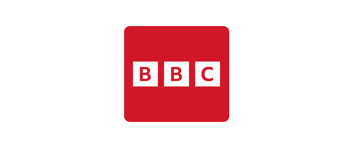
BBC
The square logo of the BBC is recognized globally. It perfectly illustrates how a basic form can be associated with a significant organization. The BBC’s authority and trustworthiness are visually represented by its instantly recognizable bold, blue square. These types of logos are usually preferred by professional logo design company. So, if you need one, search for a logo design company that will make the perfect square logo for your brand.
Make a Statement with a Square Logo!
Our designers craft square logos that capture attention and leave a lasting impression.
For many years, the BBC’s branding has been defined by the iconic blue square logo. It is a flexible design that functions on multiple platforms, including television and digital media. The square form symbolizes stability and trust, mirroring the BBC’s reputation as a reliable news source. Despite significant changes in the media industry, the BBC’s square logo continues to stand as a symbol of British broadcasting history.
T-Mobile
T-Mobile’s square logo in pink color stands out boldly among competitors in a busy market. It is a lively and energetic design that embodies the youthful and rebellious essence of the brand. The vibrant pink hue immediately grabs attention, setting the logo apart from competitors.
The design is enhanced with a modern and simple feel by the addition of the square shape. It is a flexible logo that is effective on various platforms and marketing materials. T-Mobile has effectively used the pink square to establish a powerful brand identity. The symbol represents the company’s dedication to offering affordable and creative wireless services.
Domino’s
Domino’s iconic red square logo is easily identifiable in the fast food sector. It’s a prime instance of successful branding, blending simplicity with influence. The vibrant red hue is linked to vigor, enthusiasm, and hunger, making it an ideal selection for a pizza delivery business.
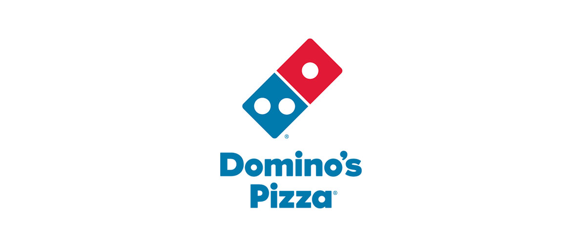
The logo is given a modern and stable feel by the square shape. It is a flexible design that is effective on pizza boxes, delivery vehicles, and digital platforms. Domino’s has effectively utilized Red Square to establish an international brand. The logo serves as a continual symbol of the company’s dedication to providing customers with piping hot, freshly made pizza delivered right to their doors.
Gap
The minimalist masterpiece is Gap’s blue square logo. It illustrates how simplicity is key in square logo design. The basic navy blue square is easily identifiable, symbolizing the brand’s traditional American aesthetic. The simple design and subtle sophistication of the logo have established it as a classic symbol.

The blue square symbolizes a relaxed and cozy style. It is a logo that attracts a broad range of people, from teenagers to adults. Gap effectively used the blue square to establish a worldwide brand. The logo demonstrates its strength through its ability to be versatile. It is effective on clothing labels, store signs, and digital platforms alike.
MTV
MTV’s orange square logo was ground breaking when it debuted. It marked the beginning of a fresh era in music television, focusing on younger viewers with a confident and dynamic visual appearance. The orange square, known for its sharp edges, came to represent youth culture and defiance.
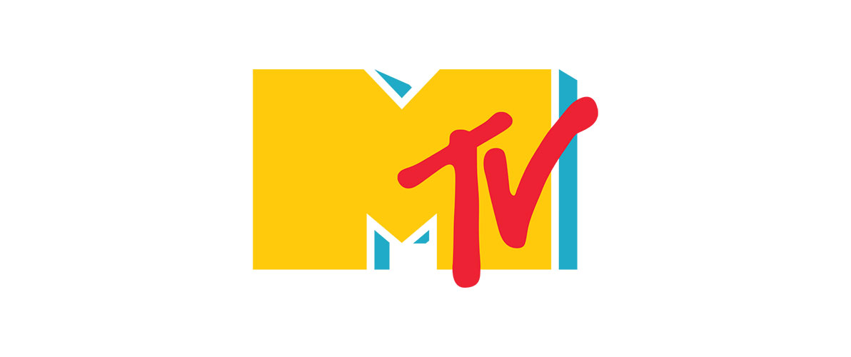
The simplicity of the logo is misleading. It is a strong design that has proven its longevity. Though MTV has changed over time, the orange square still plays a key role in defining the brand. It’s a logo that can be identified right away, even by people who aren’t regular channel viewers. MTV’s square logo demonstrates the importance of a strong visual identity.
The blue square logo of LinkedIn perfectly complements the professional networking platform. The hue blue is commonly linked with trust, dependability, and smarts, making it a perfect option for a brand focused on business. The logo gains a sense of stability and professionalism with the addition of a square shape.

The simplicity of the logo is misleading. It is a strong design that captures the essence of LinkedIn: a platform for networking with professionals and advancing your career. The blue square now represents achievement in one’s career. It is a logo that fosters feelings of confidence and trust. The logo of LinkedIn illustrates how a carefully crafted square can serve as a strong tool for branding.
Uniqlo
Uniqlo’s minimalist masterpiece is its red square logo. It demonstrates how a basic, striking design can establish a powerful brand image. The brand’s emphasis on quality basics and affordability is symbolized by the easily identifiable red square. The simple design of the logo gives it a competitive edge, helping it to be noticed in a saturated market.
The association of the Uniqlo brand’s worldwide growth is now closely linked to the red square. The logo attracts a broad range of people, from those interested in fashion to those looking for good deals. Uniqlo has effectively utilized the red square to establish a solid brand image. The logo’s adaptability is clear as it is utilized across different marketing channels, from online platforms to brick-and-mortar stores.
Notion
Notion’s logo, a purple square, is a stylish and elegant design. It’s an ideal match for a productivity application designed for a technology-savvy user base. The color purple is frequently linked with creativity, wisdom, and independence, making it a perfect option for a tool that helps individuals take control of their lives. The logo is given a sense of stability and dependability by its square shape.
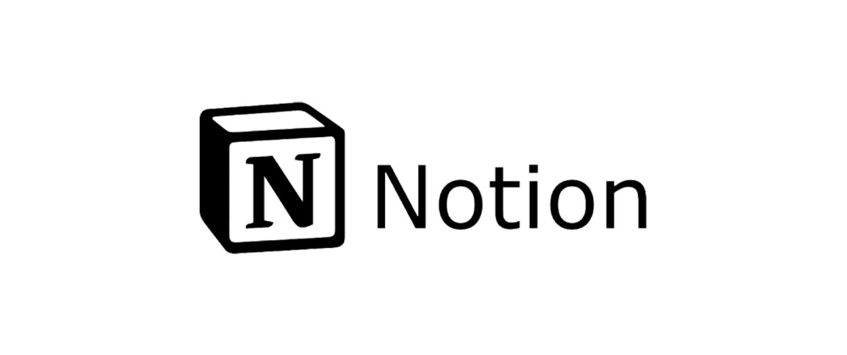
The logo of Notion has rapidly become well-known in the realm of productivity apps. The efficient and organized work is now symbolized by the purple square. The logo’s simple and clean design allows for easy adaptation to various screen sizes and platforms. The notion has effectively used the purple square to establish a powerful brand identity.
7-Eleven
The orange square company logo of 7-Eleven is a prime illustration of successful branding. It is an easily identifiable, straightforward design. The vibrant orange hue represents vitality, excitement, and warmth, making it an ideal option for a convenience store. The logo is given a sense of stability and reliability by the square shape.
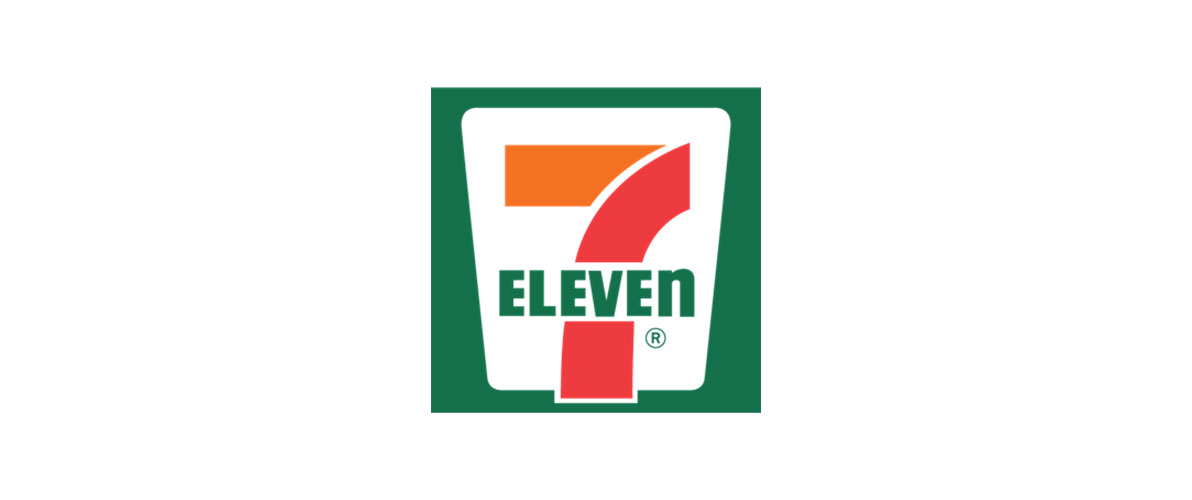
The orange square now represents around-the-clock convenience. It is a logo recognized by people all over the globe. 7-Eleven has effectively utilized the orange square to establish a worldwide brand. The flexibility of the logo is apparent in how it is applied in various store layouts and promotional items. From these logos given above, you can get logo design inspiration that fits your brand.
Tips for Designing Your Square Logo
You can simply Hire logo designer who is professional and designs the best logos, or if you are considering making a logo that is square in shape by yourself, that is an Excellent decision! Squares are sturdy, steady, and also very adaptable. Here are some pointers to assist you in creating a square logo that reflects the greatness of your business.
Keep It Simple
Keep in mind that simplicity is often more effective. A basic square logo can have the same impact as a complicated one. Concentrate on developing a sleek and unforgettable design that individuals can quickly identify.
Think About Your Brand
Your logo needs to communicate the personality of your brand. Are you enjoyable and lively? Are you perhaps earnest and professional? Allow your brand to influence the design decisions you make.
Color Psychology Matters
The color you select has the ability to elicit varied emotions. An instance of this is how blue is frequently linked with trust, whereas red can represent energy and passion. Select hues that are consistent with the communication of your brand.
Think About Scalability
Your logo will need to be adaptable for various sizes, ranging from small website icons to big billboards. Ensure it appears aesthetically pleasing regardless of its size.
Test It Out
After creating several designs, try them out on various individuals to gather feedback. Ask for their opinions and determine which one is the most impactful.
Use Negative Space
At times, the blank area in a logo is equally crucial to what is included within it. When creating a Modern logo design, utilize the impact of negative space to achieve an iconic symbol for your brand.
Looking for additional motivation? Look at well-known square logos such as Microsoft, Lego, or American Express to see how they have used this shape to create iconic designs.
Conclusion
The tales behind these square company logos are just as intriguing as the designs. They provide insight into the thoughts of the designers and the brands they embody. Whether you’re passionate about design or just interested in the world, recognizing the influence of a square can offer a new outlook on your favorite brands.
Therefore, when you come across a square logo in the future, make sure to pause and acknowledge the effort and innovation that were put into its creation. Ultimately, a fantastic logo goes beyond being visually appealing; it serves as a potent instrument in influencing our perception of a brand. With the guidelines given above, you can design a logo by yourself that suits your brand.