Have you ever thought about why certain movie logos stick in your mind even after you’ve exited the cinema? In this examination of the top 10 most impressive movie logos, we will evaluate their design components, innovative storylines, and cultural importance that render them exceptionally memorable. These logos go beyond being just symbols, as they are iconic representations that bring up emotions and memories associated with the movies they stand for.
Come with us on this cinematic adventure as we discover the enduring appeal and relevance of these logos over the years. Each logo, from the bold designs of the Star Wars emblem to the whimsical charm of the Harry Potter crest, has a unique tale. Find out how these patterns have outgrown their initial setting, evolving into enduring symbols of their individual series. Let’s explore why these film logos still inspire filmmakers and designers!
“Design adds value faster than it adds costs.” – Joel Spolsky
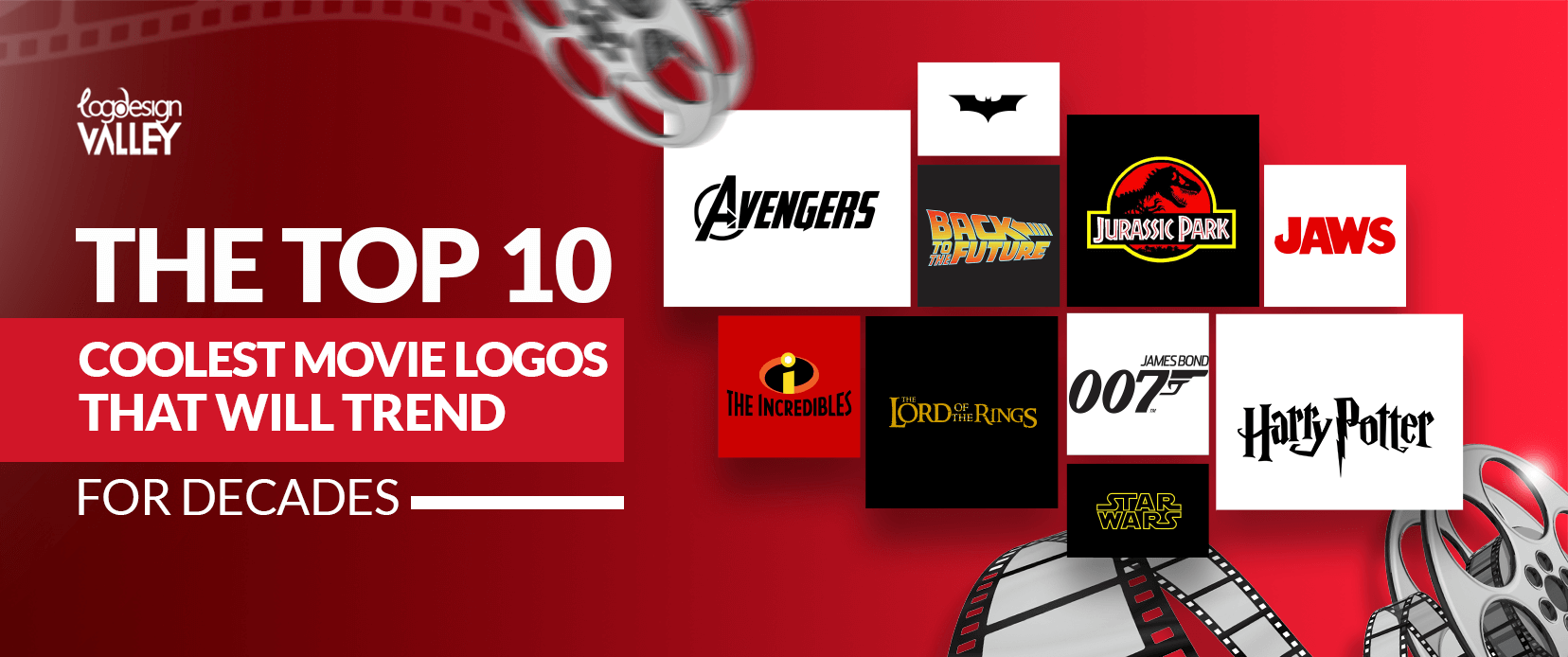
Here are the 10 best movie logos from which you can get logo design ideas when you design your movie logo:
Star Wars
The Star Wars logo is renowned as one of the most iconic logos in the science fiction genre. The film’s title is represented by a simple, sans-serif typeface, with the recognizable Aurebesh script appearing below it. This simple design captures the expansive size and enduring popularity of the franchise. Consequently, the logo has become a common feature in popular culture, seen on a variety of items for sale, such as tattoos.
The round shape of the Star Wars logo connects with viewers, triggering sensations of excitement, enigma, and the unfamiliar. It encourages viewers to explore a galaxy bursting with exciting lightsaber fights, courageous acts, and the ultimate confrontation between the forces of good and evil.
Harry Potter
The logo that defines the Harry Potter brand is highly spirited and magical and complements the fictional realm of Hogwarts. The shield-like symbol, featuring the Hogwarts crest and the well-known Deathly Hallows emblem, immediately whisks spectators away to the world of magic users.
The detailed design and vibrant colours of the logo evoke curiosity and fascination, tempting viewers to explore the wizarding realm and witness its enchantment firsthand. This is probably why the Harry Potter logo continues to be so loved after all these years; it represents memories, friends, and fantasy. The logo reminds us how crucial it is to have faith in magic and the strength of love to conquer the most challenging obstacles. The logo is attractive but quite tricky to make, so hire a logo designer who can make a logo as creative as the Harry Potter logo.
Jurassic Park
When it comes to the Jurassic Park logo, the artwork is appealing and iconic, depicting the realism of dinosaurs. The daring sans-serif font, along with the picture of a T-Rex, generates a feeling of risk and thrill. The logo’s simple yet striking design perfectly reflects the theme of the film: a new world of prehistoric animals is created and appears before our eyes, changing what we know about nature and what scientific knowledge is.
Basically, it seems that the logo of Jurassic Park has remained popular because it reminds us of the adventure, danger and strength of the natural environment. This raises and/or reminds us of the impression of the natural environment as fascinating as well as threatening, exotic and inviting for discovery. Creating a logo like the Jurassic Park logo is a bit hard, but it’s worth making.
Create a Movie Logo That Will Stand the Test of Time!
Let Logo Design Valley design a logo that leaves a lasting impression.
Back to the Future
The logo of Back to the Future is one of the most iconic in cinema history. The bold typeface without serifs grabs the reader’s attention and communicates a feeling of excitement and exploration. The iconic design showcases the DeLorean time machine moving in reverse, immediately bringing to mind concepts of time travel. This simplistic method successfully conveys the core of the movie, encouraging viewers to delve into a historical journey.
The Back to the Future logo is loved by fans as it ignites aspirations and encourages contemplation of upcoming times. It motivates us to value our history, embrace the current moment, and aspire for an improved future. Its influence extends past the monitor, serving as a representation of optimism and potential.
James Bond
The James Bond logo really has a good logo design with a sharp arrow that effectively reflects the mastered image of a secret agent around the world. The emblem “007” raises an interest along with the addition of the crest of the Bonds family. According to the figure, the shape of the logo is rigid, simple, and beautiful, as the character is depicted.
We like to be excited and feel something thrilling, and the emblem encourages us to do just that: feel the adrenaline and get ready for the unknown. It brings to mind such virtues as courage, perception, intelligence and justice.
The Lord of the Rings
The logo for The Lord of the Rings is a potent symbol that represents the vast scale and lasting characteristics of its universe. The design includes famous elements like the One Ring, with the inscription “The One Ring to Rule Them All” encircling it. The intricate details and vibrant colours enrich the complex narrative woven into the story.
The logo of The Lord of the Rings brings to mind unforgettable adventures, strong bonds, and the victory of righteousness over wickedness. It reflects on themes of bravery, optimism, and the unstoppable drive of mankind. This logo symbolizes much more than just a famous brand; it also serves as a symbol of the power of solidarity and determination.
Jaws
The Jaws logo exemplifies a combination of simplicity and terror. The logo, which showcases a great white shark, utilizes bold, compressed sans-serif fonts that quickly capture the eye. The design doesn’t include intricate elements or gradients, which increases its striking effect. The top part represents the ocean’s apparent, smooth nightmare, while the bottom part subtly hints at the eyes of a predator, creating a feeling of hidden peril.

This logo is still impactful today as it plays on elemental fears: the fear of what is not understood and the wonder at the strength of nature. It acts as a cue to honour the sea and the enigmas it hides. The Jaws logo still strikes a chord, recalling the exhilarating yet frightening encounter with the deep.
Batman
The Batman emblem is a straightforward but memorable representation that perfectly captures the sombre and reflective essence of the character. The use of the bat symbol, along with the strong typography, gives off a feeling of intrigue and fear. Having a perfect logo size, simple design, and dark hues mirror the character’s lone demeanour and dedication to righteousness.

The reason why people like the Batman logo is that it is capable of arousing feelings of fear and admiration as well as the strength of the soul. It is to be used as an indicative message about the importance of insisting on the right, though the circumstances are unfavourable.
Avengers
The logo of The Avengers is a strong representation of unity and power, symbolizing the most powerful heroes on Earth. The distinctive A-shaped structure, along with the unique logos of every Avenger, encourages a feeling of unity and collaboration. The team’s diversity and resilience are reflected in the bold design and vibrant colours.
The lasting appeal of The Avengers logo is rooted in its capacity to instil hope and drive. It acts as a cue for the significance of working together to address obstacles and preserve the Earth. This logo embodies the essence of bravery, motivating everyone to come together for a shared purpose.
The Incredibles
The Incredibles logo effectively communicates family unity and togetherness through its simple yet impactful design. The strong sans-serif font, combined with a family portrait, creates a feeling of cosiness and closeness. The vivid hues and positive message embody the characters’ hopeful attitude and their firm conviction in the significance of family.
The enduring charm of The Incredibles symbol remains in its capacity to evoke sentiments of hope, resilience, and familial affection. It acts as a strong memory of the power that results from support, collaboration, and the connections that unite us.
Key Takeaways When You Create Your Movie Logo
- Maintain simplicity and avoid clutter.
- Consider the movie’s underlying message and mood.
- Avoid passing fads to achieve a classic design.
- Adjust to different dimensions and layouts.
- Make it stand out and be different.
- Consider hiring an experienced designer to enhance professionalism.
- Make sure it is simple to comprehend.
- Hire a professional logo design services company that will make a good movie logo for you.
Conclusion
To sum up, a carefully crafted movie emblem functions as a potent instrument that can elicit feelings, establish a long-lasting impact, and improve the overall brand journey. By adhering to the main points highlighted in this article, you can design TV show logos that will not only be distinctive but also connect with your viewers for years to come. Bear in mind that a fantastic logo mirrors the core of your movie; thus, be thoughtful in your selection and allow your originality to stand out.
