The logo on your website acts as a silent messenger that leaves a strong impression on viewers. The size of the logo is very important to determine the brand’s worth. A tiny logo on a website, particularly on mobile devices, is difficult to see, hurting brand recognition and customer satisfaction. If the logo is too large, it overpowers the design, messing up website content and creating a cluttered look. Finding the right balance between logo size for website and the layout is critical for establishing a lasting impression.
The positive information is that you don’t need complicated design expertise to achieve this equilibrium. The upcoming sections will discuss important factors to consider when selecting appropriate sizes for logos for different uses, such as websites, social media, and printed materials. We will also explore typical logo dimensions and popular logo file types to guarantee that your logo appears professional and crisp on all platforms.
Why Logo Size Matters More Than You Think
A tiny website logo can be hard to spot, particularly on mobile gadgets. This could result in a messy or unpolished look, impacting brand identity and user satisfaction. On the other hand, a logo that is too big may dominate the design, causing important website material to be pushed lower on the page. Achieving the ideal harmony between logo size and website layout is crucial for maximizing effectiveness.
The upcoming sections will further explore the significance of logo size in different contexts, including websites, social media, and print materials. We will also investigate typical logo dimensions and logo file types to guarantee that your logo appears crisp and polished on every platform.
The Key to Crisp High-Quality Logos
The impact of your logo extends beyond its design. Just like a photograph, image quality plays a vital role. This is where DPI (Dots Per Inch) enters the picture, especially when considering logo size for print materials. DPI refers to the number of tiny ink dots printed per inch, directly affecting the logo’s sharpness and clarity.
Here’s the connection: a logo designed for a website uses pixels on a screen, but printed materials rely on DPI.
Utilizing a tiny logo with a low DPI when printing will result in an unclear, pixelated picture. On the other hand, a logo with a high DPI will look excellent on printed materials like brochures and business cards, giving off a professional and polished appearance.
The Goldilocks Rule of Logos
Determining the ideal logo format is comparable to the Goldilocks concept: not too tiny, not too large, but just right. A website logo may vanish on a big screen or be hard to view on mobile devices if it is too small. This undermines the goal of brand identification and can also annoy users. Alternatively, a logo that is too big may dominate the website design, causing key information to be pushed down and resulting in a messy look.
The perfect size for a website logo should be a compromise between being noticeable and visually appealing. Depending on your website design and logo intricacy, it is advised to keep the logo width between 250 and 350 pixels. Remember that the goal is to ensure visibility while maintaining an attractive design.
Avoiding Common Logo Sizing Mistakes
A properly created logo is a valuable resource. However, its impact depends on being consistently and appropriately utilized. Regrettably, a number of typical errors in logo sizing can harm both your brand’s image and user experience. Here’s a guide on how to prevent these mistakes:
- The Shrinking Syndrome: Resisting the urge to resize your logo to accommodate different social media profile pictures or website headers can be challenging. Nevertheless, a diminutive logo loses clarity and becomes unreadable, particularly on smartphones.
- One Size Can’t Fit in All: Thinking that a single logo size can work for every situation is a guaranteed failure. A logo of good quality with the right DPI is necessary for crisp printing on printed materials like brochures and business cards.
- Blurry Logo: Scaling up a low-resolution logo for a bigger banner or billboard is strongly discouraged. This leads to a low-resolution, amateurish picture that takes away from your brand. Make sure to always use high-quality logos and refrain from resizing them too much. If you require a bigger size, reach out to your logo maker for a file with a higher resolution.
Prevention of these common mistakes ensures that your logo leaves a long-lasting and positive impression. Your logo acts as a visual portrayal of your brand. Using it consistently and appropriately is essential for building brand recognition and trust.
No more Logo Size Struggles!
Master logo scaling with our guide. No more pixel peeves!
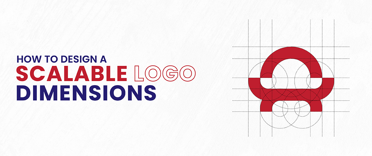
How to Design a Scalable Logo Dimensions
A properly designed logo is similar to a chameleon in that it must be able to adjust to various settings while still maintaining its fundamental essence. This flexibility is dependent on designing a scalable logo and ensuring it maintains quality and clarity when resized. Here’s how to achieve this:
Aspect Ratio
Visualize a rectangular shape – the proportion of its width to its height is known as the aspect ratio. A consistent aspect ratio is key for a well-designed logo, no matter the size. This guarantees that the logo maintains its balance and composition, whether it is resized for a social media profile image or enlarged for a large billboard.
Resolution and Pixel Density in Logos
Website logos depend on pixels for how they appear, but resolution is even more important for printing. DPI (Dots Per Inch) is responsible for the clarity of printed logos. A logo with a high resolution and enough DPI looks great on brochures or business cards, keeping the details sharp. A logo with low resolution will seem unclear and lack quality when printed in a bigger size.
Simplification for Small Logo Sizes
An elaborate logo with fine details may appear striking on a website header, but it may lose its recognition when resized for a social media profile image. Aim for simplicity when designing your logo. Sleek designs, defined shapes, and a restricted range of colors guarantee that your logo stays easy to read and powerful even when scaled down.
Choosing the best Formats
Opt for a vector format such as .ai or .svg when saving your logo. Vector formats, such as .svg, save the logo using mathematical equations, while pixel-based formats, like .jpg or .png, do not. This feature enables unlimited scaling without compromising quality, making it ideal for ensuring scalability on different platforms.
Allowing Room for Minor Size Adjustments
Adding a small margin around the important parts of your logo can be a smart choice. This space for breathing ensures that important details are not lost when the logo is resized slightly for various uses.
Making Your Logo Look Great on All Screens
Using responsive design on current websites guarantees that your brand appears amazing on all displays by adapting the layout to accommodate different screen sizes. Try multiple logo resolutions to ensure that it looks sharp and elegant on a variety of platforms, including desktops, laptops, tablets, and mobile phones.
By implementing these design principles, you can create logos that can be easily modified for different platforms and sizes, enabling genuine scalability. Your logo is the key of your brand, and its clarity and impact must be consistent across all interactions to establish strong brand recognition.
How to Avoid Logo Printing Disasters
Your brand’s worth is determined by its logo, which appears clearly on brochures, business cards, and other printed items. A carefully designed logo may have a tremendous, long-lasting impact, yet slight errors can lead to disaster.
This is how you can manage the printing procedure and make sure your logo stands out:
Know Your DPI
As mentioned earlier, DPI determines the sharpness and clarity of printed logos. A logo with a low DPI can appear fuzzy and amateurish on brochures or business cards.
Embrace Vector Formats
Do you recall the discussions about resizable vector formats like .ai or .svg? They become even more essential for the process of printing. While pixel-based formats lose quality when resized, vector formats maintain clarity no matter the size. Supplying your printer with a vector logo file ensures a polished and crisp result.
Bleed and Safe Zones
Trimming is sometimes required in the printing process to ensure neat edges. The bleed area is a specified area that goes beyond the visible design of the logo. This guarantees that crucial components are not unintentionally removed while trimming. The safe zone is located within the bleed area and indicates the closest distance text or important design elements should be placed from the edge to prevent them from being cropped. Have a conversation with your printer about bleed and safe zones to make sure your logo design meets these specifications.
Proofread Meticulously
Before starting the printing presses, carefully examine the digital proof provided by your printer. Check for typos, color discrepancies, or misplaced elements in your logo. Detecting these mistakes in the early stages helps avoid unnecessary costs and time spent on reprinting.
Color Calibration is Key
The colors look a bit different on a screen than they do on printed materials. Work together with your printer to develop a color profile that matches your brand’s color scheme. This ensures that the colors of the logo on your printed materials truly reflect your brand identity.
Following these steps will help you avoid typical printing mistakes and guarantee that your logo appears at its highest quality on all printed items. A perfect logo design that enhances brand awareness and creates a good, professional image for your clients.
Who Creates the Perfect Logo?
The solution doesn’t lie with only one individual but rather with a productive partnership. A successful logo combines strategic design principles with a thorough comprehension of your brand’s identity. Ideally, your Logo generator should have a solid understanding of visual communication, branding strategies, and the technical aspects of logo creation, such as:
A logo needs to connect with your specific audience, capture the core of your brand, and evoke the intended emotions. Experienced logo creators transform your brand’s concept into a visually attractive and unforgettable emblem. Search for what size should a logo be on the internet to get an idea. They grasp the intricacies of color, typography, and file types to guarantee your logo works seamlessly in different contexts, whether online or in print.
Looking for a Logo Design Partner? Connect Logo Design Valley to your website. We specialize in creating powerful logos that represent your brand’s distinctive identity. We are proud to work closely with our clients to understand their vision and change it into a logo that connects with their target audience.
Conclusion
Your logo serves as a quiet representative, influencing initial perceptions and building brand familiarity. A strong logo involves more than just aesthetic design; it also requires strategic implementation. It is important to have a good grasp of the standard logo size in pixels of different uses. A small logo may vanish, whereas a logo that is too large can be overpowering. The important thing is to achieve the ideal blend of visibility and aesthetics.
This guide discussed the significance of standard logo size and ways to achieve scalability. We talked about DPI for clear printing, vector formats for easy resizing, and why it’s important to think about various screen sizes. By following these recommendations and avoiding common mistakes, you can ensure that your logo creates a lasting and positive impression on every touchpoint.
Remember, a well-designed and correctly sized logo is essential for creating your brand’s identity. It boosts recognition of the brand, establishes trust with the audience, and prepares for successful communication.


