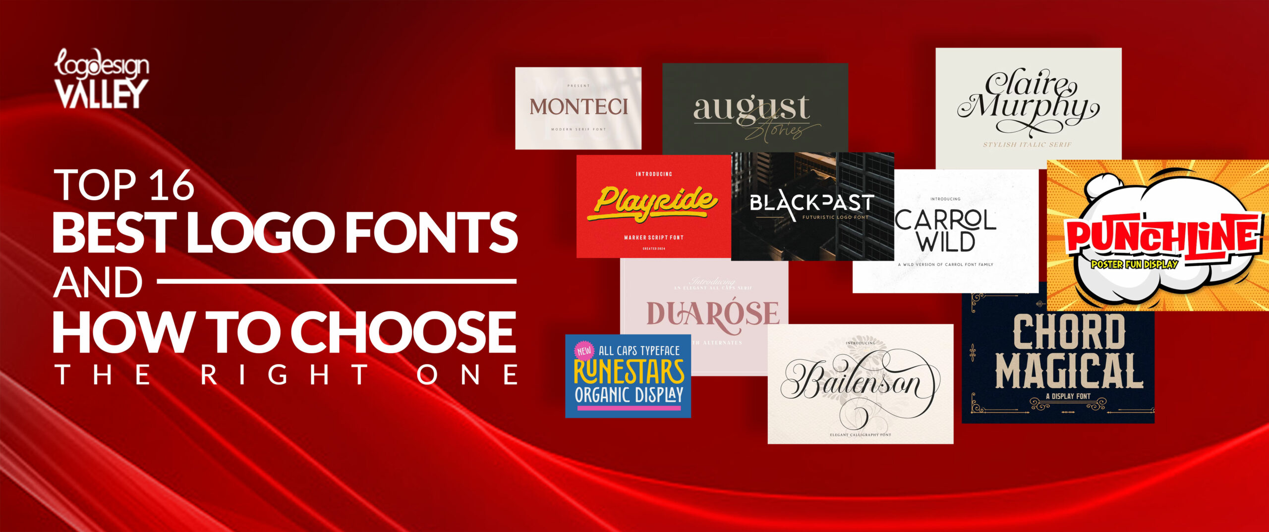
Selecting the appropriate font is crucial in determining the success of your logo. However, with such a large selection of fonts available, it can be difficult to find the one that suits your needs.
Fear not, design novice! We have done the difficult part. Here you will find the list of the most used logo fonts and the guide, which will show you how to select the best one. In this article, we shall focus on the different types of font styles, advice for their usage and, most importantly, examples. In other words, whether you are a professional graphic designer or a complete design newbie, be ready to have your logo skills bumped up a notch!
Here’s A List of Top 16 Best Logo Fonts
Let’s explore the realm of typography and uncover the 15 fonts that might be the ideal fit for your brand.
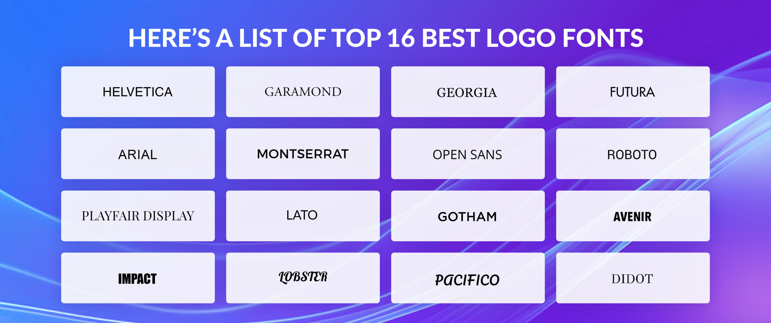
Helvetica
Helvetica is a prime illustration of a sans-serif typeface. This signifies that it lacks the small feet or decorative flourishes at the letter ends. It is neat, current, and extremely adaptable. Chances are you’ve encountered Helvetica numerous times without being aware of it. It can be found everywhere, from street signs to technology logos.
What is the reason behind the popularity of Helvetica in logos? It’s easy: it’s impartial. It doesn’t exhibit a distinct personality, making it suitable for various brands. It is like the font world’s classic black dress – sophisticated, ageless, and always fitting. If you are starting a tech startup or a minimalist fashion brand, Helvetica might be the ideal choice for your logo.
Garamond
Garamond and Helvetica are polar opposites and the most vintage font among the list. It is a typeface with serifs, which are small projections at the end of each letter. This provides it with a more conventional, vintage appearance. Consider it like a custom-made suit compared to Helvetica’s classic black dress.
Garamond is frequently employed for high-end brands or anything aiming to communicate a feeling of tradition or elegance. It is stylish, easy to read, and displays a classic feel. If your focus is on upscale dining, luxury fashion, or legal services, Garamond could be the perfect font to enhance your logo.
Georgia
Georgia is a different serif typeface that has a more contemporary vibe when compared to Garamond. It is made to be visually pleasing, even when seen on computer screens. That is why it is a common option for websites and digital media.
Adding Georgia as the font used in the logo of your business can somehow bring out the friendly and identity aspect of your company. The model is versatile enough to apply to various fields including publishing as well as the food and beverages line. All in all, Georgia’s appearance may be worth it if you are in search of a traditional font that will not strain your eyes.
Futura
Futura is a prime illustration of a sans-serif typeface, lacking the small projections at the conclusion of characters. It is famous for its precise lines and structured shapes. This typeface is frequently utilized in professional environments due to its modern and efficient feel. Consider modern technology firms, simple aesthetics, or company emblems. Futura is a commonly chosen option for these types of brands. It is adaptable, easy to read, and its enduring charm makes it a popular choice for numerous logo designs.
Need Help Choosing a Font?
Our design experts can help you select the ideal font for your brand.
Arial
Arial is a widely known sans-serif font that is easily recognizable. It is commonly utilized in digital design and printing, making it a flexible option for various font designs. Although Arial may not stand out like some other choices, its simplicity and readability are its strong points. It’s a reliable choice for numerous logo designs, particularly if you are aiming for a sleek and contemporary appearance. This typeface is a reliable asset in the design industry, and rightfully so.
Montserrat
Montserrat, though newer than Futura and Arial, has rapidly become popular. It features a geometric style with rounded elements which add a welcoming touch to the sans-serif font. This mix makes it a flexible option for various logo styles. Montserrat is frequently utilized by technology, fashion, and lifestyle companies. If you’re in search of a contemporary and friendly font with a hint of flair, Montserrat might be just right for you.
Open Sans
Open Sans is frequently encountered as one of the most popular fonts. It is a sans-serif typeface, which means it lacks the decorative strokes at the end of characters. This results in a clean and contemporary look. Due to its versatility and visual appeal, it is a widely favored option for websites, applications, and printed materials. Although it may not be the most thrilling typeface available, its simplicity and readability make it a formidable option for numerous logo designs.
Roboto
Roboto is a popular sans-serif font that has become a must-have in the design industry. It is commonly linked with technology and contemporary design. Its clean and futuristic appearance is characterized by its geometric shapes. Roboto is very easy to read and is effective in various sizes, which makes it an excellent option for both titles and main text. If you want a modern and stylish logo, Roboto is a great option to consider.
Playfair Display
Playfair Display is a type of font with serifs, which are the small feet found at the end of letters. However, don’t be deceived – it’s not the traditional font your grandma would use. This typeface features a contemporary spin with its graceful curves and bold contrast. Ideal for incorporating a hint of elegance and style into your custom logo design. Playfair Display is commonly utilized in high-end brands, fashion, and anything seeking to communicate a luxurious ambiance. It is an excellent option if you desire for your logo to be distinctive among others.
Lato
In recent years, there has been a significant rise in the popularity of the sans-serif font Lato. It is a flexible option for logo typefaces since it blends modern and traditional designs. The letters are clear and legible, making it appropriate for a range of industries. If you’re creating a logo for a tech startup or a fashion brand, consider Lato as a powerful option. Its versatility enables it to be compatible with various fonts and design components.
Gotham
Gotham is a typeface without serifs recognized for its precise lines and strong presence. It fits perfectly with all logo types It is frequently connected with contemporary and elegant brands. This particular font is often utilized in the finance, legal, and technology industries. Gotham’s powerful character has the ability to make a striking impression in your logo creation. It is a commonly chosen option for logos that want to communicate trust, power, and expertise.
Avenir
Avenir is a sans-serif font that has become one of the top fonts for logos. It is known for its modern and stylish look. Avenir is commonly utilized in technology, automotive, and design-oriented sectors. The modern and dynamic appearance is achieved through clean lines and geometric shapes. If you are searching for a font for your logo that shows creativity and futuristic ideas, Avenir is a great choice to consider.
Impact
Impact is widely known for its bold and chunky style, making it one of the most recognizable fonts. Although it is widely used, this font can be effective in logo design if used strategically. Impact is ideal for conveying a powerful message and is commonly utilized in headlines or brief expressions. Nevertheless, because of its substantial weight, it is most effective when used in moderation and paired with other typefaces for equilibrium.
Lobster
Lobster, a lively and whimsical script typeface, has become increasingly popular in the past few years. It is an excellent option for businesses aiming towards a younger audience or wanting to establish a welcoming and approachable brand identity. While not suitable for every industry, Lobster can make a logo stand out if utilized effectively. Keep in mind that using script fonts sparingly is important since they may be hard to read. Maintain a balanced design.
Pacifico
Pacifico is a different script font that is also well-liked, but it has a more casual and hand-written appearance. Frequently utilized in the food, beverage, and lifestyle sectors to communicate a feeling of coziness and genuineness. Pacifico is a fantastic option for small businesses aiming to establish a welcoming and approachable brand presence. Nonetheless, just like with Lobster, it is important to take into account readability and pair it with other fonts for a well-balanced logo.
Didot
Didot is a traditional serif typeface recognized for its stylishness and refinement. It is commonly linked with prestigious brands and upscale products. Didot is an excellent option for businesses seeking to establish a classic and sophisticated aesthetic. Although it may not have the same flexibility as certain other fonts, when utilized effectively, it can convey a strong message. Pay attention to the general layout and make sure that the font size and spacing are suitable to keep the text easy to read.
How Many Fonts Should You Use in a Logo?
It is sometimes best to keep it simple when it comes to the fonts and try to stick to one. There are no hard-set rules, but it is advisable to not exceed the use of one or two fonts. The coherence of a single font is neat and tidy, whereas applying two fonts also for the use of two different types of fonts, but in a very well-thought-out manner, will be attractive enough.
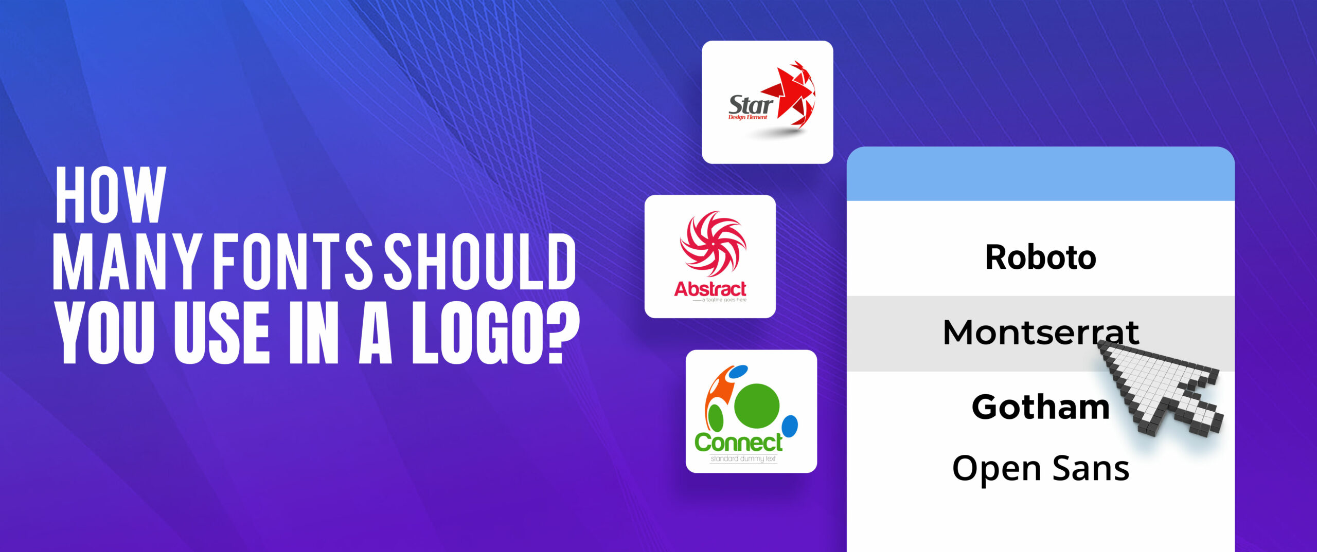
It is not good to use too many fonts as this will only result in making your logo cluttered and somewhat hard to comprehend. Therefore, it is necessary to accent on the fact that the result should be rather distinguishable and easily recognizable. If you decide on the number of fonts that you are going to use, you will also be able to achieve good readability and distinctiveness of your logo. Bear in mind that a good strategy to follow is to achieve a good and clear image of your brand, and trying to use too many fonts is not helping the case.
How to combine logo fonts?
- Combine different styles of fonts (serif and sans-serif) to add visual appeal.
- One font should take precedence, while the other should provide backing.
- Modify font size and weight to create a sense of depth.
- Make sure the mix is simple to comprehend.
- Maintain consistency in font pairing for all aspects of your branding.
- The pairing of fonts should be consistent with the image of your brand.
- A clean appearance can usually be achieved with just two fonts.
- Try out various combinations until you discover the ideal match.
How to Choose the Best Logo Font for your Logo Design?
Choosing the appropriate font for logos is important since it determines the overall brand image. The best font must therefore complement the generic nature of your business and the personality or the values for which it stands. You need to take into consideration the target, the field it is operating in, or the overall theme of the image. Select a font that will appeal to your target market and thus there will be a better association.
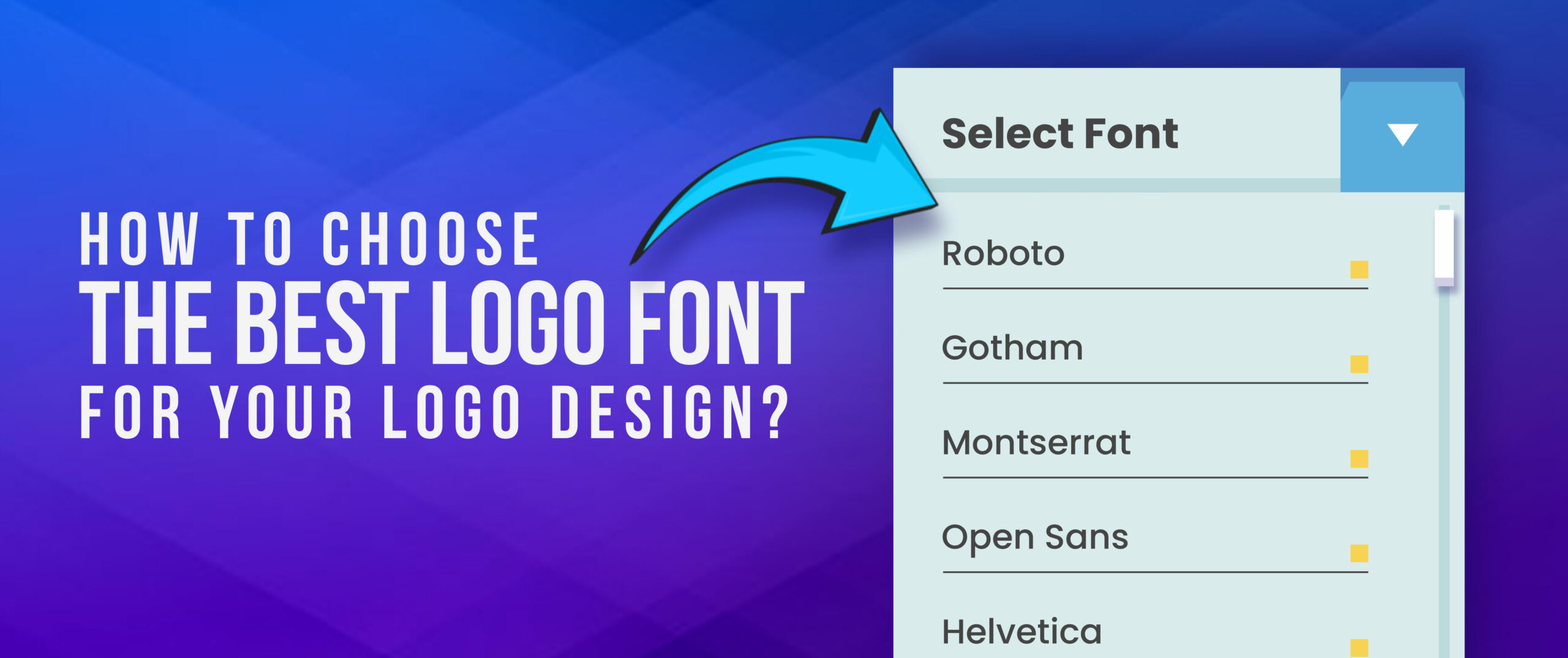
Bear in mind that the font has to be clear and universal, nice when viewed both large and small, and on different backgrounds. Try out the different fonts and see which one of them suits best to the identity of your business. Or simply hire a logo designer who will help you find the perfect font for your logo design.
Key takeaways
- Distinguish between different kinds of fonts – serif, sans-serif, script and be able to make relevant distinctions.
- It will be important for the choice of the font to take into consideration the personality of your brand and the personality of your audience.
- Take into account the personality of your brand and your target audience when choosing a font.
- Try different combinations of fonts to achieve a distinctive appearance.
- Using fewer fonts in a logo is usually better for its design.
Conclusion
Selecting the perfect font for your logo is a very difficult task to be honest, however, after much choice and trials, the right font can be chosen for a brand. If you have familiarity with the various fonts, and how best to use them and how they are likely to affect your brand’s image, then you are in a good position to come up with a memorable logo. See, the font you choose is the basics of the visual identity and logo design of an enterprise. Thus, welcome to the world of typography, specify millions of variants of the font, and derive pleasure from creating a unique logo!