Does your logo appear dull and uninspiring? Does it camouflage itself like a chameleon on a dreary Monday? Don’t be afraid, tired warrior! Your secret advantage is the strength of color!
We are discussing color combinations that go beyond trends, convey a lot about your brand, and cause people to pause, gaze, and recall. Forget easily forgotten logos – get ready for a colourful explosion that will make your brand stand out more than a superhero on an energy drink.
Are you prepared to get rid of the boring and welcome the exciting? Keep scrolling to find the 20 best logo color combinations that will help your brand stand out, free from any tacky reality TV drama. Let’s start clicking!
Logo Color Combinations That Endure Modern Trends
Are you experiencing the sensation that your logo is blending in among similar ones? In today’s competitive market, logo best color combinations are essential for distinguishing yourself. They are lasting color palettes that leave a lasting impact and convey the fundamental principles of your brand.
Where do you start from? Do not be afraid, brave designers! We’re here to help navigate you through logo color matching. We will examine different ideas for color schemes and investigate the various categories of color schemes that are out there.

We will provide the information needed to select the ideal complementary colors, whether you desire the familiarity and dependability of traditional blue & white or the lively enthusiasm of a bright green logo. From good color combinations to striking and attention-grabbing pairings, we’ll present various color scheme ideas to fuel your creativity.
Get rid of the uncertainty and welcome the influence of color! We should create an ideal logo color palette that turns your brand into an everlasting symbol.
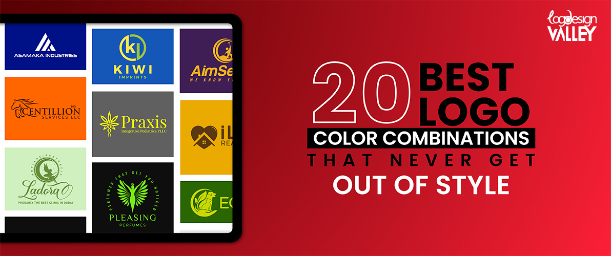
20 Classic Logo Color Combinations
A logo is the building block of your brand’s identity. It is the visual signal that clients will immediately identify and connect with your business.
Let Your Logo Colors Speak Volumes!
Discover the psychology behind color and find your perfect palette.
How can your logo distinguish itself among the many others competing for attention? The solution can be found in the strength of hues. Here, we reveal 20 timeless logo color coordination that goes beyond fads and make a memorable impact.
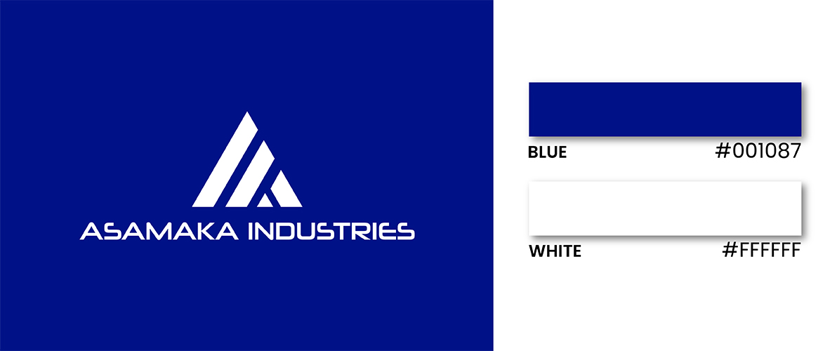
Blue & white
This classic pair elicits emotions of confidence, dependability, and expertise. Blue signifies stability and tranquillity, while white stands for purity and cleanliness. They design a logo that boosts confidence and nurtures a feeling of safety in potential customers.
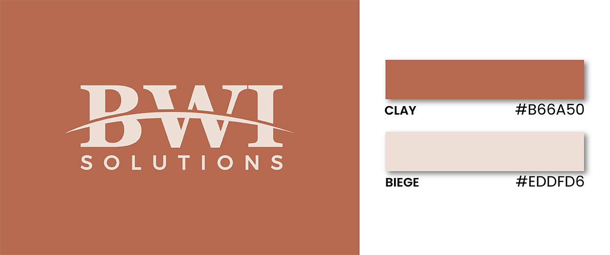
Clay and beige
These natural colors emit a feeling of coziness, comfort, and elegance. Clay brings about emotions of security and a bond with the natural world, while beige introduces a hint of sophistication and polish. This mix is ideal for companies aiming to establish a friendly and accessible environment.
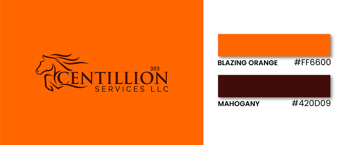
Blazing orange and mahogany
This intense combination is focused on attracting notice and expressing oneself. Bright orange represents vitality, enthusiasm, and a spirit of exploration, while mahogany brings an element of elegance and refinement. This mix is perfect for brands looking to convey a solid and adventurous image.
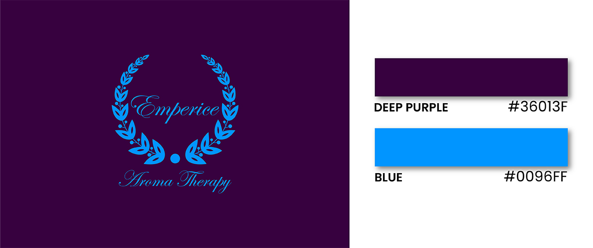
Deep Purple and Blue
This majestic blend gives off a sense of opulence, innovation, and insight. Deep purple represents luxury, enigma, and creativity, while blue brings in a sense of dependability and trust. This mix is ideal for brands aiming to communicate a feeling of tradition and elegance.
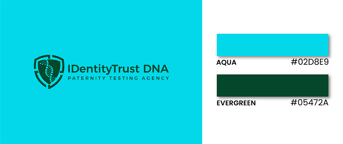
Aqua and evergreen
This invigorating pair brings out emotions of nature, development, and calmness. Aqua represents a feeling of peace and revitalisation, while evergreen symbolizes development, firmness, and association with nature. This mix is perfect for brands seeking to convey an environmentally friendly and sustainable image.
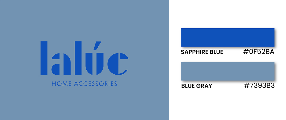
Sapphire Blue and Blue Gray
This advanced combination adds a touch of expertise and creativity to your logo. Sapphire blue symbolises power, reliability, and a hint of extravagance, whereas blue-grey gives off a contemporary and innovative vibe. these two colors are the colors that go well together. This mix is perfect for brands looking to convey reliability while also staying ahead of the curve.
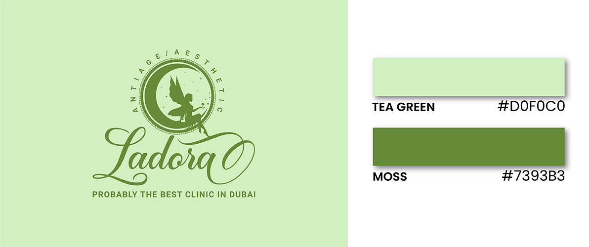
Tea green and moss
This calm duo evokes feelings of tranquillity, balance, and growth. Green tea symbolizes tranquility and revitalisation, whereas moss offers a sense of grounding and connection to the environment. This mixture is ideal for businesses seeking to create sensations of calmness and rejuvenation.
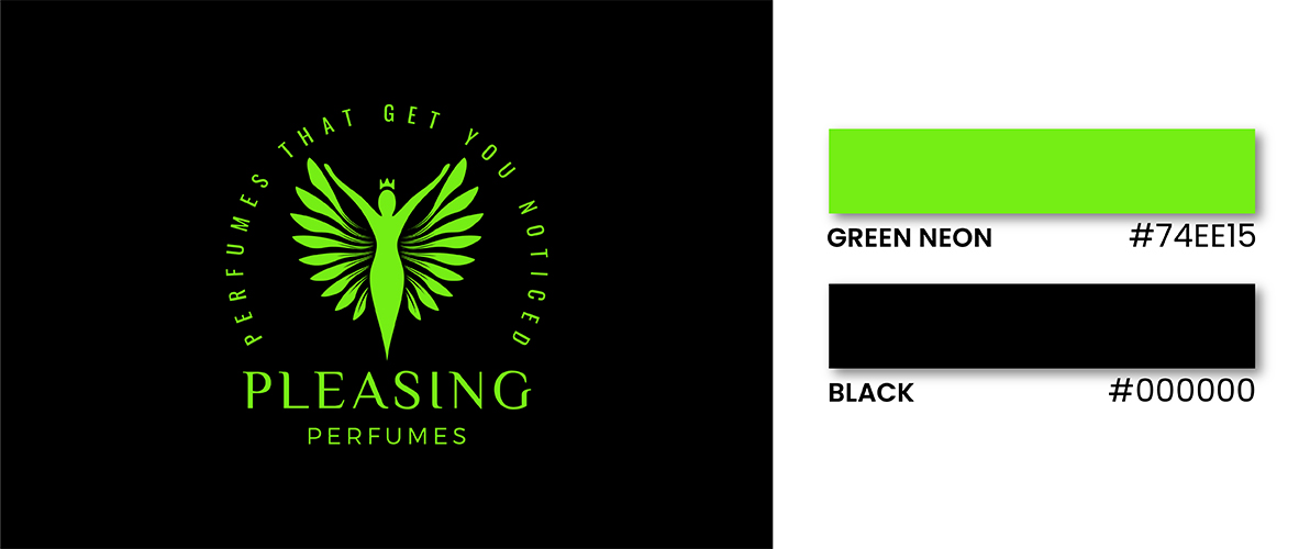
Neons on black
This daring combination is focused on being unique and making a bold statement. The colorful neon tones unlock fresh vitality, sparkling excitement, and a show of amazement, whilst black functions as a contrasting shade that makes them more noticeable. This combination is ideal for brands that target teenagers and young adults stereotypically seeking to be on edge, calm, and daring.
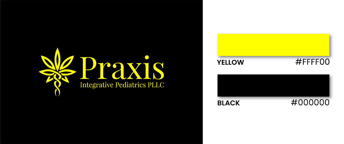
Black & yellow
This classic mix represents power, grace, and a touch of wariness. Black signifies strength, sophistication, and a sense of mystery, and yellow symbolises energy and optimism. This blend is ideal for brands seeking to communicate a sense of stability and confidence.
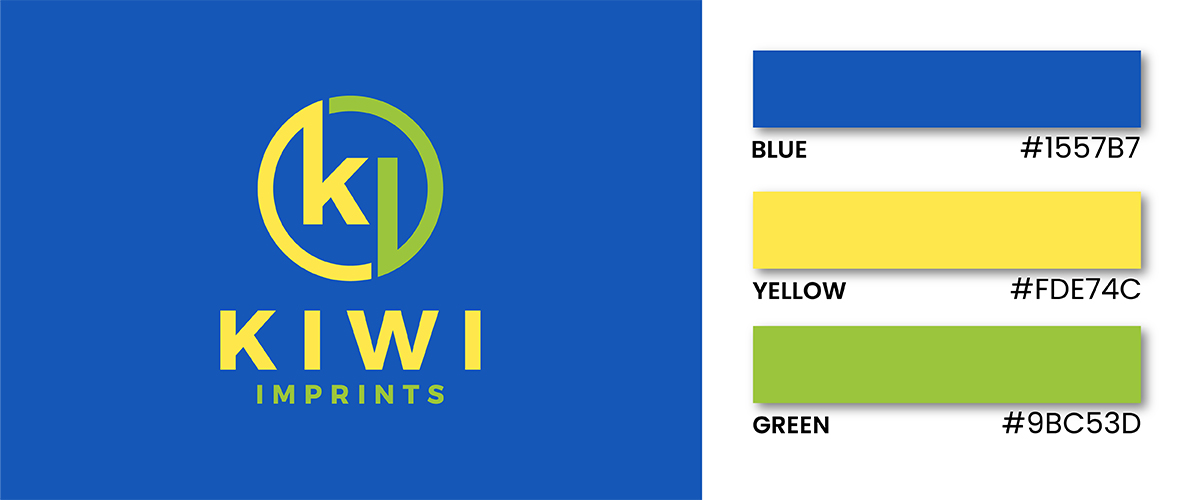
Blue, Yellow, Green
This versatile trio offers a mix of assurance, enjoyment, and a connection to nature. Blue portrays confidence and responsibility; yellow sprouts joy and brightness; green is the image of a developed and natural part. This concise blend of phrases is handy for organisations with an impression of a favourable, friendly, and environmentally friendly entity.
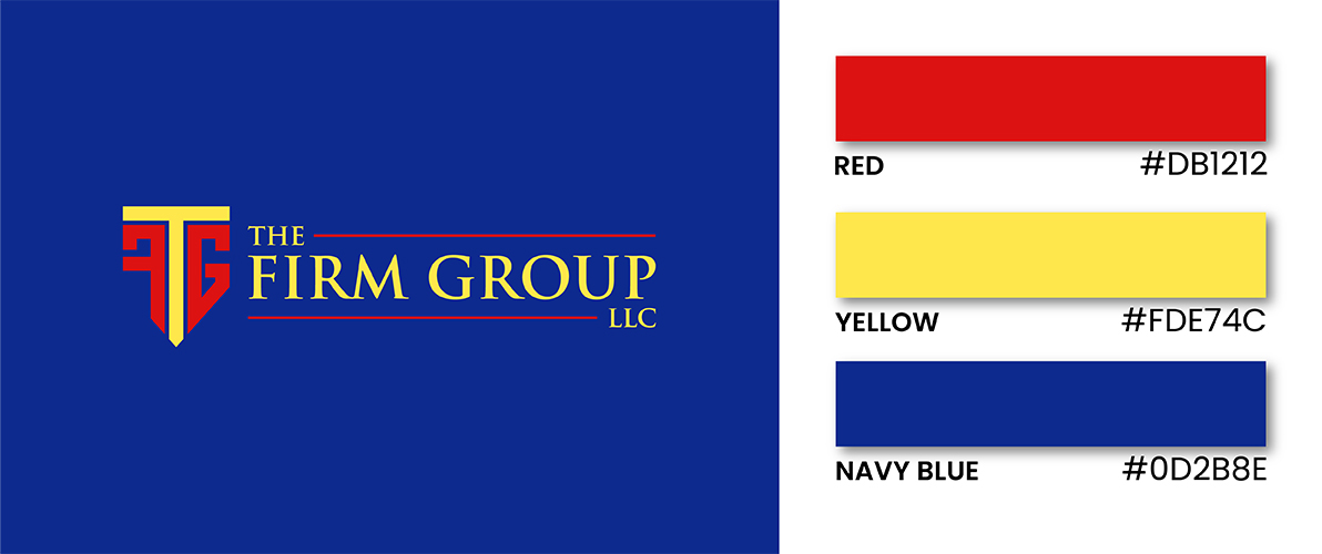
Red, navy, & yellow
This trio brings energy, excitement, and confidence to your Business Logo. Red represents courage, love, and a feeling of haste, while navy brings an element of elegance and steadfastness. Yellow exudes positivity and joy. This mix is perfect for companies wishing to convey a lively and proactive image.
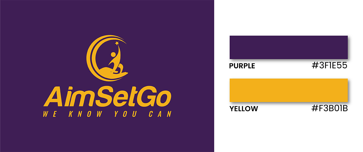
Purple & yellow
This fun combination brings about emotions of creativity, imagination, and happiness. Purple symbolises richness, enigma, and a hint of playfulness, while yellow brings in a surge of hope and vibrant vitality. This mix is perfect for brands seeking to convey a distinct and fun-loving character.
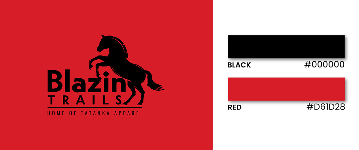
Black & red
This classic pair oozes power, elegance, and a hint of fierceness. Suppose you’re comparing the Blue Logo vs. the red Logo red wings because this color is more eye-catching than blue. Black represents power, elegance, and an element of enigma, whereas red brings in a surge of intense emotion and thrill. This mix is perfect for brands looking to convey sophistication and vital self-assurance.
Blue & green
Blue signifies reliability, serenity, and the absence of disturbance, while green logos evoke associations with nature, development, and connection to the environment. This tone is appropriate when the brand features the terms “trustworthy” and “eco-friendly” as their image is concerned.
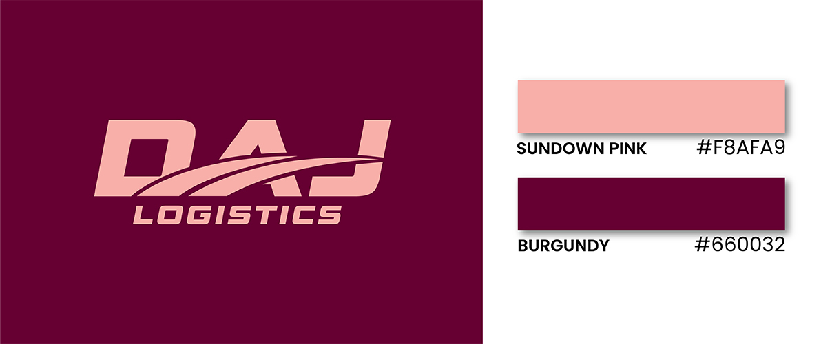
Sundown Pink and Burgundy
Three color combinations can be the best choice. Like this graceful combination inspires emotions of love, elegance, and a hint of womanliness. The peachy blush of sundown pink evokes comfy, warm, and understated beauty, whereas burgundy (a rich red color) combines luxury, maturity, and a cheeky air of mystery in one. This mixed medium is excellent for brands that want to protect their brand as one of class, elegance, and intrigue.
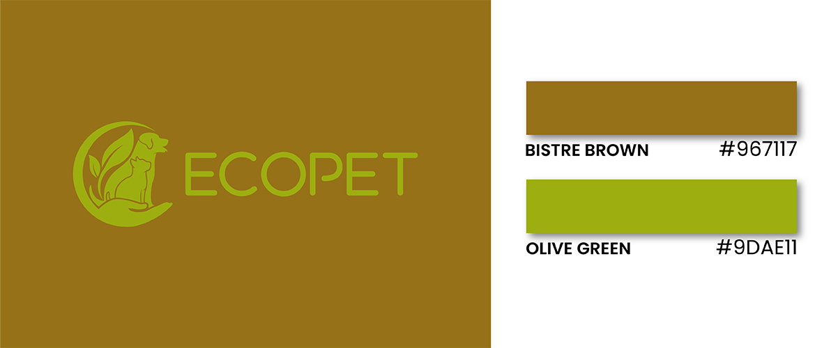
Bistre Brown and Olive Green
This organic combination inspires sensations of groundedness, dependability, and a link to the natural world. Bistre brown exudes a feeling of stability, comfort, and a hint of antique allure, whereas olive green represents growth, nature, and a link to the environment. This mix is perfect for brands looking to convey a genuine and reliable image.
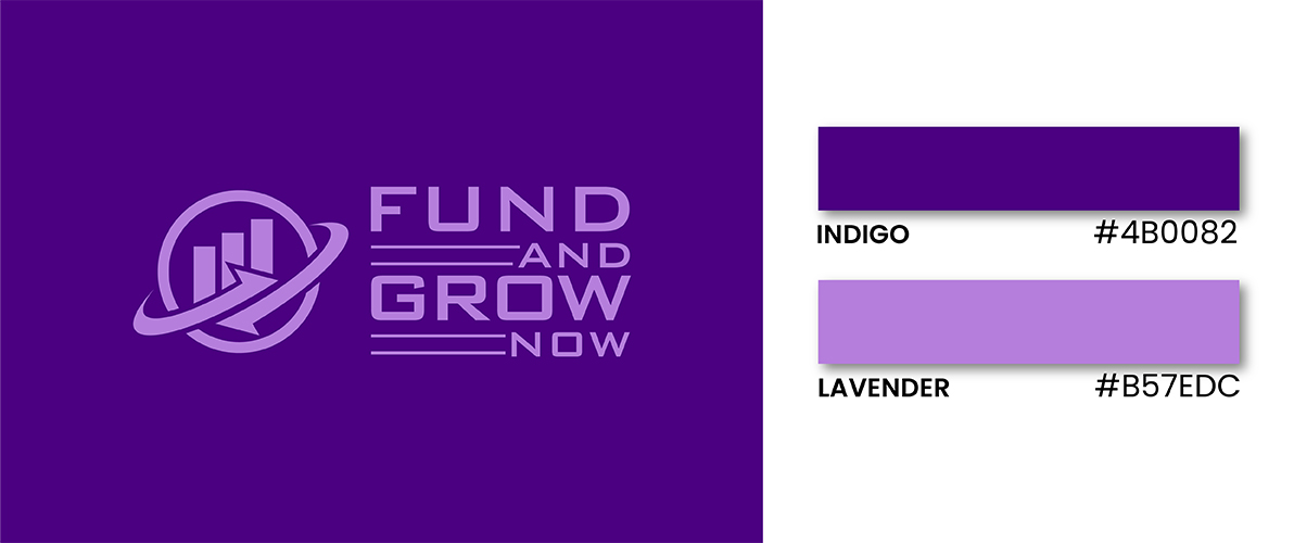
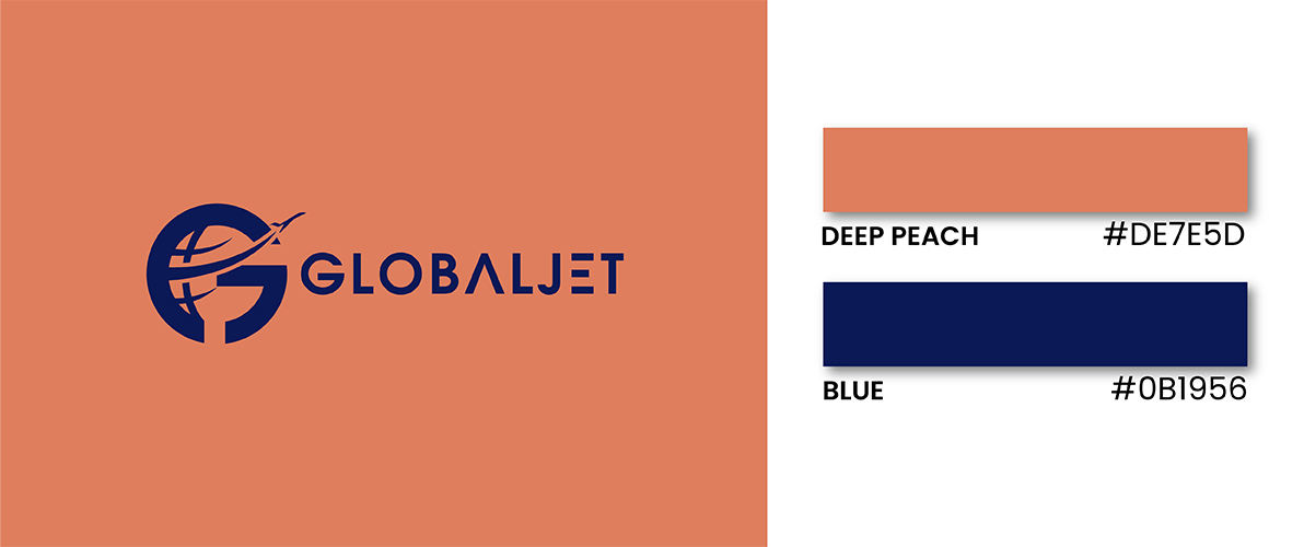
Indigo and Lavender
This classy pair provides a unique mix of opulence and serenity. Deep blue imparts reliability, dependability, and professionalism, whereas deep peach creates warm-heartedness, friendliness, and a bit of creativity. A good hint of it would make the brand image more warm and reliable, funny but playful also.
Blue and Deep Peach
For a moment, one can feel a soft, husky transition from one state of mind to another—for example, confidence, safety, and a light touch of coziness. Blue has an effect on faith, trustworthiness, and professionalism, while peachy color brings warmth and friendliness to the mix and a more minor touch of creativity to it. This combination can bring brands together to communicate amusement and a solid life with fashionable character.
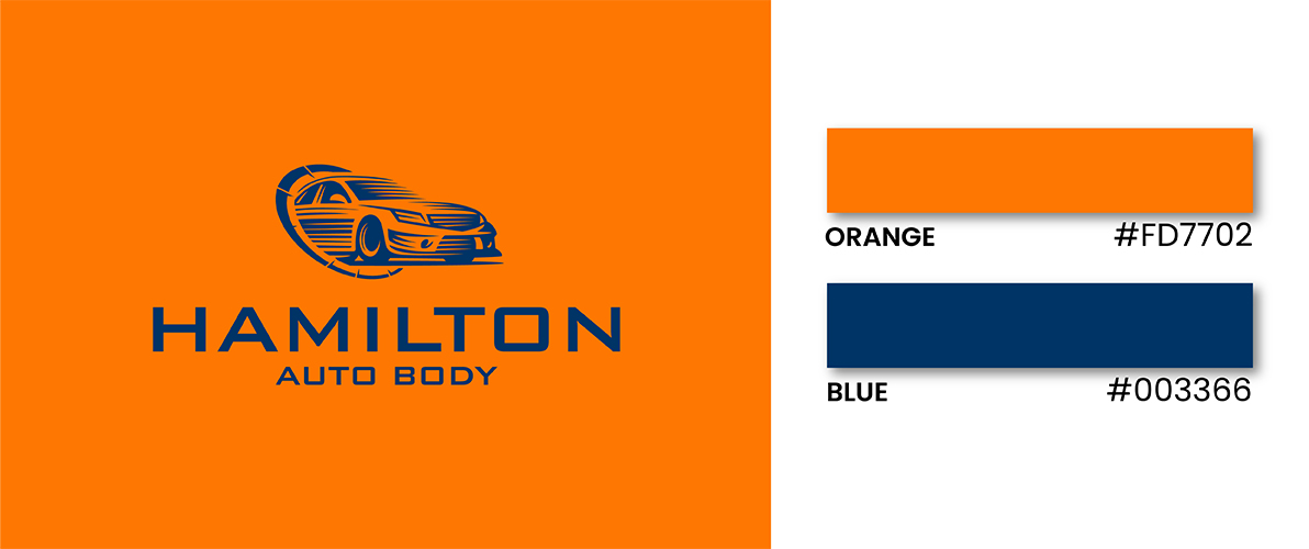
Orange & blue
This formidable duo will not only deliver the perfect style but also lend the logo of your design the necessary trust value. Orange always reminds us of endurance, an added hint of boldness and passion, whilst blue, on the other hand, depicts trustworthiness, dependability, and tranquillity. Dynamic confidence-inducing is an excellent fit for organizations that want to convey their dynamic nature and trustworthiness.
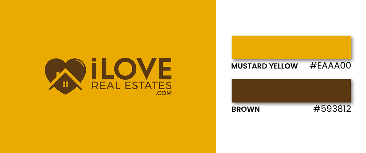
Brown & mustard yellow
The fact that there is something organic about this summation makes a person feel down-to-earth, comfy, and cheerful. Brown evokes a sense of stability, straightedge, and, to a certain extent, conservatism. At the same time, mustard yellow brings a component of friendly warmth, optimism, and a bit of wholesome happiness. This is precisely what makes the blending, crew diversifying campaigns, photos, or videos great for brands who want to portray a message of stability and inclusivity.
Classic Color Combinations vs Bold Color Combinations
| Feature | Classic Combinations | Bold Combinations |
| Mood | Trustworthy, Secure, Reliable | Energetic, Exciting, Eye-Catching |
| Colors | Blue & White, Black & White, Navy & Gray | Orange & Black, Pink & Teal, Neon Green & Purple |
| Impact | Timeless, Traditional, Professional | Modern, Edgy, Unforgettable |
| Use Cases | Financial institutions, Law firms, Established brands | Tech startups, Creative agencies, Trendy products |
How Do You Choose the Perfect Logo Color Combinations
Your logo is a visual representation, conveying your brand’s core message without words to the public. Numerous logos compete for notice; how can you ensure that yours is distinctive? The solution can be found in the deliberate choice of colors. Colors elicit feelings, create brand identity, and make a lasting impact. It is essential to select the ideal color patterns for your logo. So, where do you start?

First of all, keep these questions in mind. What values are fundamental to you? What is the demographic you are aiming for?
A bank chooses colors like blue and grey to convey trust and security, whereas a toy store might select yellow and green for a fun and playful vibe.
This helpful tool demonstrates the way brand colors interact with and impact each other.
Here are a few popular choices to think about:
Complementary colors
These are positioned across from each other on the color wheel, forming a lively and attention-grabbing difference. Consider the combination of red and green in Coca-Cola or the pairing of orange and blue in Harley-Davidson.
Analogous colors
These colors are adjacent to the color wheel, creating a pleasing and harmonious blend. Picture the soothing impact of blue and green or the comforting feel of brown and orange.
Triadic colors
A logo that is dynamic and energetic is created by evenly spacing three colors on the color wheel. The blue, yellow, and green colors of Google’s logo are perfect illustrations.
Keep in mind that maintaining equilibrium is crucial. Although striking combinations can attract attention, excessively intricate schemes could befuddle viewers.
In the end, don’t hesitate to try new things! Examine the logos of well-known brands in your sector to get ideas. Make sure that the colors you choose can be easily read on different mediums, such as digital and print.
If you want to make use of the color palette on your brand’s identity properly, research color psychology and proceed carefully. You will get an outstanding combination of colors for your logo that could deliver a strong emotional connection to your audience, making it hard to forget.
Conclusion
Choosing your colors should be based on the expected audience and the ideas you want to come across. Fantastic color combinations such as blue and white or black and white also have the capability to reveal feelings of security and trust. Bright colors in designs, such as orange and black or pink and teal, would bring you a sharp feel of energy and excitement. The prominent color of a custom logo design that, at its best, captures the core of the brand identity is the one that is eventually chosen.