
Have you ever questioned the meaning of the small, camera-shaped icon on your phone’s screen? That is the Instagram logo. It goes beyond being only a beautiful image; it represents a worldwide social media platform that has revolutionized how we interact, exchange, and view the world.
Since its creation in 2010, Instagram has experienced an exciting transformation, keeping its iconic logo. Starting as a simple photo-sharing app, the logo has been essential in defining the platform’s identity as a diverse social media powerhouse.
In this blog , we will go through the history of the Instagram logo, looking at its different versions, the design principles that shaped its evolution, and the role it played in the platform’s success.
“Design is not just about making things beautiful; it’s about making things meaningful.” – Dieter Rams.
Let’s Trace the Evolution of the Instagram Logo
We will see how this iconic logo has changed over the years. In short, we will focus on what changes have been made to this logo since last decade.
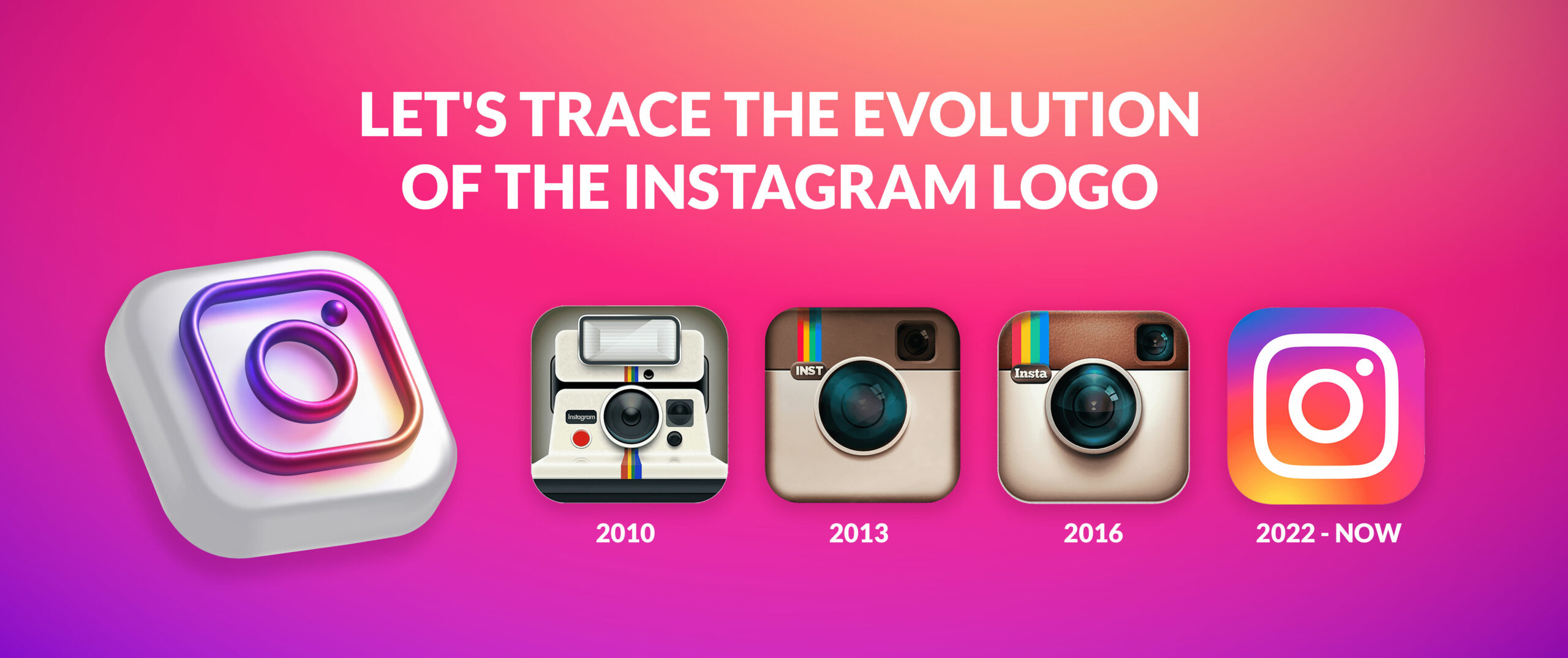
2010: The Original Polaroid-Inspired Logo
Instagram was initially designed in 2010, and its logo design was the now famous Polaroid camera symbol. This design choice was made in reference to the immediate selling of instant photographs, a favorite at that time. The camera design option was chosen to stress the concept of the app as an open space for sharing multiple ordinary and unpretentious moments of life.
To be specific, it could be pointed out that the first logo was much more oafish and not so sophisticated in comparison with the further developments. It was a perfect statement that allowed Instagram to be unique in a world full of app competitors. That said, as the platform steadily expanded its functionality and adapted to users’ needs, a contemporary and multifunctional logo was required.
2013: A More Minimalist Approach
Another case is that in 2013, Instagram realized that it was high time to update the look of this application. Anyway, the previous logo was quite symbolic, but it seemed somewhat old-fashioned, and the platform in question is becoming more and more popular. They felt that the current logo was a bit messy and complex, and what they wanted was a modern one.
They removed the Polaroid-style frame and the beveling, and instead, they settled for a flat two-dimensional look. Some changes were made to the icon of the camera, and the bright colors were reduced to a black-and-white design. This decision preliminarily allowed for the fact that the logo is simplified and therefore, it can easily be placed on any screen and at any resolution.
Some positive reactions were received over the new logo. While some customers appreciated the updated sleek and minimalist look, others were disappointed by the fact that the new logo brings to mind the radical changes of the early twenty-first century. Nonetheless, gradually, the simple lettering/logo was associated with the brand Instagram.
“Simplicity is the ultimate sophistication.” – Leonardo da Vinci.
Create Your Own Logo Like Instagram
Let our designers help you craft a memorable logo for your brand.
2016: A Flat, Gradient Design
Just three years after the minimalist redesign, Instagram decided to make another change.
This time, the consideration was designing a logo that is more vibrant and attracts the attention of the target clients.
The designers implemented a flat, gradient design that was accompanied by the use of a number of colors. The camera icon remained the same, but the backdrop was changed to a colorful gradient, which moved and changed based on the angle at which the screen was being viewed.
This gradient design shocked many users because it looked much different from before, even in the flat and simple design concept. Using bright and saturated colors while creating combined and animated effects helped to make the logo more attractive and noticeable on the background of other applications in the application store.
The 2016 logo is actually the familiar one that everyone is so used to nowadays. It has grown to be an emblem of art people, as well as communicating messages using graphics in every field.
2022: The Current Logo
The most recent and modern logo design of Instagram was launched in 2022. The camera icon and the gradient background remained as foundational components of the design, but the designers changed small things to make it even better.
The gradient colors were fine tuned with the purpose of achieving a better balance and consistency in the colors used. The camera icon was modified a little bit by making it more symmetrical as well as adjusting the size of the icon elements. These changes were made with the purpose of making the logo more classy and sophisticated in nature.
The current logo of Instagram is the best evidence to prove that the platform has not only evolved but is constantly working to remain so. This symbol is quite striking and impactful; it is easily memorable because it signifies a global community of writers and artists.
| Year | Logo Description |
| 2010 | Polaroid-inspired logo with a rainbow gradient. |
| 2013 | Simplified camera icon without the gradient. |
| 2016 | Flat, two-toned gradient design with a rounded rectangle shape. |
| 2022 | Simplified camera icon with a solid color and a subtle gradient. |
Why the Instagram Logo Evolved?
The Instagram logo has evolved over the years for several reasons:
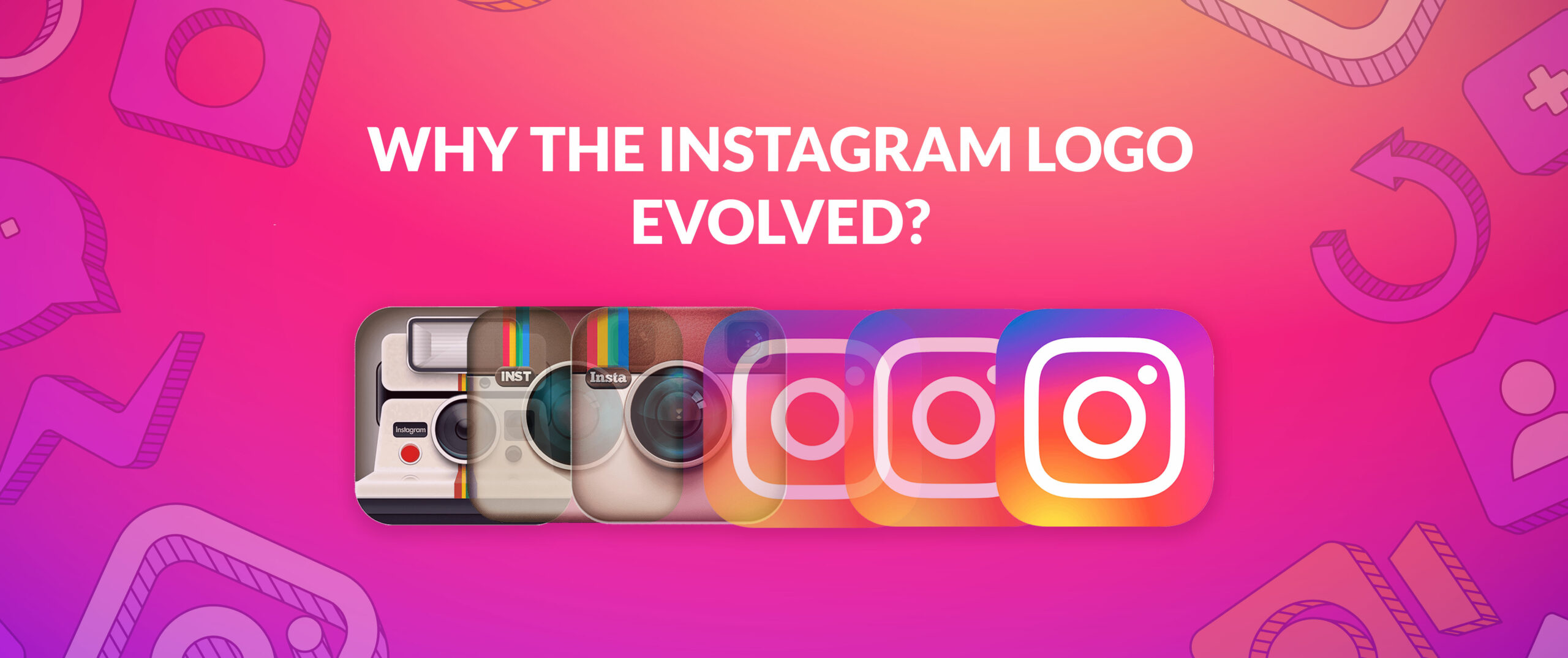
Brand Identity
When the platform Instagram began to take off and develop its many features, the application required a logo that could match its progression. The changes that were made in the design of the website were important in an effort to market the platform as a more diverse and vibrant social site.
User Experience
There have also been changes in user behavior and technology that have impacted the design of this logo. For instance, the change in minimalist design in 2013 was done using increased smartphone screens and the strengthened need for logos that can easily be detected on devices.
Visual Trends
As with most other visual platforms, Instagram has not itself escaped the influence of certain currents within graphic design and other visual disciplines. The flat gradient design was adopted in 2016; it was part of a broader sisters’ trend characterized by minimalism and the use of colors in the digital interface.
Brand Consistency
It is worth noticing that although the logo has changed, the company behind this social platform, Instagram, was very cautious about the consistency of branding. Just the primary icon and the color gradient have been retained to help the users easily identify what the icon means.
The Design Philosophy Behind the Instagram Logo
Instagram’s logo has always tried to represent simple, elegant, and modern aesthetics. One of the major aims that have been pursued by the designers is to come up with a symbol that is visually attractive and easily distinguishable. They’ve concerned themselves with aspects such as the use of straight lines, application of bright colors, and simplicity that would make the logo pop, among other logos. The aim has been to develop a logo that would be classic and can fit any changes within the social networking sphere. So to get an iconic logo like instagram logo hire a logo designer or a logo design company.
The Meaningful Elements of the Instagram Logo
- The camera symbol is the logo’s most identifiable feature, representing Instagram’s main purpose as a photo-sharing site.
- The logo is enhanced by the vibrant and dynamic gradient background, showcasing the diversity and creativity of the Instagram community.
- The minimalist design of the logo allows it to be easily used across various screen sizes and resolutions.
- The logo is easily identifiable and memorable, even when displayed in a small size.
- The design mirrors current styles in graphic design and visual culture.
- The logo has an attractive visual appeal and a refined aesthetic.
- The logo enhances Instagram’s branding as a platform focused on creativity and visual storytelling.
- The design of the logo is timeless and has the ability to evolve with shifting trends.
Conclusion
The change of the logo has been quite interesting, especially with regard to the designs; what started as a logo similar to that of Polaroid is now a more refined and trendy logo. These modifications are inherent to portraying the growth of the platform, new tendencies in design, and, more importantly, the readiness of Instagram to adapt.
It is really good to see how the logo has developed over time and how important the role it plays in the company’s branding is. It has become synonymous with the logo and is easily identifiable; this further supports the propagation of the Instagram brand. It is intriguing to pass through its development as the platform develops and progresses to become a tool for shaping the future of the social media logo.
FAQs
Why did Instagram change its logo so frequently?
Instagram’s logo changes were primarily driven by the app’s evolution, changing design trends, and the desire to maintain a modern and relevant brand identity.
What was the original Instagram logo inspired by?
The original Instagram logo was inspired by Polaroid cameras, reflecting the app’s initial focus on photo sharing.
What is the significance of the camera icon in the Instagram logo?
The camera icon directly references Instagram’s core function as a photo and video-sharing platform. It symbolizes the app’s purpose and identity.
What are the key elements of the current Instagram logo?
The latest Instagram logo features a simplified camera icon with a solid color and a subtle gradient. It is designed to be clean, modern, and easily recognizable.
How has the Instagram logo evolved over time?
The Instagram logo has become increasingly minimalist and iconic, reflecting the app’s growth and adaptation to changing design trends. It has moved from a Polaroid-inspired design to a more simplified camera icon.