Picture walking down the street and one logo immediately captures your eye. It’s bold, it’s creative and sticks with you for days. This is the power of a good logo! But, How do you create one that immediately catches your eye?
It’s not rocket science, but it’s not something you can wing. Creating a compelling logo is a balance of creativity, a vision and knowing your people. If you’re a seasoned designer or a beginner, this guide will teach you how to create a logo that’s truly unique.
The Powerful Impact of Logo Branding on Your Business
Your logo is more than just a design—it’s a solid symbol of your brand. It visually represents the core values, character, and purpose of your business. A distinctive logo plays a key role in brand recognition, building trust with your audience, and fostering customer loyalty. When people see your logo, you want them to instantly connect it with your brand and the positive experiences they’ve had with your company. A well-crafted logo strengthens your brand identity and makes your business stand out in a crowded marketplace.
What Makes a Good Logo Design?
Simple yet impactful logos are successful. They successfully convey a distinct message by utilizing color, shape, and typography. They are versatile, looking appealing on different platforms like business cards and websites. Take examples of Some of the most popular logos like Nike’s swoosh, Apple, or McDonald’s. These logos are easy to recognize because they are simple, memorable, and effectively communicate the brand’s main principles.
The 5 Must-Know Principles for Perfect Design
The perfect design doesn’t just happen, it’s a combination of creativity and strategy. But if you want to make visually stunning and effective designs, you need to understand the core design principles. Any successful project is built upon these principles to achieve balance, clarity, and cohesion. The five must know principles that every designer should know; let’s break it down!
Balance
Balance is key to creating visually appealing designs. It ensures that no single element dominates the layout. A well-balanced design uses symmetry or asymmetry to distribute weight evenly. Achieving balance is essential for making designs aesthetically pleasing and easy to navigate for your audience.
Contrast
Contrast adds depth to your design by using opposing elements like light and dark colors or large and small fonts. It helps important elements stand out and creates visual interest. Strong contrast enhances readability and guides the viewer’s eye to the focal points in your design.
Alignment
Proper alignment organizes your design and gives it structure. When elements are aligned, the design looks cleaner and more professional. It creates a cohesive layout by ensuring text, images, and shapes are placed logically. Good alignment makes your design easy to follow and visually balanced.
Repetition
Repetition is vital for building brand consistency in your design. Repeating colors, fonts, or shapes throughout your project makes it look unified. This principle is key to reinforcing your brand identity and helps your audience recognize your visual branding quickly, creating familiarity and trust with your brand.
Proximity
Proximity involves grouping related elements together to create an organized design. It improves clarity by making your layout more readable and easy to understand. Proper proximity reduces clutter and gives your design a clean look, making the information more digestible and enhancing the viewer’s experience.
The Design Process
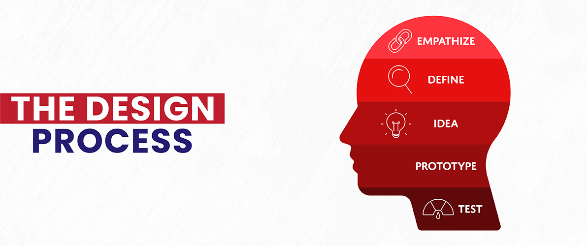
Now that you grasp the importance of simplicity and bright colors in logo design, let’s explore the exciting logo creation process! This is where the spotlight shifts to your creativity and design skills.
Create Some Sketches
Drawing allows you to freely explore simple logo ideas without limitations. Don’t worry about perfect performance right now. Create a compilation of different shapes, symbols, and text styles that represent your brand. Try different layouts and mix colors to see what works best. The initial brainstorming phase is crucial in generating a wide variety of logo concepts.
Understanding the Power of Simplicity
Simplicity remains imperative throughout the entire design process. Despite having multiple sketches, focus on enhancing them to produce clear and concise visual representations. A logo with too many elements can be messy and difficult to remember. Look for techniques to simplify your sketches, focusing on the main concept you want to convey in your logo design.
Choosing the Right Colors for Impact
Colors play a significant role in designing logos. Refer back to your color psychology notes and choose colors that match your brand’s personality. Experiment with different color pairings in your sketches to see how they affect the overall perception of your logo. Remember that the design process consists of repetitive cycles. Feel free to revisit and enhance your sketches once you have a clearer vision of your ideal logo.
Creating a Versatile Logo
Your logo will be visible on various platforms. Designing a logo that is flexible enough to work well at different sizes is incredibly important to stand out in the crowd. Simple logo designs with minimal details offer more versatility. Experiment with your logo by testing it in various sizes and positions to ensure it remains impactful and easily seen in any context.
Pick the Right Typography
Choosing the right typography, also known as the font, is essential. It must be quickly identifiable at all sizes, match your chosen colors, and reflect your brand’s identity. A toy shop, for example, might choose a playful, whimsical typeface, while a financial advisor may pick a clean, professional font. Try different typefaces to see how they affect the overall look of your logo design.
Brainstorming Powerful Logo Concepts
Don’t get too wrapped up in your initial drafts! Sometimes, the best logo ideas emerge later in the process. Search online logo galleries, competitor logos (without copying), or everyday objects for logo inspiration. Ask yourself, “Which visual elements best represent my brand’s values and objectives?” This brainstorming session could produce creative ideas to improve your logo design.
Refining Your Design for Maximum Impact
Display your logo to people you trust, like friends, colleagues, or potential customers. Get their honest thoughts on the clarity, memorability, and impact of the message. If your logo still appears busy, simplify it even more. Can you remove any additional parts or enhance the design for a more streamlined look? Once you are satisfied with the design, ensure clean lines, consistent spacing, and the appropriate file format for different uses.
By carefully focusing on typography, coming up with new ideas, and ensuring flexibility, you can turn your logo sketches into a captivating representation of your brand.
Level Up Your Logo Game!
Our design team will craft a logo that turns heads.
Getting Client Feedback and Making Final Tweaks
You’ve devoted the time to brainstorming and developing your logo design. Now is the moment to get important feedback before producing your Logo.
Seeking Feedback from Others
Share your logo with a trusted group of people, including friends, colleagues, or even potential customers. Here are some key questions to ask them:
- Is the logo easily recognizable and memorable?
- What emotions does this logo evoke?
- Does the logo look professional and trustworthy?
- How does the logo perform in black and white versus color?
- Does the logo stand out among competitors?
Honest feedback from a fresh perspective can be invaluable in identifying areas for improvement.
Making Final Tweaks
You may have to make some final changes to your logo based on the feedback you receive. Here are a few suggestions:If your logo seems messy, think about taking out extra parts or improving the design for clearer communication.Feedback could indicate the necessity to modify the color palette or font selection to more closely match your brand identity.Make sure to format your logo correctly and save it in the appropriate file formats for different purposes after it has been completed.
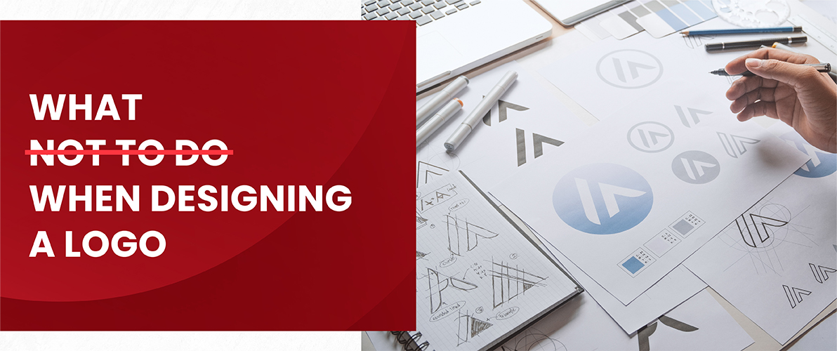
What Not to Do When Designing a Logo
You’re on the path to creating a stellar logo, here are some common pitfalls to avoid:
- Following trends too closely: Trends offer inspiration, a logo should be simple and reflect your unique brand.
- Using too many complex elements: A logo should be simpler and easier to recognize, so avoid messing it with extra details.
- Choosing illegible fonts: choose font that is clear and readable at various sizes, especially for smaller applications like business cards.
- Copying competitor logos: Originality is key! Create a logo that stands out from the competition and represents your brand identity.
Why Must You Hire A Creative Design Company
A well-designed logo acts as a silent salesperson, focused on building brand recognition and trust. Yet, designing a logo that effectively catches the audience’s eye requires talent and creativity. This is the place where design experts like Logo Design Valley can make a difference.
Our professional designers mix strategic thinking with artistic skills to produce visually appealing logos that correctly reflect your company. We will collaborate with you to understand your concept and create a distinctive, memorable logo that distinguishes you Visit Logo Design Valley for professional logo design services.
Conclusion
Ultimately, creating a logo is essential for building a brand that connects with your desired market. This detailed manual helps you create a lasting symbol by focusing on simplicity, memorability, and versatility. Use rough drawings to generate logo concepts, thoughtfully choose colors that represent your brand’s identity, and select straightforward fonts to improve legibility.
Keep in mind that truthful feedback is an important tool for improving your design. By adhering to these guidelines and steering clear of typical mistakes, you can turn your original logo idea into a timeless visual symbol that grabs attention and makes a lasting impact, establishing your brand identity for the long haul.
FAQs
How to design a logo?
You can DIY or hire a logo designer. If you’re designing it yourself this guide will provide you with helpful tips on logo design ideas, including designing a logo, simple logos, and creative logo concepts.
How can I get logo design ideas?
There are many resources available to spark your creativity! Look at online galleries showcasing logo design ideas and designer logos. You can also browse business logo ideas or search for terms like cool logo ideas to get your wheels turning. Even everyday objects can inspire you to create a logo.
What makes a good logo?
Creative logos are memorable and impactful. They provide a unique message by combining font, color, and shape. The secret is simplicity! Nike’s swoosh and Apple’s bitten apple are simple enough and that’s why they are easy to remember.
Is it worth hiring a logo designer?
Professional logo designers bring experience and artistic talent to the table. They would help you create a logo that perfectly reflects your brand and captures attention. Logo Design Valley is a great resource if you’re looking for a logo design company.
What are some common mistakes to avoid when designing a logo?
Following trends make your logo look dated. Avoid cluttering your design with too many complex elements. Choose a font that is clear and readable at various sizes, especially for applications like business cards. Most importantly, ensure your logo is original! Don’t copy competitor logos.
