
Have you ever thought about the origins of the basic, vibrant Google logo? It is a tale of development and transformation, much like the company’s own evolution. The Google logo has transformed from a simple Stanford University research project to a major global tech company. Let’s delve into this intriguing adventure and observe how the iconic logo mirrors the company’s story.
The Evolution of Google Logo
Starting as a Stanford University research project, the Google logo has gone through several types of logo design to become a worldwide tech powerhouse. Every transformation has mirrored the expansion of the business and the changing digital environment. Let’s take a look at the history of the Google logo and observe the evolution of the iconic logo throughout history.
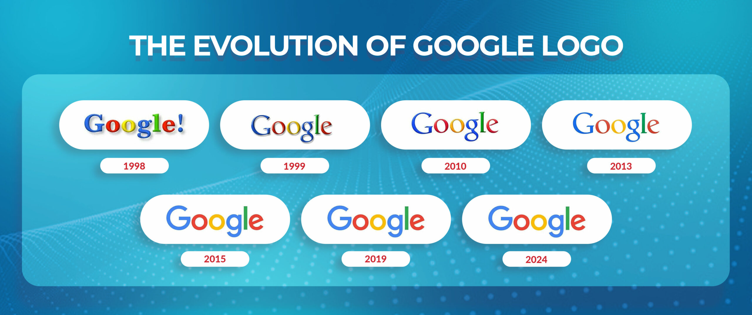
1998: The Birth of Google’s First Logo
Google’s first logo featured a basic blue sans-serif font, with the word “Google” playfully arranged. This initial design showcased the youthful and innovative essence of the company. Although it may appear simple in comparison to current complex logos, it acted as a strong base for the brand’s visual identity.
The strategic decision was to choose the blue color, which is commonly linked to trust and reliability. It played a key role in solidifying Google’s reputation as a reliable information provider during the internet’s early years, a time marked by widespread online scams and misinformation. The playful organization of the characters brought a sense of personality, resulting in a more welcoming and user-friendly atmosphere for Google.
1999: Google’s First Major Update
Google made its initial significant logo revision in 1999. The most striking difference was the inclusion of the famous “O” with a question mark inside. The playful element in the logo not only gave it a special touch but also represented Google’s dedication to answering users’ queries and offering useful information.
The design, as a whole, stayed fairly basic. However, the question mark became an easily identifiable representation of the brand. It suggested Google’s desire to be the global leader in providing information and knowledge. The update marked a significant advancement in defining Google’s brand and distinguishing it from other search engines.
2010: A Subtle Shift
In 2010, there was a noticeable but important change in the Google logo. Even though the general layout stayed the same, the letters were improved and condensed slightly, giving a more sleek look. This adjustment, commonly referred to as a “cleaning up,” showcased the company’s increasing maturity and its aim to portray a more polished image.
In addition to the visual updates, the 2010 revision also suggested a possible change in Google’s branding approach. The company’s shift towards a slightly more formal appearance indicated a departure from its previous playful, colourful aesthetic. The shift was probably motivated by the company’s growing visibility and its aim to attract a broader range of individuals, which includes businesses and professionals.
Create Your Own Iconic Logo
Let our designers help you craft a memorable logo.
2013: The Modern Minimalist Approach
In 2013, Google introduced a new logo that was vastly different from its earlier versions. The classic “Google” font was swapped with a minimalist, sans-serif style in a sleek, muted colour scheme. The updated logo was created to have more flexibility and be easily used on different platforms and devices while still being easily recognizable.
The 2013 logo’s minimalist design boldly conveyed the company’s dedication to simplicity and user experience. Through the removal of superfluous components and concentration on the essential features of the brand, Google successfully developed a logo that embodies both timelessness and iconic status. The flat colour palette and clean lines were in line with the growing design trends at the time, establishing Google as a frontrunner in the digital era.
2015: A New Era Begins
In 2015, Google made a small but important modification to its logo. The famous “Google” logo was made simpler by joining the “o” and “l” letters. This update signaled a new chapter for the company, showcasing its increasing focus on ease and adaptability. The updated logo was created to easily fit various screen sizes and devices, providing a unified experience on all platforms. The linked letters represented the interconnection of data and the organization’s dedication to offering smooth entry to information.
2019: Google’s Logo Today
The Google logo we see now is basically identical to the version from 2015. Although slight modifications and colour changes were made for branding reasons, the general design has remained the same. This enduring nature showcases the logo’s timeless popularity and its resilience over time. The simplistic design, sleek lines and perfect logo size still appeal to users, making the Google logo highly recognizable globally. The linked “o” and “l” letters still stand out, representing the connection of data and the goal of organizing global information for everyone’s benefit.
2024: Looking Back at 25 Years of Google’s Iconic Logo
As we mark Google’s 25th anniversary in 2024, it’s an appropriate moment to ponder the changes in its professional logo design over the years. Starting as a simple Stanford University research project, the Google logo has evolved over time to become a major player in the global tech industry, mirroring the company’s expansion and the evolving digital world.
A Journey of Simplicity
The growing simplicity of the Google logo’s evolution is one of its most noticeable aspects. The original logos were intricate and vibrant, showcasing whimsical typography and color gradients. Google has gradually adopted a minimalist design, emphasizing simple lines and a restricted range of colors. This change shows the company’s dedication to being user-friendly and wanting to design a logo that can be easily identified on various platforms and devices.
A Symbol of Innovation
The Google logo is now seen as a representation of progress and advancement in technology. The company’s famous search bar, known for its iconic status, has changed over time to include additional features and capabilities. The logo has stayed relevant and recognizable in the fast-moving digital world by adjusting to changing trends and technologies.
A Timeless Classic
The Google logo has maintained its fundamental identity despite experiencing alterations. Its straightforward, uncluttered design and iconic search bar have elevated it to one of the most well-known logos globally. As Google keeps progressing and expanding, it is probable that the logo will keep changing, mirroring the company’s future goals and the evolving technology industry. To create a logo like a Google logo, Hire a logo designer, or if you have time and talent, you can make it yourself, too.
“The best logos are simple, memorable, and timeless.” – Paul Rand.
How Doodles Reflect Google’s Creative Culture
Have you ever observed the playful and vibrant alterations to the Google logo on the search engine’s main page? They are known as Doodles, providing Google with a special outlet for showcasing its creativity.
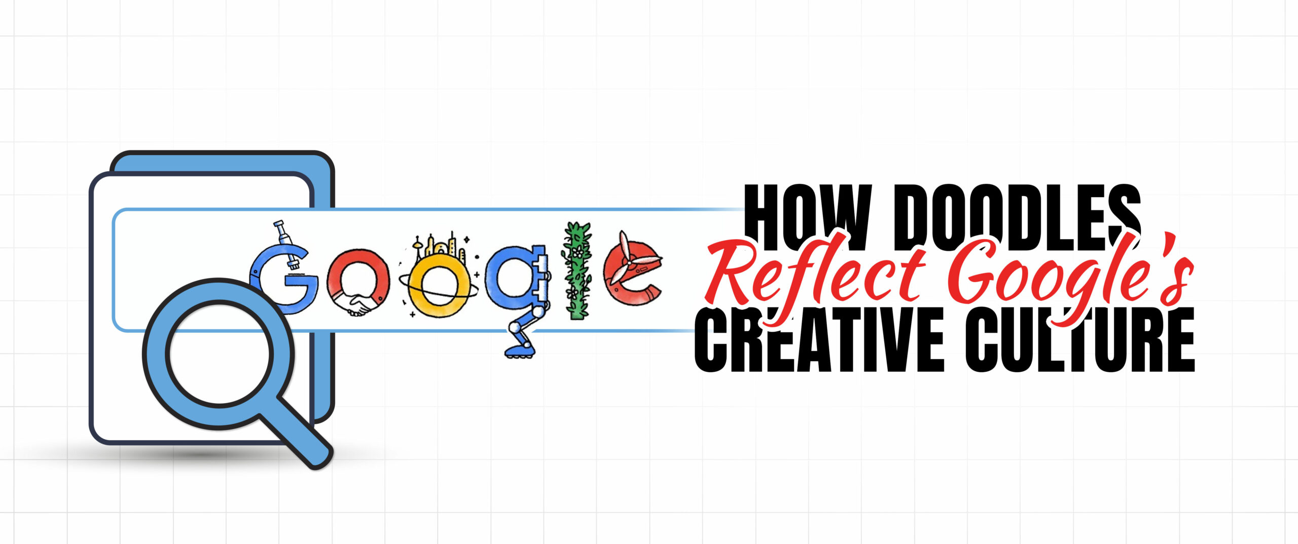
Doodles are unique illustrations or animated designs that take the place of the usual Google logo to commemorate special occasions like holidays, birthdays, or significant events. They are similar to small, unexpected gifts that you come across when opening Google, demonstrating the enjoyable and imaginative side of Google.
These Doodles go beyond being mere pieces of art. They provide Google with a means to engage with individuals globally and express its admiration for various cultures and concepts. It’s an enjoyable and engaging method to discover new information.
Key Lessons for Designers from Google’s Logo Changes
- The simplicity of Google’s logo has made it iconic. Steer clear of unnecessary items and concentrate on crucial components.
- The logo needs to be able to adjust to various platforms and screen sizes.
- Strive for a timeless design that will not succumb to fleeting trends.
- The logo must be consistent with the brand’s overall identity and message.
- Embrace new trends and be willing to experiment, but always stay true to the core elements of your brand.
- Think about how users will interpret the logo and make sure it is clear and memorable.
- A successful logo should trigger feelings and establish a bond with the viewers.
- The logo needs to be adaptable for different uses, from print to digital platforms.
Conclusion
The Google logo has changed a lot over time, mirroring the company’s expansion and the evolving digital environment. From its modest origins to its renowned reputation today, the logo symbol has continued to represent innovation, simplicity, and ease of use. With technology progressing, the Google logo is expected to keep changing and developing to stay important in the future.
FAQs
What was the first Google logo like?
The original Google logo had a simple blue sans-serif font, with the word “Google” creatively positioned. It was basic yet successful in creating the company’s brand image.
Why did Google change its logo in 2010?
The revision of the logo in 2010 showcased Google’s increasing maturity and its intention to project a more professional appearance. It also indicated a possible change in the company’s branding approach.
What is the significance of the connected “o” and “l” letters in the current Google logo?
The joined “o” and “l” letters represent the link between information and Google’s dedication to giving easy access to knowledge.
How has the Google logo evolved over the years?
The Google logo is now simpler and more minimalistic, showing the company’s emphasis on being user-friendly and adaptable. It has progressed to serve as a representation of progress and technological development.
What is the future of the Google logo?
Although the current Google logo has stayed mostly the same, it is expected that it will undergo further changes as technology and the digital environment progress. Features like augmented reality, personalization, or sustainability could be included.