Fed up with tooth-shaped logos? It’s time to break from the mold and create a dental logo that wows your patients. By 2024, a Professional logo design doesn’t just involve stunning aesthetics; it’s about establishing a connection with your audience in a more meaningful and compelling way. Let’s learn how an effective dental logo design can help boost your practice and leave an impression.
Why Branding is Key to Attracting Dental Patients
Flourishing dental practice almost always depends on a strong brand identity. This is the differentiator that makes you different from the rest of the competitors and which your patients will resonate with — your values and services. A consistent brand image is a go-to for your expertise and professionalism, giving people the confidence to trust you with their patients.
The power of a strong brand is that it creates emotional ties with a patient that drives not only repeat visits but positive word-of-mouth referrals and a loyal patient base.
Besides that, a functional brand helps you distinguish your practice from others in the same industry, attracts new patients and makes your practice visible. By perceiving your brand as being of a premium nature, you can likewise charge premium fees for your amazing oral services. Branding is investing in the long-term growth and profitability of your dental practice.
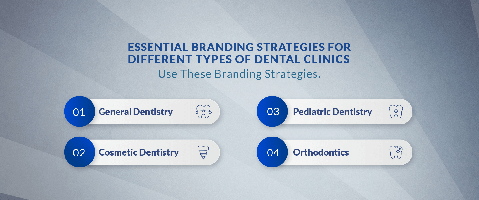
Essential Branding Strategies for Different Types of Dental Clinics
A well-constructed brand identity is essential to drawing and retaining patients. Following are some essential branding strategies for different types of dental clinics:

General Dentistry
A warm and inviting brand image is necessary for general dentistry practice. With soft colours, gentle imagery, and friendly messaging, you can infuse your environment with a warm, welcoming place for families to shop. Make it clear how important your commitment to comprehensive dental care, preventive dentistry, and a patient-centered approach is. Optimise your brand with keywords such as family dentistry, preventive care, and general dental services.
Cosmetic Dentistry
When it comes to cosmetic dentistry practices, people usually want to choose a cool, fashionable, and classy brand image. Bold colours, great imagery, and high-quality language give a premium experience. Focus on your ability to enhance smiles and increase self-confidence. Keyword incorporation, such as cosmetic dentistry, smile makeover, teeth whitening, dental veneers, and dental implants, will help draw the canines.
Pediatric Dentistry
A brand that is fun and playful should be made for pediatric dental practices to attract the kids. Use bright colours, cartoon characters, and child-friendly language to make a dentist visit a positive or at least a less scary experience. Show that you are committed to making dental visits pleasant and stress-free for young patients. Optimise your brand for keywords like pediatric dentistry, children’s dentistry, and dental care for kids.
Orthodontics
Creating a logo trustworthy, reliable brand image should be the top priority of Orthodontic practices. Make a point of emphasising your capability to straighten teeth and improve facial aesthetics. Add keywords like orthodontics, braces, Invisalign, teeth straightening, and dental alignment so you will attract possible patients.
Make Your Brand Sparkle with a Custom Dental Logo!
Show patients you care from the first glance.
5 Inspiring Dental Logos Ideas That Will Light Up Your Branding
Here are five dental logo design inspirations that have captured our attention:
Tooth Love
A playful and memorable design is the perfect example of Tooth Love’s logo. The logo shows a stylised tooth characterised by heart-shaped eyes so that it conveys a sense of warmth and affection. A bright colour palette is used in the logo to make it recognisable.
Oblik
A prime example of modern and minimalist design is Oblik’s logo. A simple line drawing of a tooth done in such a slanted way gives it some extra personality to it. Bold typography and clean lines give a sophisticated and professional view.
Seimadent
A classic and timeless logo is Seimadent’s logo, which gives an impression of tradition and expertise. The logo uses a simple, elegant typeface and a stylised tooth icon. The use of the cast darkness in the palette of the logo finishes the logo on the sophisticated side.
Energetic Smile
The colourful and lively logo of Energetic Smile represents a healthy and energetic smile that is fun. Bright and white teeth have also been added to a bold, bright, coloured smiling face that makes up the logo. A dynamic layout accompanied by playful type gives the feel of youth and energy.
Hilborn Family Dentistry
The logo of Hilborn Family Dentistry is warm and inviting and focuses on family and community. The logo is a family of stylised teeth with a distinct expression on each one. Even though the colours used are soft, the font used is friendly and approachable.
The Ultimate Guide to Designing Dental Logos in 2024
A standout dental logo isn’t just about style; it’s about building trust, making a memorable impression, and reflecting the unique essence of your dental practice. In 2024, effective logo design for dentists focuses less on following traditional shapes and more on connecting with patients through clean, meaningful design choices. This guide covers everything from branding for dentists to creating custom logos that enhance patient trust, ensuring your logo doesn’t just catch the eye but resonates deeply with your target audience.

Minimalism Speaks Volumes
Minimalist logos are not only modern but also instill a sense of calm and cleanliness—key elements in healthcare branding. In fact, 61% of consumers prefer minimalist logos for healthcare brands because they’re easy to recognise and convey professionalism. Focus on simple logo design with shapes and clean lines that deliver warmth and approachability without overwhelming detail. Minimalist designs are especially popular in dentistry for their ability to communicate expertise and precision.
Soft and Trustworthy Color Palettes
Colour psychology is crucial in dental branding, as different shades evoke different feelings. Cool tones like blue and green are popular in healthcare logos because they suggest trust, cleanliness, and relaxation, while soft, muted colours give a sense of warmth and friendliness. Bright, inviting hues can work well in pediatric dental logos, while sophisticated tones are a better choice for cosmetic dentistry or orthodontic practices. Use colour theory in modern logo design to find a palette that matches your brand.
Creative Typography
Font choice can make or break a logo’s effectiveness so choose the best fonts for logos. In 2024, bold and readable typography trends lead with sans-serif fonts, which offer simplicity and modern appeal. Fonts that balance professionalism with approachability are ideal for dental logos, ensuring they’re easy to read across various formats, from business cards to digital ads. Fonts that create a sense of trust and comfort in dental logo design make a lasting impression.
Organic Shapes and Symbols
Tooth-shaped icons can feel overused, but you can add a fresh twist by opting for organic shapes that subtly hint at dental care. For example, shapes inspired by a smile, wave, or even nature can create a warm, inviting logo symbol without relying on the typical tooth icon. Using subtle dental symbols like abstract shapes keeps the design modern, avoiding clichés while communicating care and health.
Hire a Designer for Customization
While logo design templates are easy to find, choosing to hire a designer can give your practice a custom logo that truly reflects your brand. A professional designer can blend your unique values with current design trends to create an original, memorable logo aligned with your dental practice’s mission. Custom designs are especially valuable in healthcare, where trust, professionalism, and reliability are essential. Whether you need a logo for a dentist’s office or a full dental branding strategy, working with a designer ensures your brand stands out.
Key Trends and Tips for Dental Logo Design in 2024
Authenticity and connection are the new things to consider in 2024 when it comes to dental logo design. Patients want to be able to feel like they belong, so think about a logo that can be used to represent your practice’s personality. Simple designs that speak cleanness and professionalism are trending with minimalism. Recently, a survey found that 61% of consumers prefer minimalist logos for health-related services.
Color choice is also important, with blue and green inspiring trust and calm and bright colours suggesting friendliness. Don’t forget about typography; a readable, modern font adds to the appeal of your logo. Make sure your logo does the job on various platforms: print, signage, social media, etc. Take feedback from your patients and your team to improve your design. Trends and Tips to follow first to create a dental logo that looks good resonates with your audience and makes your brand more visible.
Conclusion
A well-crafted dental logo in 2024 is so much more than just an image; it’s a trust-building tool, a patient magnet and an essential brand tool. Everything, from minimalism to meaningful colors to the elements of your practice, matters in how patients perceive it. An effective logo that is memorable and professional branding enhances your brand and establishes lasting connections with patients. Investing in a great, different brand logo for your dental practice will separate you from other practices and is the first step to long-term growth for your practice.


