A combination logo mixes text and image to form a versatile and memorable visual identity. It goes beyond being a mere logo; it is a strategic instrument that can significantly improve your brand’s awareness and remembrance. Combination logos effectively make a strong and enduring impact on your audience by blending words and images together.
This special combination of factors provides your brand with a competitive advantage. It provides flexibility for using images or text separately while keeping brand consistency. A carefully designed combination logo can serve as the foundation of a robust brand identity, enabling you to differentiate yourself in a competitive market.
Why Choose a Combination Logo?
A combined logo also referred to as a combination logo or combo logo, offers the advantages of both worlds for your brand. It is an intelligent decision that merges the strength of a symbol (or icon) with the transparency of your company’s name. This pair collaborates to design a logo that is visually attractive and contributes greatly to establishing brand awareness. These types of logos are usually preferred by professional logo design companies. So, if you need one, search for a logo design company that will make the perfect square logo for your brand.
Different from a basic text-based logo or an independent symbol, a combination mark logo provides flexibility. You have the option to either use the symbol alone for instant recognition or combine it with the complete logo for a more powerful effect. Having dual logos provides versatility for various marketing materials and scenarios, essentially creating two logos in one. Additionally, a memorable combination of a catchy image and a memorable name makes it easier for people to remember your brand, leaving a lasting impression.
Combine Your Brand’s Essence with a Powerful Logo
Unite wordmark and symbol for a logo that’s both memorable and meaningful.
Some Famous Combination Logos for Inspiration
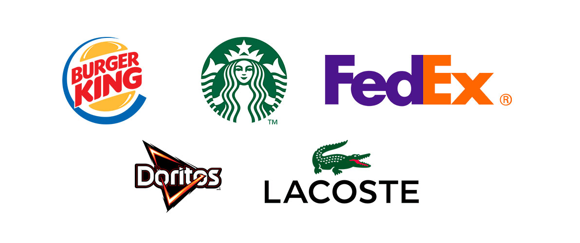
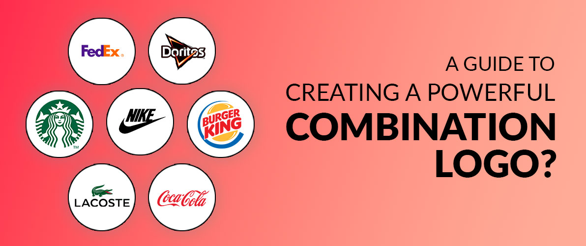
Combination logos are an effective tool for establishing brand recognition. They combine the power of an icon with the precision of a label. Let’s examine a few well-known instances.
Lacoste
The Lacoste emblem is an enduring classic. The elegant and sporty green crocodile is easily identifiable as a symbol. It strikes the perfect balance between luxury and casual style. The unique identity that has endured over time is created by combining the animal with the brand name. This logo demonstrates how a basic yet impactful blend can enhance a brand.
Burger King
The logo of Burger King makes a strong statement. The fire-inspired letters, along with the famous crown, combine to form a strong symbol associated with the fast food monarchy. It epitomizes self-assurance and control. This logo successfully conveys the brand’s image as a high-quality, quick dining choice. The fiery letters and regal crown together make a memorable and impactful visual identity.
Doritos
The Doritos logo shows how a basic form can become famous. The triangular design coincides with the shape of the chips, giving it immediate recognition. Paired with the fun brand name, it forms a youthful and vibrant image. This logo successfully conveys the brand’s identity and resonates with its intended audience. The mix of form and words is a successful recipe for this well-liked snack label.
FedEx
The design of the FedEx logo is exemplary. It exemplifies how empty space can be utilized to convey a strong message. The concealed arrow connecting the letters E and X represents rapidity and distribution, fundamental principles of the brand. This smart blend has turned into a famous representation of the maritime sector. This demonstrates how simplicity and creativity are impactful in logo design.
Starbucks
The Starbucks emblem combines elements of mythology with contemporary culture. The brand name mixed with the mythical creature, the siren, evokes a feeling of magic and reassurance. It’s an ideal fit for an authentic coffee shop experience. This logo is now associated with feelings of calmness and pampering. The worldwide symbol was born from the pairing of the mermaid and the brand name. From these logos given above, you can get logo design inspiration that fits your brand.
Combination Logos vs Wordmark Logos
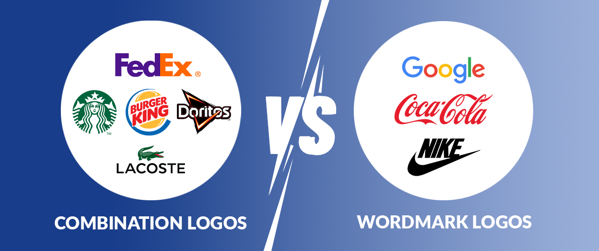
Let’s compare the most common logo type with combination logo:
| Feature | Combination Logo | Wordmark Logo |
| Definition | Combines text and imagery | Uses only text |
| Examples | Lacoste, Burger King, FedEx | Coca-Cola, Google, Nike |
| Strengths | Versatile, memorable, strong brand identity | Simple, clean, timeless |
| Weaknesses | Can be complex, might not work in small sizes | Limited visual impact, might be less memorable |
| Best for | Most businesses | Short, distinctive names |
Key Elements of a Successful Combination Logo
A mixed logo, also called a combo logo or combined logo, is an effective tool for establishing brand recognition. It is a clever combination of a symbol (or icon) with your company’s name. When designing a logo that stands out, remember to focus on these essential components.
A combination mark logo is successful when it achieves a harmonious balance between the image and the text. Both should maintain an equal balance and not dominate one another. They need to collaborate effectively in order to achieve a cohesive appearance. It resembles a dance in which both partners share an equal role in the presentation.
Your logo needs to be simple and easily readable. The text must be easily readable, even when printed in a small font size. The symbol needs to be easy to identify quickly. An intricate or cluttered logo can cause confusion among your audience.
The chosen image should be pertinent to your brand. It is important to describe the fundamental nature of your business, as well as the products or services you provide. A carefully selected symbol has the power to elicit feelings and establish a bond with your desired audience.
A versatile combination logo is highly effective. It should function effectively across various sizes and formats. The image and text should work together to enhance design possibilities. This adaptability guarantees that your logo will appear impressive in all settings, including business cards and billboards.
Your objective is to design a logo that remains memorable to individuals. An unforgettable logo can be created by combining images and text in a unique way. It must be unique and differentiate itself from competitors. A memorable logo aids in establishing brand awareness and memorability.
By taking these factors into account, you can design a hybrid logo that accurately reflects your brand and makes a strong impact.
A Guide to Creating a Powerful Combination Logo
You can simply Hire logo designer who is professional and designs the best combination logo. A combination logo, also known as a combo logo, is a thrilling exploration into the visual representation of your brand. This kind of logo merges the strengths of both a symbol and text effectively. Let’s analyze the process step by step.
Before delving into the design process, make sure you fully understand your brand. Can you tell me about your brand’s history? Who is the intended audience for your message? Which feelings do you aim to provoke? These questions are designed to help you with your logo creation.
- Allow your creativity to run freely. Create rough drafts and combine various symbols and text. Don’t hesitate to try new things. Seek motivation from within your field, rivals, or even common experiences.
- Choose a symbol that aligns well with your brand. It might be an object, an animal, or a shape without physical form. Please rewrite the text provided, maintaining clarity and readability to embody the personality of your brand. Think about utilizing fonts that enhance your brand’s aesthetic.
- A combination mark logo achieves balance by blending the image and text effectively. Both should have equal power and influence. Try out various sizes, positions, and arrangements to find the perfect balance.
- Emotions can be triggered by colors. Select colors that match your brand’s character. For instance, trust is frequently associated with the color blue, whereas energy is symbolized by the color red.
- Display your logo to friends, family, or potential customers. Receive input. Do they feel attracted to it? Are they able to comprehend your brand? Use their feedback to improve your design.
- Your logo should be visually appealing on all platforms, including business cards and billboards. Experiment with various sizes and formats to see how it performs. A flexible logo is a strong instrument.
- After you have designed your ideal combination logo, make sure to safeguard it by obtaining a trademark. This legal action protects your brand identity.
With the guidelines given above, you can design a logo by yourself that suits your brand.
Keep in mind that a logo combining different elements is a financial commitment to your brand. Don’t rush; try out different ideas and design a logo that accurately reflects your company.
Conclusion
A combination logo is a strong asset that can enhance your business. It goes beyond being aesthetically pleasing; it’s a strategic choice that can greatly influence the success of your brand. By skillfully blending text and image, you establish a visual identity that is memorable and adaptable.
An effectively designed combination logo can improve brand visibility, establish trust, and make a lasting impact on your audience. Don’t forget your logo is usually the initial point of contact for people with your brand, so ensure it leaves a lasting impression. Put in time and energy to create a hybrid logo that accurately reflects your company and boosts expansion.
In the end, the success of a combination logo depends on your brand, target audience, and effective design principles. By adhering to the instructions provided in this manual and adding your distinct brand identity to your logo, you can develop a stunning visual creation that advances your business.


