Have you ever wondered why some chocolate brands seem so special? It is not only taste; it is the logo. A good chocolate logo can give you luxury, comfort, and pure indulgence. It’s a chocolatey handshake, urging you to bite and enjoy. Here, we will figure out the top 10 chocolate logo symbols that have the hearts of lovers of chocolate. Get ready to be tempted!
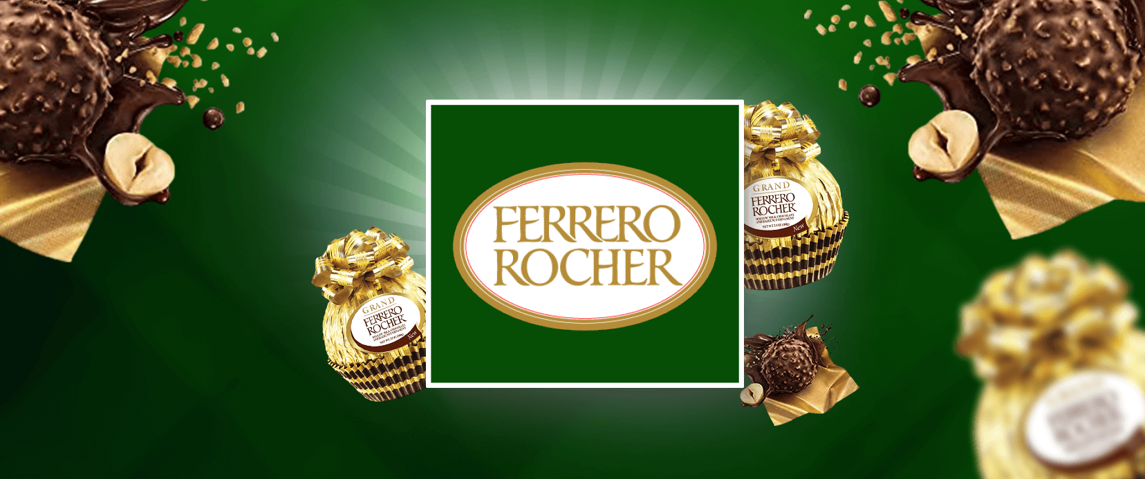
Ferrero Rocher
Ferrero Rocher symbolizes luxury and indulgence. The refined gold in its logo gives a sense of its signature chocolate hazelnut confection’s opulence. This elegant design implies joy and quality, so it’s very popular as a gift. Its distinctive font and simple but elegant design make the brand’s logo very clearly its promise of using only high-quality ingredients and giving the highest quality in what it makes. This visual identity allowed Ferrero Rocher to differentiate itself from other chocolate brands, compelling the consumer who was looking for something special.
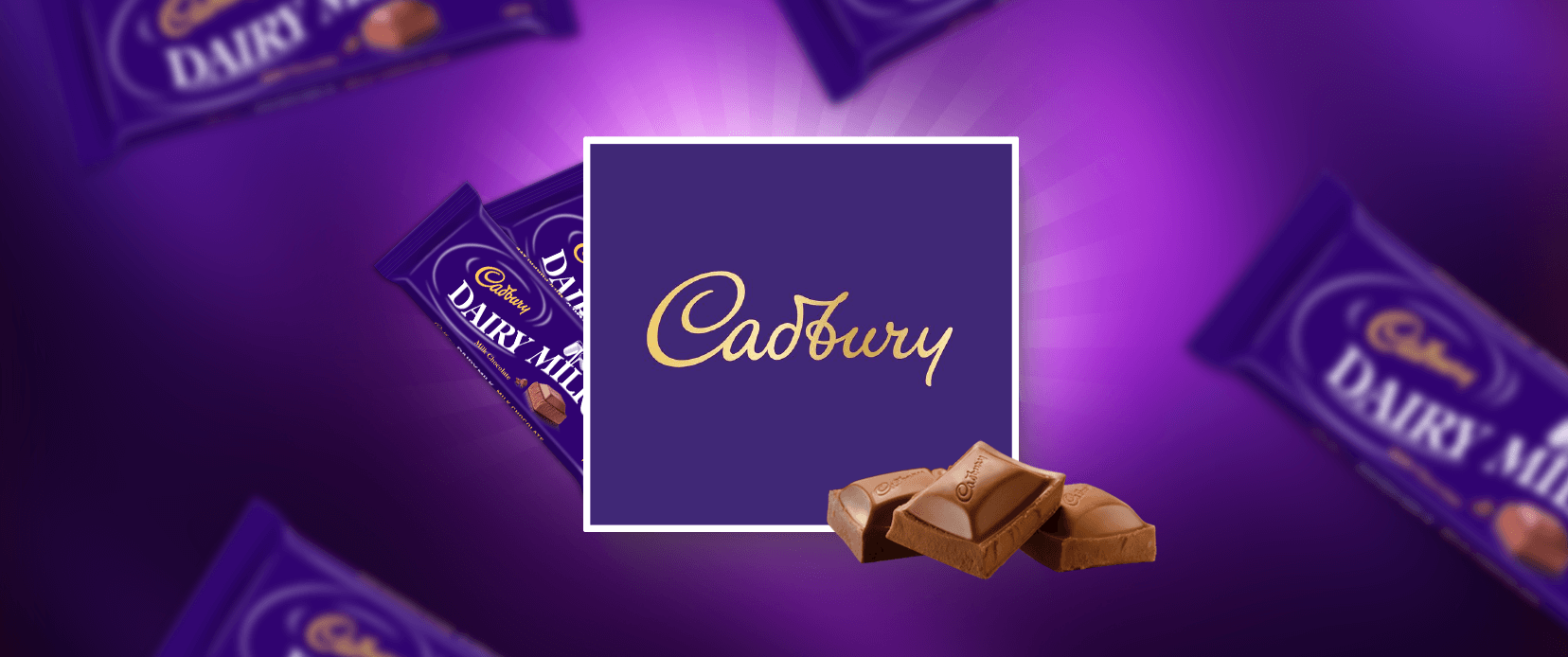
Cadbury
The modern logo design of Cadbury has the spirit of fun that invites consumers of all ages to enjoy their chocolates. Its simplicity makes it suitable for various dairy milk products, including roses. The brand slogan ‘Glass and a half,’ made famous by the iconic Cadbury campaign, acted to cement its reputation as offering quality and generosity. This clever combination of color and typography captures the essence of Cadbury: a brand that makes everyday moments sweeter and happier.
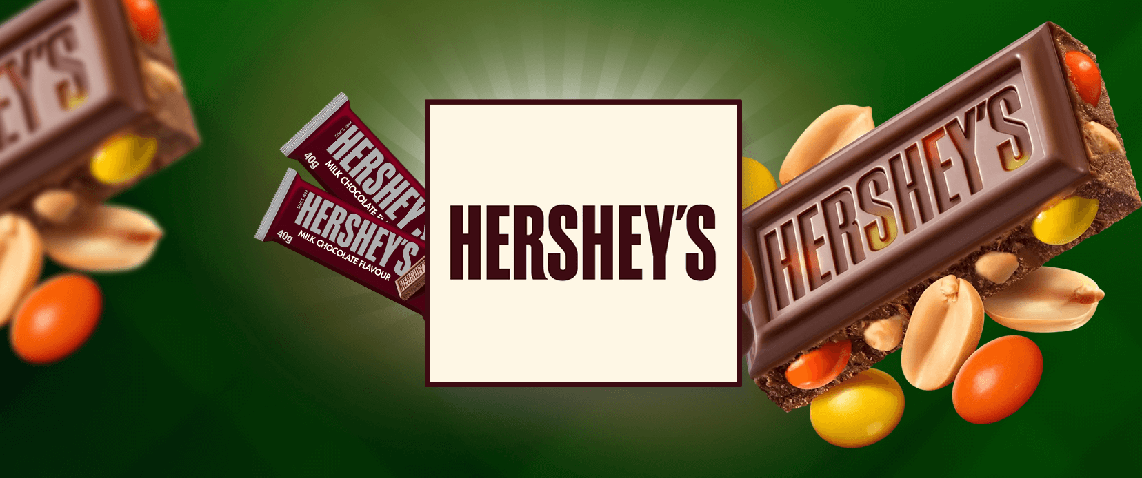
Hershey’s
Hershey’s logo is a classic representation of the culture of American chocolate. This uses a bold, simple font with a rich brown color; it reminds me of nostalgia and warmth. The iconic Hershey’s chocolate bar silhouette boosts brand recognition, and it’s so universally recognized: it stands for comfort and indulgence. The logo puts the brand’s heritage and commitment to quality to good use, making this a chocolate lover’s logo of choice. The Hershey logo isn’t just a delicious treat branding; it means sharing sweet moments with friends and family.
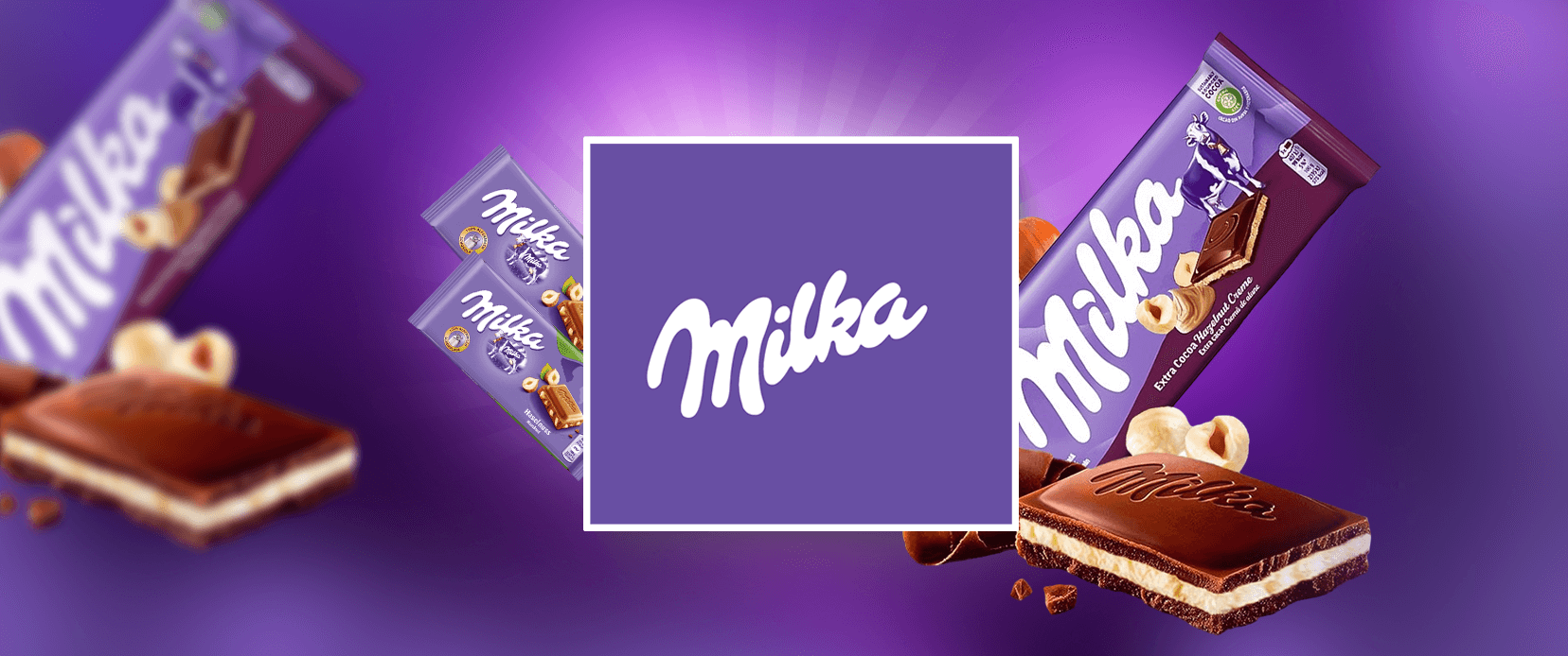
Milka
The soft purple color and the good typography of Milka’s logo stand out. Playful cow font with a cow image adds a sense of nostalgia and innocence, helping consumers see the brand connect to its Alpine roots. This logo represents milk made from fresh milk and represents Milka’s high-quality chocolate production. The usage of imagery of the cow is the symbol of the brand’s natural ingredients and appeals to consumers seeking authenticity. The warmness and comfort you hear in Milka’s logo draw out chocolate lovers to indulge in their smooth, creamy delights.
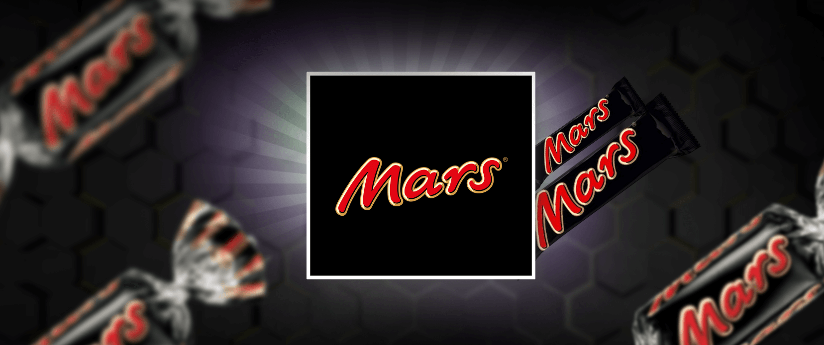
Mars
Mars’ logo is strong, bold red, and a strong, confident font. Since it’s so simple, it just pops right out at you and is a beauty in the branding for chocolate. Its dynamic logo successfully represents the adventurous spirit of the brand and its wide variety of products — from Mars bars to M&M’s. This vivid color attracts the attention of the stores and the iconic “M” logo for quality and reliability. This collection of compounding factors has served Mars well in keeping its status intact as a loved one worldwide and a favorite of generations of chocolate aficionados.
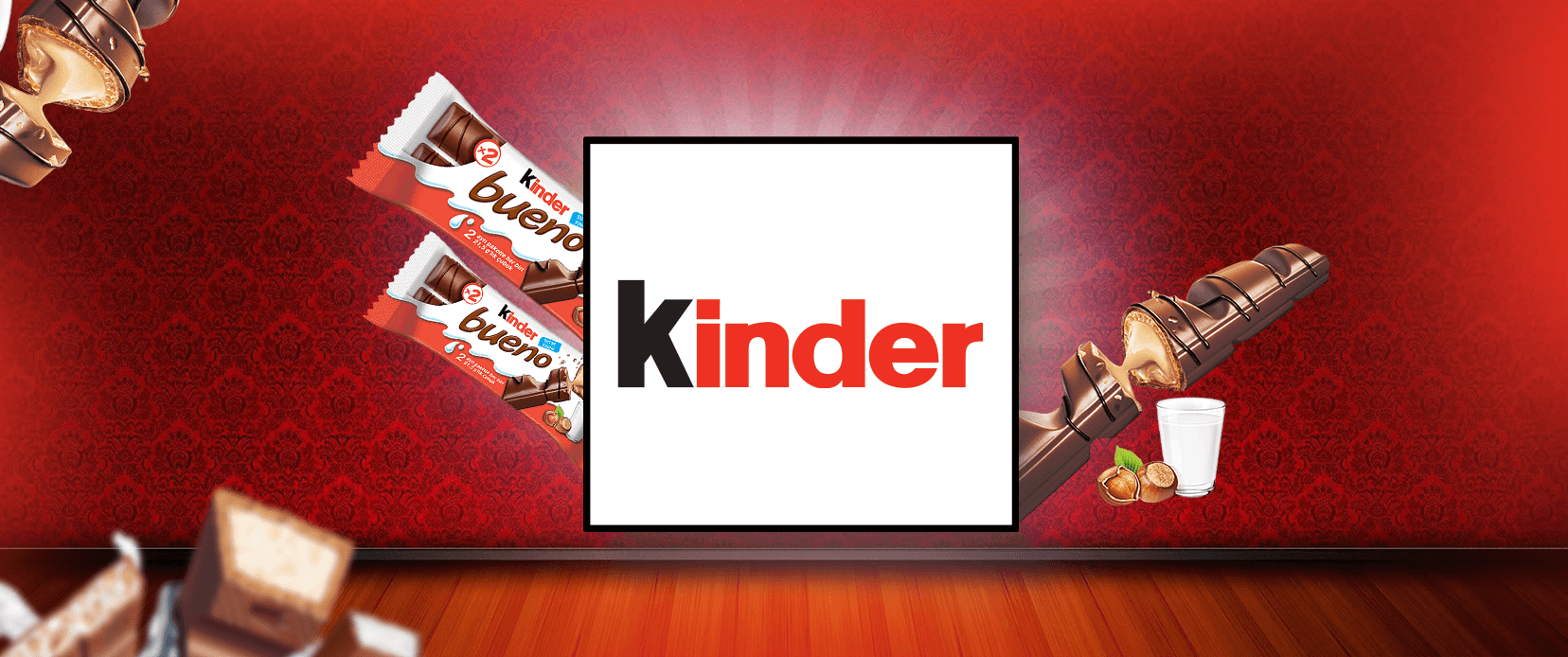
Kinder
Kinder’s logo is bright, child-friendly, and playful. A font that is friendly and warmer, conveying fun, the German word for children is written as Kinder. A smiling chocolate bar logo often accompanies kinder chocolates, and parents are invited to choose this chocolate for their little ones. Red and white colors were applied to add excitement and sweetness, making it a no-brainer for kids. This logo is simple yet effective in what it says about the brand and about making delicious, high-quality treats that make people happy or family.
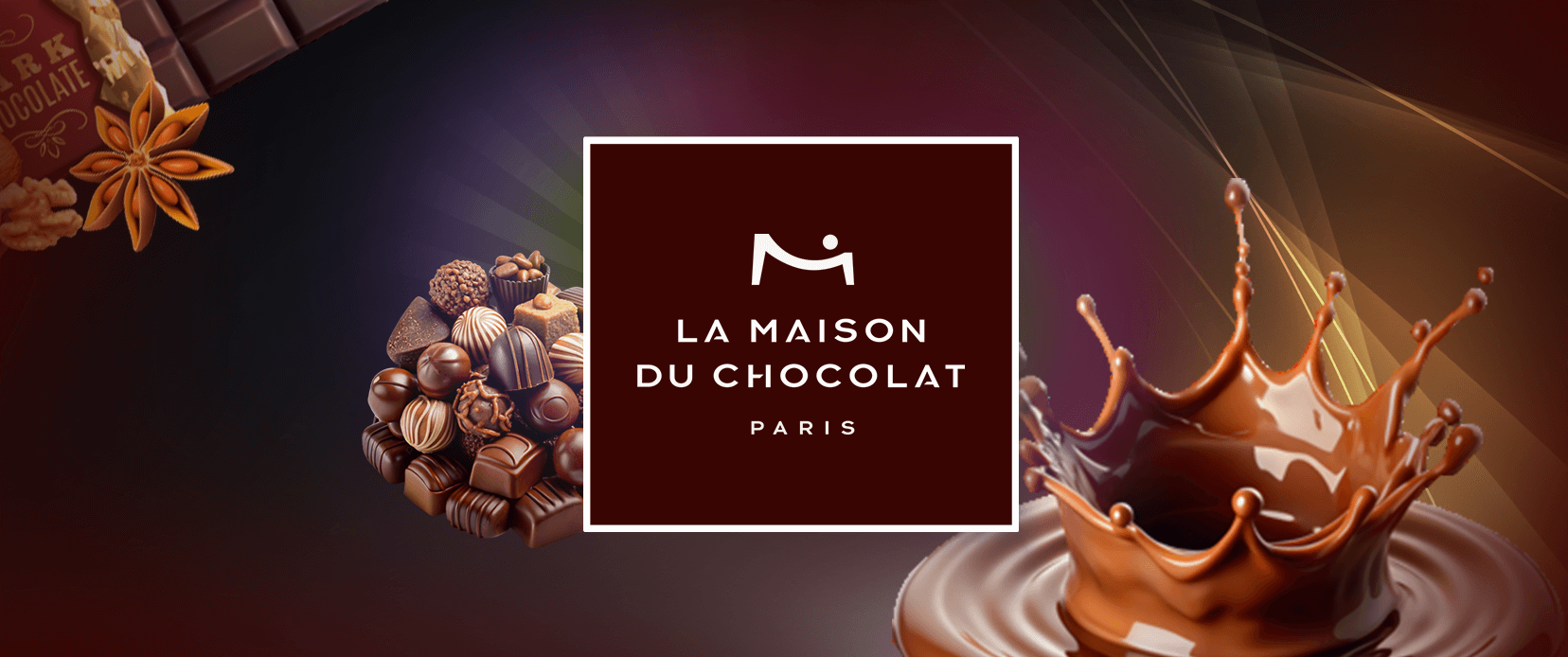
La Maison du Chocolat
The logo of La Maison du Chocolat is elegant and sophisticated in its simplicity and classic typeface. The brand is artisanal, and the color is deep brown, meaning luxury, while the stylish font captures that. However, the problem with this logo is its commitment to high-quality craftsmanship and exquisite chocolate creations. Creating a logo like La Maison du Chocolat needs a good sense of design; for that reason, if you want a logo like La Maison du Chocolat, you should hire a logo designer. The word ‘Maison’ (house) suggests a sense of heritage and expertise, which attracts chocolate lovers to indulge in a real luxury Chocolate experience. This refined logo resonates with consumers looking for premium chocolates and want to gift and taste these higher quality products.
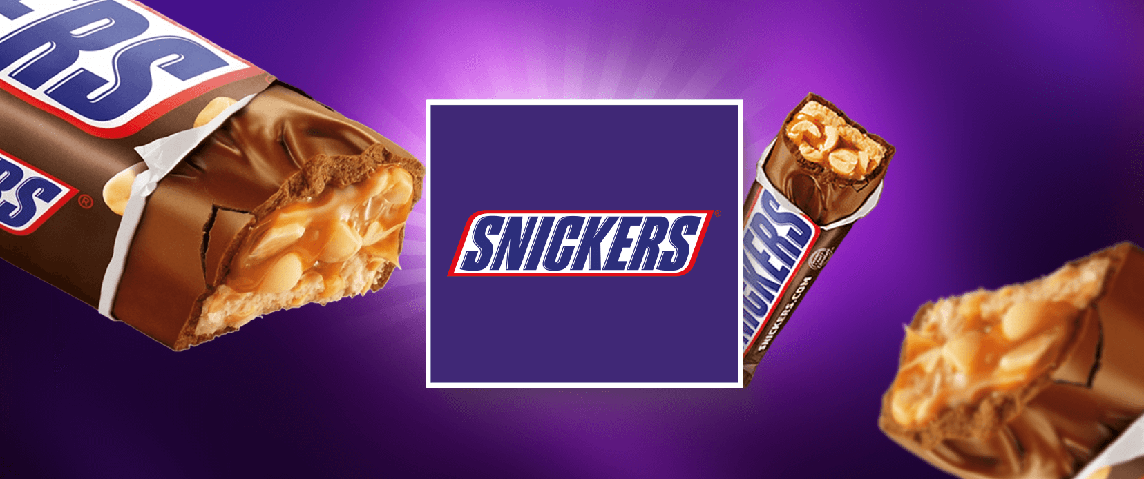
Snickers
Snickers logo is full of strong font and colorful images conveying energy and end pleasure. B and orange create a match that catches the brand’s attention and has a fun and playful personality. The logo brings across the promise of the brand to deliver a hearty, satisfying treat in one go, which is just what people want to go for: something to lift them up temporarily. Second, the design centers itself on the classic Snickers bar, which should make it instantly recognizable to consumers. The impact of this logo fits in perfectly with the brand’s positioning as a loved snack by chocolate lovers everywhere.
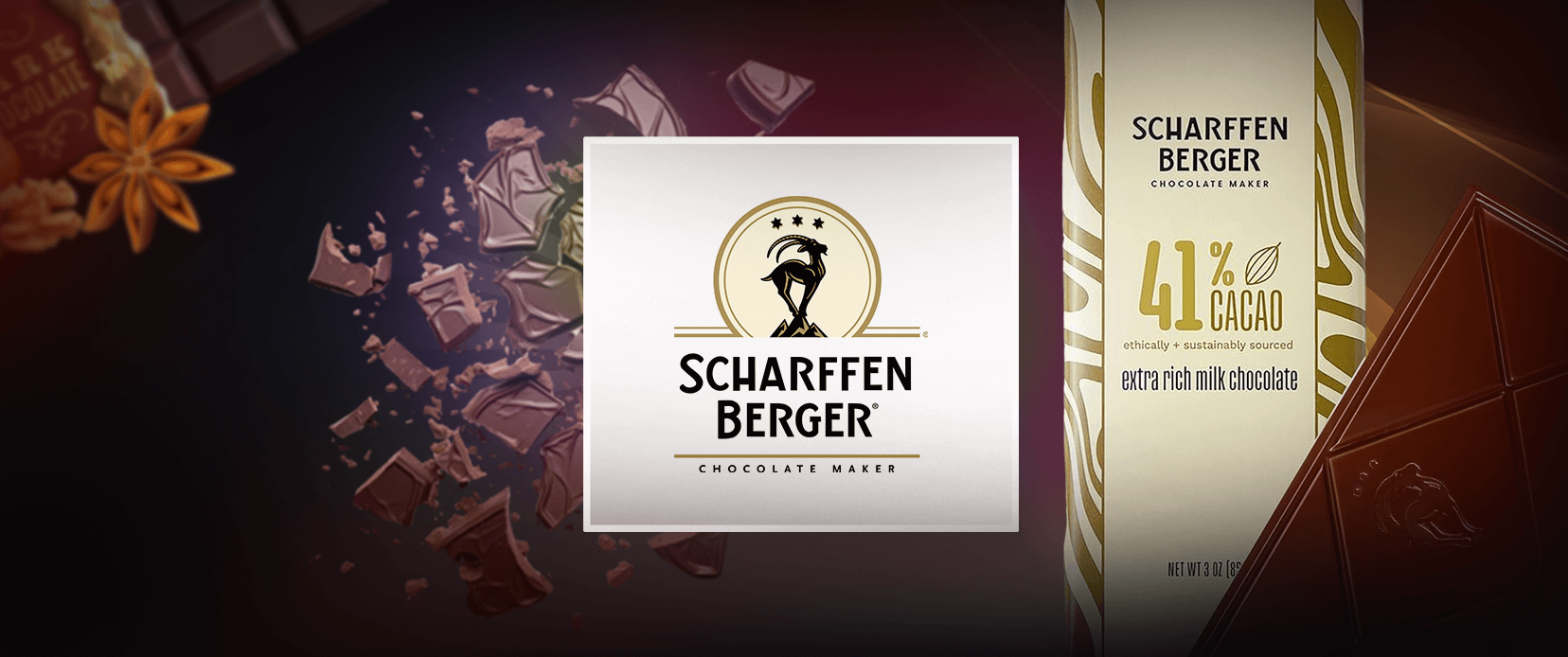
Scharffen Berger
The logo of Scharffen Berger reflects an artisanal craftsmanship look and feel of quality. The logo has elegant typography and is a piece of sophistication, and the rich brown color symbolizes the premium nature of its chocolates. The company’s logo typically includes images related to cocoa to reflect its focus on such high-quality ingredients coming directly from the farmer. The combination of the elements presents a logo for chocolate connoisseurs hunting for authentic flavors. The logo for Scharffen Berger does an excellent job of communicating a message of excellence – all without using words.
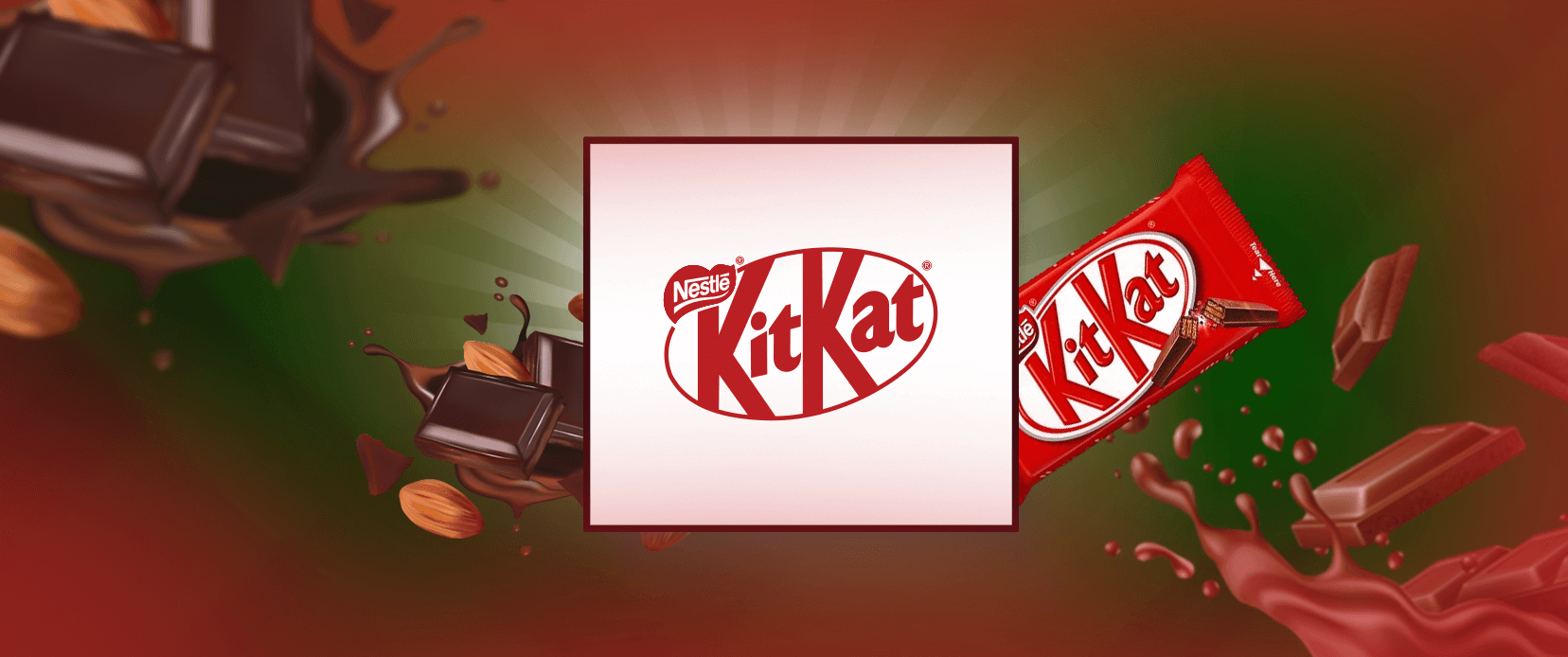
Kit Kat
Kit Kat’s logo is a big badge, designed in strong red and white, and undeniably identifiable. The playful yet simple font suggests consumers ‘have a break’ and urges consumers to have fun. Logos draw attention to the name on signature chocolate-covered wafer bars, and it helps reinforce the brand’s marketing message: that you deserve to enjoy a moment of indulgence. Using the Kit Kat name in combination with the signature logo gives a powerful visual identity that people of all ages recognize. Your logo size inspiration can be the Kit Kat logo because it has the perfect size that can fit at any platform.
What Makes These Chocolate Logos Special?
Chocolate logos are fundamental to brand identity and give each brand its appeal. Kinder’s fun design resonates with children and brings joy and nostalgia to her. There is elegance in their typography and minimalist aesthetic, which brings sophisticated consumers.
Want a Custom Logo Design?
Want a logo that perfectly captures your brand’s essence? Let our talented designers create a custom logo that stands out.
Snickers uses bold colors and strong fonts to convey the energy, so it’s a favorite snack for many. Rich cocoa with artisanal colors and craft imagery appeal to the connoisseur, Scharffen Berger. Kit Kat’s colorful logo suggests their identity as a fun and shareable treat. Each logo tells a story. To get the best logo for your brand, hire a logo design services company that will help you get the best logo.
Conclusion
Logos matter a lot in the world of chocolate for how we feel about our favorite treats. All logos have their own story to take, Ferrero Rocher’s luxury or Kinder’s playful design. Not only are these logos the logos of delicious chocolates, but they also give you a sense of comfort, joy, and indulgence. We love those symbols that make us remember our love for chocolate as chocoholics.
Author Bio
Still choosing the right logo design company?
Get a quick, expert review. No pitch, just clarity on what fits your stage, budget, and growth.

