Revamping a logo design is necessary with changes in market demand and shifts in business vision. Logos bridge the gap between audience anticipations and brand objectives. It is one of the main reasons why brands invest in logo redesigns or website redesign. Branding is vital to develop an image that aligns with prevailing needs, value perception, and promotional campaigns.
For instance, if you want to redesign health services of a brand, you need to redesign logo and branding for prominence. Symbols convey the brand’s message complying with what the audience wants. Famous brand logos evolution keeps them in the limelight while reinforcing their branding and amplifying their promotions. Let’s review some of the best logo redesign efforts of the 20 brands in 2023 to analyze underlying objectives and design inspiration.
Importance of Logo Redesigns
Being necessary to adhere to the shift in demands and strategies, redesigning a logo helps bring many benefits. Think of a Toyota 4runner redesign or Lexus GX redesign, for instance, that car enthusiasts are waiting for. Why is it so important to them? The answer is their craving for novelty and innovation, even when the features and functionality sometimes remain the same. Likewise, a website redesign with the same content aims to amuse viewers’ aesthetic tastes.
We can go on about other revamps like the NFL logo redesign and the NBA logo redesign of various teams. But what’s important is understanding why famous brand logos evolve with market shifts. One underlying reason for rebranding in 2023 is to emerge from the post-COVID financial crisis. The following are some benefits that signify the importance of a logo revamp.
- Precisely reflect the brand’s image and identity
- Establishes consistency in branding and promotion
- Develop or modify the brand colors or visuals
- Formulating a design for a mass audience
- Grab attention by creating a noticeable buzz
- Reinforce brand awareness and recognition
20 Brand Logo Revamps So Far in 2023
Here we present a list of the redesign of 20 brand logos that set the base for the 2023 logo trends. Although there are exceptions, many brands initiate a revamp to reflect new visions and explore new markets and business growth. Review the following rebranding by famous brands.
1. Twitter
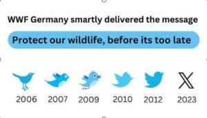
Twitter rebranding to X is gaining momentum besides controversies and rage, as searches spiked on Google and Bing in July. Twitter, a platform for thought expressions and connectivity, is used by millions worldwide. It has been in the spotlight after being taken over by Elon Must, founder of Tesla, SpaceX, and The Boring Company. Elon’s obsession with the letter X (the unknown variable) reflects in SpaceX, his son’s name, and the new brand icon. Many are confused with the remodel, while some are furious. However, the Panda logo nonprofit WWF took the best shot.
2. Pepsi
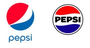
One of the most expensive brand logos, the Pepsi emblem, is often criticized for spending too much on slight modifications. The company again adopts a minor makeover, radiating the 1970s vibes of pop culture and the old west. Its new design uses the legendary red and blue patterns with negative space in between, containing the brand name. The circular logo also has a black outline with thick weights, while it uses bold capital letters in the black vintage style font.
3. Wise
The Fintech platform for international payments, Wise, revealed its logo amendment in March, using a bright green palette. The combination picks up the 2023 logo trends of taking inspiration from the past, resembling the neon light color. Brands build familiarity by evoking the emotional memories of their audience, using colors, objects, and font styles of an era. It also amends the font styling as seen in the S letter, which is more simplistic now.

4. Nokia
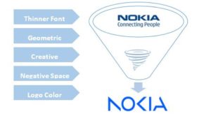
For many years, the top mobile phone manufacturer, Nokia, revamps its iconic logo, envisioning a strategy shift. Its representatives announced an overhaul to support its new emphasis on digital marketing through B2B technology innovation. Dropping the renowned logo from 6 six decades for a fresh identity is challenging, yet crucial to highlight the six pillars of a novel approach. It marks the new positioning, research & development, and sustainable branding for growth.
5. 7Up
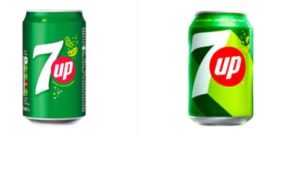
Anybody seeking a logo’s impact on the packaging or declutter a symbol may refer to the 7Up rebranding. The 7 Up rebrand aims at a minimalistic design that is simple yet modern. PepsiCo’s design team uses the logo with slight alterations for global acceptance and versatility. It had been around ten years since an update on the 7Up font, marking a milestone in 7Up logo history. Although we can see the same 7Up font, the shadow, angle, and size are slightly different now.
6. Baskin Robbins
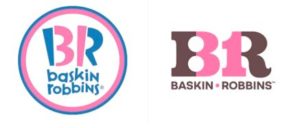
The American chain of ice cream shops, Baskin Robbins, unveils a new identity reflecting fun, professionalism, and quality taste. Its new logo targets a younger audience and promises a memorable experience. Adding a new color while refreshing the old one with a stylish font adds distinction by keeping its ‘31’ signage. It drops the circular outlines and switches to a monogram.
7. Mirinda
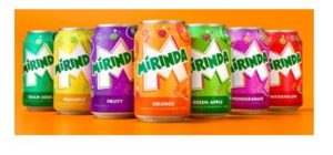
Another division under the ownership of PepsiCo., Mirinda refreshes its image on the packaging. It receives a brighter green color and sharper edges while dropping the irregular lettering. One more notable feature is the prominent white M on the background. The direct rival to Fanta now boasts unique color schemes for each flavor, signifying the variants. It targets the Gen-Z audience through alluring packaging with fizzy bubbles and fruit images.
8. Castrol
Castrol has a new logo design with a modern style and simplistic elements. It perfectly adheres to the consumers’ changing demands with precision and distinction. The image has clear graphics and no outline, while its font is more prominent and readable. The new combination emphasizes its key strengths to serve the diverse market with classic red and green brand colors.

9. Channel 4
What some consider a retro logo due to the color resembling neon signs is the new Channel 4 symbol. It has now adopted a single bright green color, leaving the five-color pattern it previously had. While the iconic blocks are there, the minimalist style signifies the importance of using not more than two colors. It has a broader appeal and an animated version of the new identity.

10. Bolt
The shockingly simple checkout platform, Bolt shifts its brand identity with a creative wordmark with positively negative space. The new visual has an appealing bright background color, thick capital letters, and a flash sign between its L and T. Adding creativity in a wordmark is too challenging; however, once done, it enhances the visually amusing and memorable appearance.

11. Minute Maid
The refreshing beverage brand underwent a slight modification for a wider market reach. Its emblem replaces the green and black design with a simple black monotone and refined typeface. The words now use a sleek, bold, soft font just before summer to refresh its branding and promotions. It will be visible across all product packaging with relative names and flavors.

12. Fanta
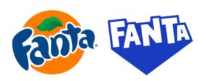
The Fanta logo evolution makes us wonder why all the drink brands are going for a revamp. Dropping the fruit image and irregular fonts seems like a good idea when you offer several other flavors. Moreover, the novel design has a neon blue color, electric white fonts, and a converging geometry that illuminates its name. All the letters are capitalized, marking a prominent brand.
13. Myers and Briggs Foundation
The foundation mainly offers personality-type assessment services through expert professionals. The nonprofit logo rebrand of 2023, the Myers and Briggs Foundation logo, is a rare sight. It adds a monochromatic star over bubbles design, replacing its calligraphic fonts with a professional common typeface. The design stresses personal development by understanding. Many wonder why did Fanta change their logo? Because it was confusing clients of other flavors.

14. Sundance Film Festival
The Sundance Film Festival required a new brand mark for a solid concept and execution. For 2023, the well-known event will have a modern, global image with minimalistic elements. The choice of transparent fonts on a black canvas will highlight the brand with slight variations for different backgrounds. The aspect ratio is a good fit with the standard screen size in the industry.

15. Los Angeles County Medical Center
The Los Angeles County Medical Center is transforming into Los Angeles General Medical Center with a new sign. It also updates its slogan to “Exceptional Care. Healthy Communities” to build a link between the hospital and the community. The sole purpose is to redesign health services to retain the past value while attracting new clients from LA.

16. Children’s Hospital of San Antonio
Another healthcare rebrand of 2023 is the Children’s Hospital of San Antonio, Texas, reforming as Christus Children’s Hospital. Everything from its campus to its visual identity will evolve per the new branding needs, including murals and signage. The brand colors changed from yellow and blue to purple, aligning with Christus Health, featuring a universal healthcare symbol.

17. 7-Eleven’s Slurpee
The famous 7-Eleven’s Slurpee gets a makeover with a vibrant “Anything Flows” campaign. Its new logo and cup design features a more colorful and vibrant advertisement. The campaign aims to target a diverse audience that loves self-expression. Its promotion will run across different online and offline mediums as The Brainfreeze Collective, for the iconic brand.

18. Kraft Singles
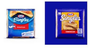
Kraft Singles also goes through a makeover with new easy-to-open packaging, uncluttering its design. The new packaging has a prominent brand name on a yellow frame, featuring sandwiches at the bottom. The company’s logo remains the same, but the brand name has a lengthier font.
19. Keds
The footwear icon Keds is replacing its old branding identity with a new one, slightly modifying its logo type. There are no significant changes in the logo except color but a major change in its vision that reflects. It aims to “Create a space where everyone is celebrated for their unique identity.” The symbol now has a blue hue in its fonts, dropping the old blue frame.

20. Peloton
Peloton reintroduces itself as something more than an in-home bike company, offering solutions for anyone, anywhere. The relaunch of a fresh identity and promotional campaign provides new content, open for everyone, even for free. The new logo drops a cycling pictorial mark to cater to a wider audience. It offers a Free App, One App, and App+ for the needs of diverse segments.

Conclusion
Many brands are looking for new markets, avenues, and clients for survival or growth, rebranding their image. Unknowingly, they are forging the path for new logo design trends in 2023 and beyond. Many firms opt for logo redesigns, branding, and marketing strategies to tackle consumer demand shifts or market dynamics. The 20 rebrands by far in 2023 will provide an understanding of a revamp and ideas to inspire a relaunch. Consult a professional logo design service to adopt a novel redesign compliant with your new vision and client needs. Follow our logo design blogs for more updates and information on branding and logo designs.
Please visit Our Design Blog


