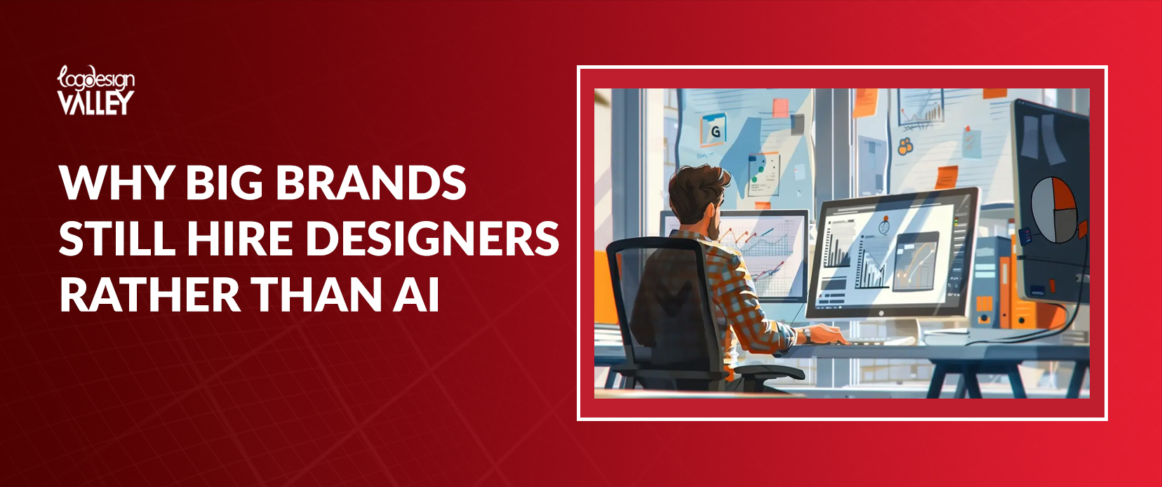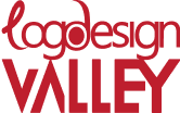
The transparent barbie logo represents childhood dreams and fashion aspirations without a doubt. However, this famous picture has not always appeared unchanged. The transformation of the Barbie logo is an intriguing exploration mirroring the evolving era.
The transformation of the Barbie logo from its simple origins to its current, diverse representation reflects the continued popularity of the Barbie brand. In the same way that Barbie has changed to reflect a variety of beauty ideals, her logo has also undergone a transformation. It is a tale about adjusting, developing, and remaining current. Let’s explore the vibrant history of this legendary symbol and learn how it influenced the Barbie we cherish today.
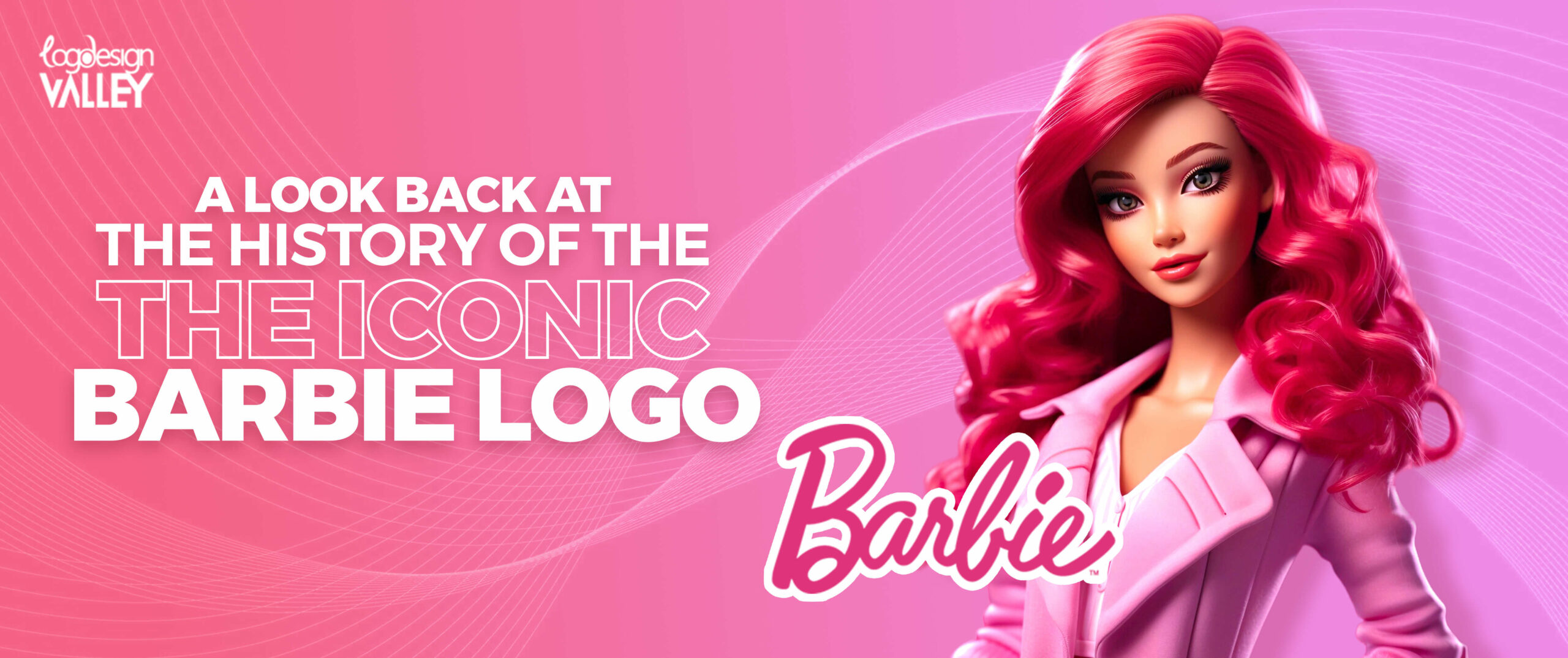
The Evolution of the Barbie Logo Design
For many years, the barbie logo, known for its unique barbie font and typically including a barbie head symbol, has been a symbol of culture. The transformation of the barbie logo, from the original one beloved by young girls to the modern symbol seen in the barbie movie logo, is a captivating journey. Let’s explore the evolution of Barbie logos and see how this iconic symbol has transformed throughout the years. This guide will definitely inspire you to design a logo like the Barbie logo.
Inspired by the Iconic Barbie Logo?
Get your professional logo without any hustle contact us now!
1959-1961: The Birth of an Icon
The journey of the barbie logo began in the late 1950s. The original barbie logo was a simple yet striking design that introduced the world to the iconic Barbie brand. Featuring a classic, elegant font and often incorporating a distinctive barbie head, the logo perfectly captured the essence of the doll. This early iteration laid the groundwork for the visual identity that would come to define Barbie for generations.
The barbie font used in this initial logo was sophisticated and timeless, reflecting the aspirational image of the Barbie doll. While the design was relatively straightforward, it possessed a charm and simplicity that resonated with audiences. The color palette for this early logo was primarily focused on pink, a hue that has since become synonymous with the Barbie brand. This initial logo was a powerful statement, establishing Barbie as a fashion-forward and glamorous figure.
1961-1971: A Decade of Refinement
The Barbie logo underwent a period of improvement in the 1960s. Although the fundamental components of the initial design stayed the same, slight alterations were made to update the logo and make it more attractive. The Barbie font kept developing, becoming more stylish and whimsical to mirror the shifting cultural landscape. The barbie head logo, a significant aspect in the early days, remained unchanged, functioning as a familiar icon for the brand.
During this decade, designers started experimenting with different color palettes to complement Barbie’s changing image. Even though pink still took center stage, additional hues were incorporated to design a logo that was more dynamic and visually appealing. During the same time period, various logo options were introduced, including the black barbie logo, providing a chic and contemporary option to the traditional pink design. As Barbie became more popular, the significance of the logo also increased, becoming a symbol of childhood and aspiration.
1971-1985: A Playful Transformation
The Barbie brand experienced a notable change in the 1970s, leading to a corresponding update in the logo. The traditional, sophisticated designs of the past were no longer present. The era of the past ten years adopted a fun and lively appearance, mirroring the carefree attitude of the period. The barbie logo was revamped to be more vibrant, with bright colors and modern fonts that reflected the energy of the time. Designers were experimenting with different styles to discover the perfect look to reflect Barbie’s changing image during that period.
In the 1970s, the barbie logo emphasized enjoyment and uniqueness. It differed from the formal styles of the previous ten years and connected with a fresh group of young females. As Barbie became more relatable and down-to-earth, the logo adapted to reflect this transformation, becoming more approachable and friendly. This era was a significant moment in the development of the barbie logo, setting the foundation for future modern designs.
1985-1991: Modernity Meets Glamour
In the mid-1980s, the Barbie brand gained a new perspective which was reflected in the updated logo. The fun-loving vibe of the previous decade was replaced by a more refined and elegant persona. The barbie logo was redesigned to have a more modern and stylish appearance, attracting a larger group of people. This period emphasized Barbie’s role as a fashion symbol, and the logo mirrored this change in emphasis.
The barbie logo from the late 1980s and early 1990s portrayed confidence and style. The fonts were improved, giving a cleaner and more sophisticated overall design. This progression aligned with the evolving fashion trends of the era, reflecting the growing empowerment and independence of women. The Barbie logo evolved into a representation of ambition and achievement, mirroring the advancing reputation of the Barbie brand.
1991-2009: The Barbie World
The Barbie brand went through significant changes in its logo during the 1990s and early 2000s to represent the important time in its history. The singular, focused logo symbol of previous decades were no longer present. Instead, the barbie emblem evolved into a flexible icon embodying the vast Barbie universe. Designers were experimenting and exploring different logo variations to align with a range of Barbie themes, storylines, and product lines during this period.
During this time, the barbie logo shifted from focusing on individual expression to emphasizing fun, friendship, and adventure. It was a portrayal of the Barbie world in a visual form, where endless possibilities existed. The logo evolved to be more fun and welcoming, mirroring the shifting preferences of a fresh crop of young women. As Barbie broadened her horizons, her logo also evolved, symbolizing infinite opportunities.
2009-Present: Timeless Elegance
Recently, the barbie logo has gone through a notable change, adopting a classic and sophisticated look. The attention moved from the fun and varied styles of before to a more cohesive and elegant appearance. This transformation represents Barbie’s development as an international fashion symbol and a representation of empowerment.
The contemporary barbie logo aims to attract a broad range of people while remaining loyal to the brand’s history. It combines classic and contemporary elements, reflecting Barbie’s timeless popularity. The logo now represents not only a visual component, but also embodies confidence, diversity, and the pursuit of dreams. As Barbie develops further, her logo will also be updated to ensure it stays relevant and iconic for the brand.
The Meaning Behind the Barbie Logo
The barbie logo represents the core of the Barbie brand, going beyond mere letters and colors to serve as a potent symbol. Since its creation, the logo has been meticulously designed to elicit particular feelings and connections.
One of the standout features of the Barbie logo is its choice of colors. The famous shade of pink, commonly known as Barbie pink,is easily identifiable and a crucial part of the brand’s image. Pink is typically linked to womanhood, being sugary, and being young, characteristics that Barbie has represented for a long time. It’s a color that brings up emotions of joy, happiness, and optimism, fitting well with the brand’s inspirational image.
The barbie font has been essential in defining the logo’s message. Throughout the years, various fonts have been utilized, each possessing its own distinct personality. Nevertheless, the general feeling conveys elegance, sophistication, and a hint of playfulness. Barbie’s font selection mirrors her persona as a stylish and self-assured character that is also friendly and enjoys having a good time.
Certain components of the barbie logo have remained consistent despite its evolution. The barbie head logo, seen in different versions, serves as a strong visual symbol of the brand. It immediately resonates with customers, bringing up sentiments of nostalgia and a sense of recognition. The design of the logo, whether it has a modern bold appearance or a traditional elegant style, always communicates feelings of confidence, empowerment, and limitless opportunities. That is why the Barbie logo can be your logo inspiration.
How to Create a Logo Like Barbie’s
Basically, the barbie logo is a thoughtfully designed visual tool that conveys the brand’s core principles and goals. It represents femininity, joy, and success, motivating girls and women to have big dreams and self-belief. The logo’s capacity to change while preserving its fundamental nature proves its lasting strength and significance. Keep these keywords in mind while designing a custom logo design like Barbie logos.
- Select a color that complements your company’s identity – either subtle and charming or daring and vivid.
- Search for fonts that have a graceful and flowing design. Consider the emotion you want to convey: do you prefer a playful, elegant, or combination of both vibes?
- Barbie’s logo stands out due to its memorable design. Avoid making things too complicated.
- What sets your brand apart from others? Perhaps a symbol, form, or even a small picture that symbolizes you.
- What will your logo appear like on various items? Ensure that your online presence, physical marketing materials, and social networking profiles are visually appealing across all platforms.
- Inquire with friends, family, or even strangers for feedback on your logo. Their views are important!
- Pink is wonderful, however, don’t hesitate to experiment with other colors that complement your brand.
- Minimalism and logo sizes are superior. At times, a basic logo showcasing only your name and a single color can have the most impact.
Conclusion
The Barbie logo is a cultural symbol that has grown in conjunction with the brand. From its humble origins to the contemporary, refined symbol we observe now, the logo has appealed to the emotions of countless individuals. It shows how Barbie maintains her timeless charm and adjusts to modern times without compromising her fundamental beliefs.
The barbie logo seamlessly combines art and business. It is a visual depiction of Barbie’s evolution from a basic toy to a worldwide symbol. Its development mirrors the shifting eras, indicating the preferences and goals of various generations. The average logo design cost of a logo like a barbie logo can be high but it would definitely make your brand shine.
The barbie logo, whether in its traditional pink color or contemporary minimalist styles, has always been more than a mere symbol. It represents childhood fantasies, style goals, and Barbie’s empowering essence.
FAQs
What is the original barbie logo like?
The original barbie logo was simple and elegant, often featuring a barbie head. It was the foundation for the iconic brand identity.
Why is pink associated with Barbie?
Pink is synonymous with Barbie because it represents femininity, sweetness, and youth, qualities that Barbie embodies.
Has the barbie logo always been the same?
No, the barbie logo has evolved over the years, reflecting changes in fashion, culture, and Barbie’s image.
What does the barbie logo mean?
The barbie logo represents femininity, fun, and achievement. It’s a symbol of empowerment and endless possibilities.
What is the most famous Barbie logo?
The most famous Barbie logo is likely the one featuring the classic Barbie head and a pink color palette, though many variations have become iconic over the years.
What is the barbie font called?
While there isn’t an exact match for the Barbie font, many similar fonts are available. Some popular choices include Dollie Script, Barbie Medium, and Brush Script.