
Have you ever thought about the reason behind the Apple logo being a basic apple shape with a bite out of it? Even though the official reason given is that the bite represents the computer’s capability to “take a bite” out of a problem, there are numerous other interesting theories that have been spread over time.
From secretive clues to individual stories, Apple’s professional logo design has captivated the minds of countless individuals globally. In this article, we will uncover the unheard tales and background of this iconic representation and examine the different understandings that have arisen throughout the years.
“Design is not just what it looks like and feels like. Design is how it works.” — Steve Jobs
How Apple Got Its Name and Why It Matters?
The name Apple seems quite appropriate for a technology company, but the story behind the name is far from ordinary. For instance, one of Apple’s founders, Steve Jobs, was a great fan of the Beatles. The name of the band was chosen as The Quarrymen by John Lennon, the founder of the band; Jobs was in search of a basic and memorized name for the new company and picked Apple as its name; he also liked the connection in the context of the counterculture movement of the 1960s. The name “Apple” was chosen because it really embodied a young company, and its goal was to revolutionize the industry.
Here is A Decade-by-Decade Evolution of Apple’s Logo
1976 – The Original Apple Logo
Few people are aware that the initial Apple logo was not the familiar bitten apple. To know how the first Apple logo looks, we need to move back in time to 1976, when it all started. The first logo was created based on the story of Sir Isaac Newton, which depicted a man standing under a tree with an apple falling over his head. This image reflected the mission set before the company, which was to revolutionize the commercial market through the introduction of sensitive, innovative technology. Nevertheless, the initial logo, unsuitable for small-scale production, was soon replaced with a more simplified logo.
“There are no rules for good design. There are only good designs.” — Glaser’s
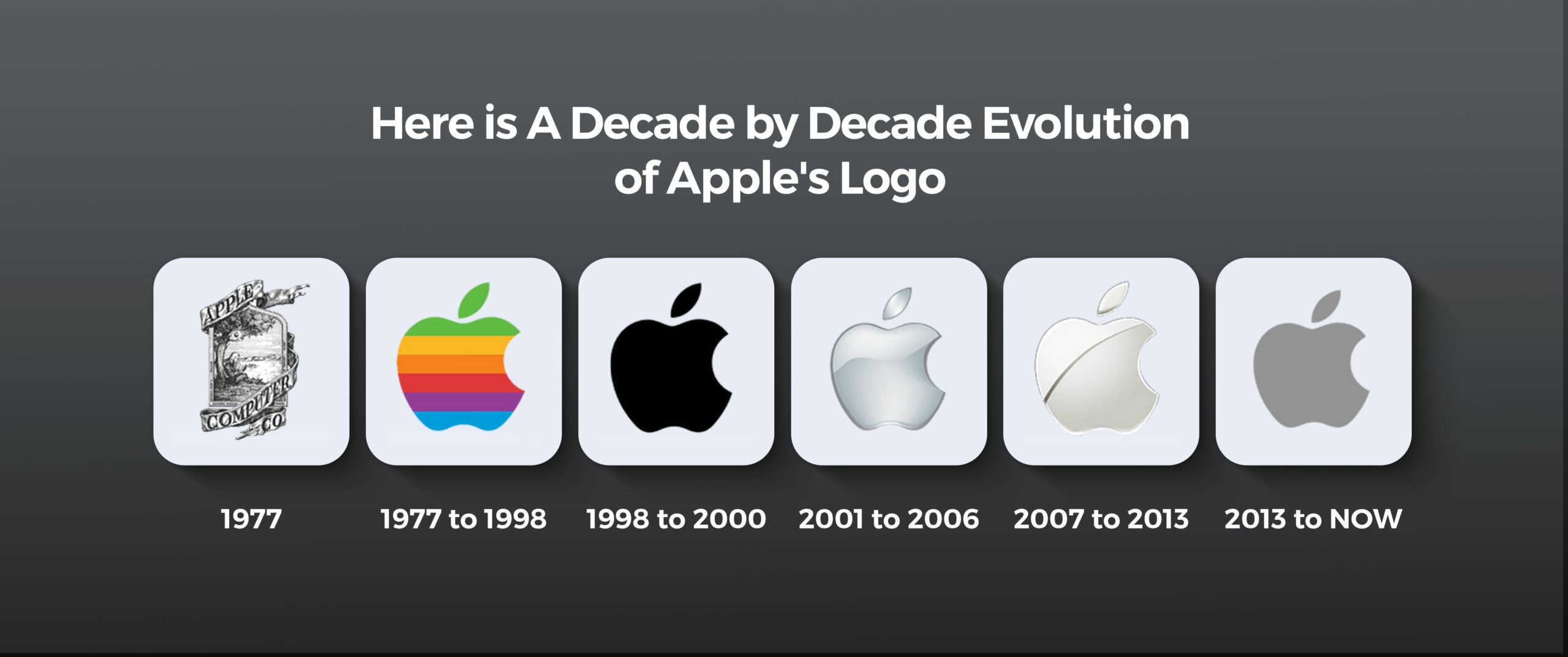
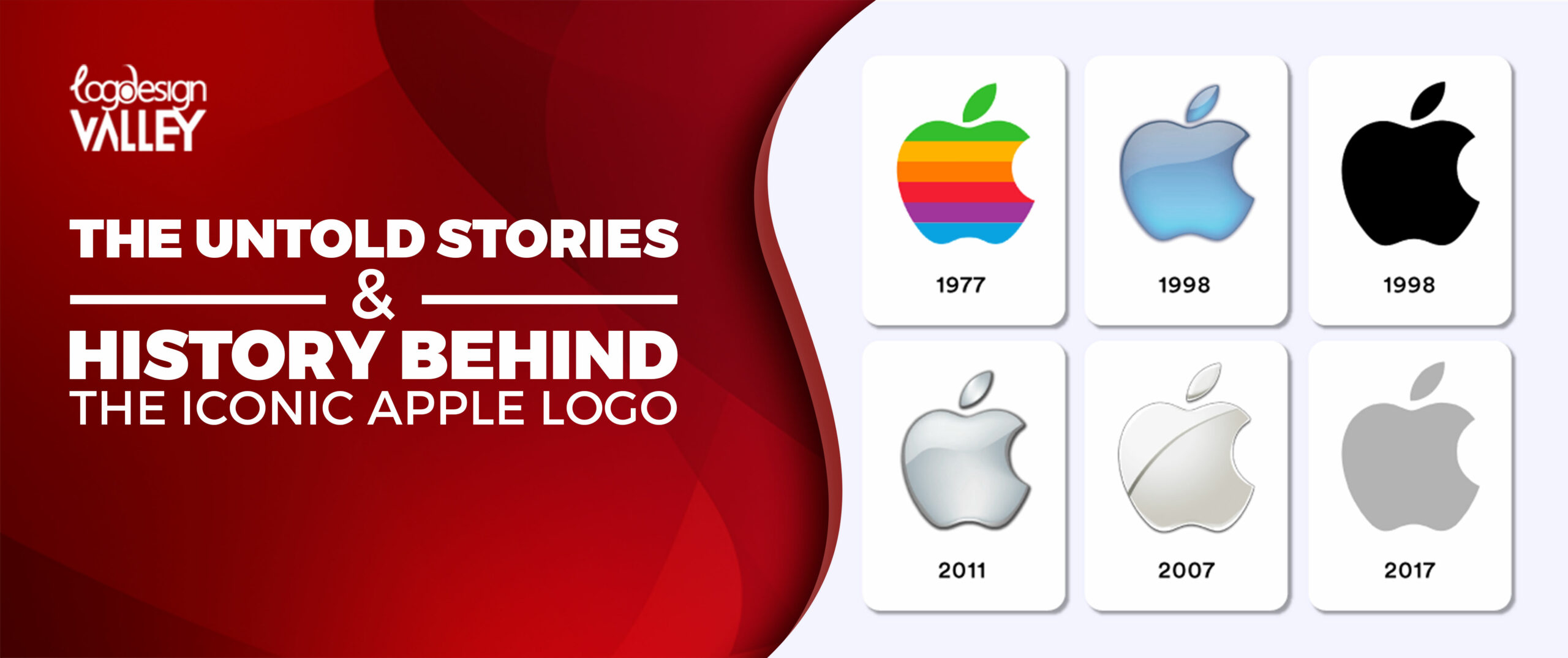
1977 to 1998 – The Rainbow Apple Logo
1977 was the year Apple launched its famous ‘Bite of an Apple’ logo, which was made up of stripes of different colors. This pretty design, containing a rainbow gradient drawn inside the contour of an apple, was rather provoking and recognizable. Rainbow colors stood for the diversification of products and services offered by the company, and an apple signified the knowledge which Apple wanted to impart to its customers. It was rapidly associated with Apple and was employed on such products as Apple II and Macintosh computers, occasionally as a fruit.
1998 to 2000 – The Monochrome Apple Logo
This monochrome apple symbol, introduced in 1998, shifted dramatically away from the colorful trends of the earlier years. This concept was proposed as a simple shape that represented an apple, with its name written in one color, which was meant to promote views of advancement and refinement. The monochrome Apple was first introduced with the iMac G3, a revolutionary all-in-one computer that became an emblem of Apple’s Design and Marketing. Due to its clarity and simplicity, the monochrome Apple logo became one of the most iconic logos in history and is still used by Apple today.
2001 to 2006 – The Refined Monochrome Apple Logo
Apple continued using the classic black and white logo introduced in 1998 throughout this time frame. Nevertheless, the design experienced slight improvements to increase its sophistication and minimalism. The logo now has a sleeker design, featuring a crisper outline and a uniform color scheme. This updated edition was incorporated in several Apple devices, like the PowerBook G4 and the iPod, confirming its role as a distinctive emblem of the company.
Let’s Design Your Iconic Logo Like Apple!
We know the creativity behind iconic logo like Apple. Let’s build one together!
2007 to 2013 – The Glass Apple Logo
The known glass apple logo was launched by Apple in 2007. This was a very daring and progressive 3D design that depicted a fruit, an apple that was made of transparent material with a reflective base. The Apple symbol in the form of a glass was first used on the iPhone, a pertinent smartphone that altered the dynamics of the mobile phone business. The subtle and elegant look of the logotype in the form of a glass apple played its part in strengthening the company’s image as a high-tech manufacturer. The glass Apple logo was used in many Apple products, such as the iPod and iPad; it is still among the company’s favorite logos.
2013 to Present – The Flat Apple Logo
The flat apple logo was launched in 2013 and was a completely new concept replacing the three-dimensional logo concepts. This design was a neophyte at that age, with ‘an apple symbolizing the computer, depicted with a minimalist feel and a flat façade’ as its aesthetics were aimed at evoking a simplistic and modernistic emblem. The flat Apple logo was first seen in the iOS 7, which is the incremental update of Apple’s mobile operating system. Frequently applied to modern Apple devices such as Apple Watch and AirPods, the flat Apple logo can also be considered one of the modern emblem hits.
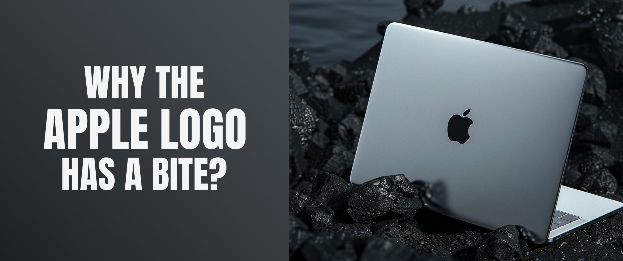
Why the Apple Logo Has a Bite?
The Apple logo’s bite is not just a whimsical design choice; it serves a deliberate purpose for both practical and symbolic reasons. In 1977, Rob Janoff created a good logo design that was easy to recognize and unique. The bite mark on the apple made it easily distinguishable, avoiding confusion with a cherry or tomato. It also brought a fun and friendly element to the logo, matching Apple’s innovative and user-friendly beliefs.
This design approach resembles other well-known logos that have been created to differentiate and communicate certain brand characteristics. For example, the Adidas logo consists of three stripes representing the brand’s dedication to performance and stamina. Likewise, the Starbucks logo features a double-tailed siren to create a feeling of nautical charm and excellence. The font used for the Barbie logo is lively and whimsical, highlighting the brand’s emphasis on creativity and imagination. The Google logo, with its bright colors and uncomplicated design, highlights the brand’s friendly and dedicated stance toward accessibility.
Essentially, similar to these logos, the Apple logo’s bite is a deliberate design choice that distinguishes the brand and conveys its fundamental values successfully.
Key Secrets of Apple’s Iconic Logo Design
- The simple, minimalist design of the Apple logo makes it easily identifiable and adaptable for different media and sizes.
- The logo’s unique and instantly recognizable apple shape, with a bite taken out, prevents any confusion with other fruits.
- The apple’s bite can represent wisdom and creativity, reflecting the company’s values of pushing boundaries and embracing change.
- Apple employs a variety of colors, ranging from rainbow stripes to elegant monochrome versions.
- Even with updates and modifications, the fundamental apple shape has stayed the same, ensuring brand uniformity while adapting to contemporary styles.
- The logo’s minimalist but striking design ensures it is effective on different backgrounds and products.
- The logo is now seen as a symbol of culture, not only symbolizing a brand but also creativity.
- The design of the Apple logo plays a major role in the recognition and loyalty of the brand.
What Influenced Apple Logo Design?
Looking at the evolution of Apple’s logo for computers, it is obvious that its design has never been a sheer coincidence. Steve Jobs and Steve Wozniak, who are the founders of Apple, have had some of the most major impacts when it comes to the logo design of the company. One of the co-founders of Apple, who was quoted many times, was Steve Jobs, who was really obsessed with design and used to demand simplicity in products. He frequently said that he was convinced that design is not so much in the aesthetics of an object but its sensitivity when in use.
Corporate culture and company are the other key factors that have impacted Apple’s growth. Apple, hence, has always been recognized for its innovative culture and its operation based on the process of change agenda. This has been evident in most companies’ logo designs, which have frequently been daring and unconventional.
Apple has also been a victim of the cultural factors that were present in society at the time of its production. For instance, the ‘rainbow spread on apple’ logo in the 1970s corresponded to the psychedelic aspect known in this period, whereas the ‘flat apple’’ logo of the 2010s corresponded to the minimalist trend of this decade.
Conclusion
For years, the world has been fascinated by the Apple logo, a symbol that is both simple and iconic. The company’s company’s innovations are showcased in the evolution of the original Newton-inspired design to the modern flat apple. The company’s company, originally just a design decision, now represents its distinct identity and dedication to questioning norms.
In addition to the official explanations, the Apple logo has inspired numerous theories and interpretations. From mysterious hints to individual anecdotes, the symbol has touched people worldwide. The reason it continues to be popular is not just because of its simple beauty but also because it can stir emotions and resonate with individuals on a personal basis.
While Apple persists in pioneering and molding the future of technology, the distinctive Apple logo will endure as a symbol of the company’s company’s commitment to excellence.