First impression of your brand can be the last impression for the audience, if it is not appealing. The small symbol of your app competes for user focus, ultimately determining whether it will be downloaded or overlooked. How can you design an app logo that is not only visually attractive but also impossible to resist? The key is a logo that combines memorability, brand identity, and user trust all together.
What is the process for creating a logo that is memorable and makes a strong impression? This guide reveals how to create an appealing app logo that ignites user curiosity and builds brand credibility. Understand that the symbolism, color, and simplicity can be utilized to design a logo that embodies the fundamental purpose and beliefs of your app.
A symbol is a visual that accurately represents the app’s function or a color combination that creates a feeling of safety. It captures interest, ignites wonder, and creates a lasting impact, ultimately turning a hesitant user into a loyal app fan.
Why is an App Logo Important?
The initial impression is what persuades users to either download your app or continue scrolling. Aside from just looks, a properly designed app logo plays an important role in establishing brand awareness and credibility. you need good app logo ideas for designing attractive app logos.
A powerful logo is akin to a recognizable face in a sea of people. It immediately captures the user’s attention and prompts recollection. A logo extends past just being memorable. It is a graphical depiction of the character and principles of your app.
A fun and lively logo conveys an enjoyable and interactive vibe. A polished and professional one inspires confidence and dependability. Similar to the well-known Instagram symbol, which is a basic camera icon, it immediately indicates that it is a photo-sharing application.
This visual identity helps to establish trust with users. Having a sleek and expertly designed logo shows that you value precision and treat your app with importance. Users are more likely to interact with an app that is perceived as established and trustworthy. Seeing the well-known logo of a major bank app (such as Chase or Bank of America) provides a feeling of safety while handling your finances.
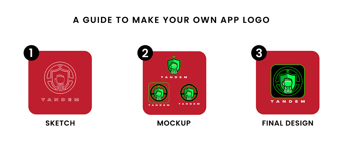
A Guide to Make Your Own App Logo
The small logo of your app competes for user attention, making the difference between being downloaded or ignored. However, how can you design a distinctive logo? This manual will lead you step by step in creating your own app logo, giving you the ability to create a symbol that is both memorable and significant.
Choose a Unique Symbol
The heart and soul of your app is represented by its logo symbol. It could be a vague image, a familiar object, or a symbol of your app’s identity. Selecting a distinctive item that represents the essence of your app is vital. Well-known app logos such as the Twitter bird or Instagram camera are iconic symbols that capture the essence of their apps.
Although a distinctive symbol is crucial, steer clear of excessively intricate designs. Keep in mind that your logo will appear small on mobile devices. If it’s overly complicated, it will lose its effectiveness and turn into a confusing jumble.
Focus on Simplicity
Simplicity reigns supreme in the realm of app logos. A simple and straightforward layout is more memorable and comprehensible, particularly when shown in different dimensions. The Spotify logo and the Netflix logo showcase how simplicity can be highly successful.
Yet, simplicity does not equate to being dull. Strategically incorporate color to bring out individuality and evoke feelings. Consider the soothing blue of the Facebook logo or the vibrant yellow of the Snapchat icon. Choosing the correct color scheme can enhance the visibility of your logo while maintaining its clarity.
Sketch Out Your Ideas
Do not hesitate to think outside the box! Take hold of a pen and paper and let your inner artist come out. Create various concepts and explore them with forms, icons, and hues. Examine well-known app logos and mobile app icon designs for ideas, but keep in mind the objective is to develop something distinctive that reflects your app.
The magic of your logo begins in this first brainstorming stage. Do not be concerned about flawless performance right now. Simply allow the thoughts to come naturally and enjoy the experience.
Test Your Logo at Different Sizes
After selecting a few logo ideas that appeal to you, it’s important to evaluate them through testing. Modify your logo designs to view their appearance in various sizes, ranging from a small app icon on a phone screen to a bigger banner on your website. This guarantees that your logo will stay distinct and easily identifiable no matter where it is placed.
Testing your design at various sizes is important for improving it and making sure it effectively conveys its message at all scales.
Ask for Feedback from Experts
Do not hesitate to ask for feedback from others! Show your logo creations to friends, family, or design communities on the internet. Receiving input from individuals who are not familiar with your app design can be extremely beneficial. They are able to inform you if your logo is clear, memorable, and properly conveys your app’s purpose.
Hire a professional designing company such as Logo Design Valley for mobile. They can assist you in perfecting your logo to make sure it follows the top design standards for mobile app icons, because they have designed popular app icons.
Level Up Your App with a Pro Logo!
Our designers create app logos that resonate with users and drive downloads.
By adhering to these guidelines and considering your intended audience, you can design an attention-grabbing app logo in a competitive market. Keep in mind your app’s logo represents its identity; therefore, dedicate time and energy to making it stand out.
A Comparison of App Logo Approaches
| Approach | Strength | Weakness |
| Unique Symbol | High Memorability & Versatility | Risk of Abstraction & Lack of Clarity |
| Simplicity | Excellent Readability & Timelessness | Potential for Unremarkableness |
| Text & Symbol | Clear Branding & Meaning | Balancing Text & Symbol to Avoid Clutter |
How to Avoid Common App Logo Design Mistakes
Your app’s logo serves as your rallying call in the competitive realm of mobile apps; it is a small emblem competing for user focus, determining whether to be downloaded or disregarded. However, designing a logo that has a significant impact involves more than just focusing on visual appeal. To ensure your app logo stands out, steer clear of these typical mistakes:
Although it may be tempting to follow the latest trends, keep in mind that your logo should reflect your app’s distinct identity in the long term. Pursuing a trend could lead to a logo that appears out-of-date within a short period. Concentrate on enduring design principles such as clarity, memorability, and versatility.
Your logo must initiate a visual dialogue, igniting interest in your app’s purpose. If your logo is too vague or doesn’t align with your app’s goal, users could become puzzled. Strive for a logo that visually represents the main feature of your app.
Having a harmonious color scheme is important, as using an excessive amount of colors or conflicting palettes can result in a chaotic and amateurish appearance. Select a restricted color palette that works well together and strengthens your brand’s image. Consider the soothing blue of Facebook or the vibrant yellow of Snapchat.
Balancing text and symbols is crucial for some applications. Putting too much text into a small icon makes it impossible to read. On the other hand, a prominent symbol with small, illegible text fails to capitalize on brand recognition through text. Opt for a straightforward and compact brand name that can be easily reduced if you decide to merge them.
Best App Logos to Spark Your Creativity
Famous Apps logos such as Spotify, Instagram, Twitter, Netflix, and WhatsApp are commonly recognized as examples of how design can establish enduring brand identities. Spotify’s three simple green circles are a clear and powerful symbol of music. Instagram’s colorful camera symbol highlights the platform’s focus on sharing photos. The blue bird of Twitter represents rapid messaging. The bold red “N” of Netflix represents entertainment. The green speech bubble on WhatsApp with a phone effectively conveys messaging. These logos demonstrate how simplicity, color selection, and symbolism are key in creating a memorable mobile app logo design and for various platforms that represent the app’s main purpose and beliefs. you can also take mobile app development company guide they have a lot of app logo ideas which will inspire you.
Spotify
The logo of Spotify is a perfect demonstration of minimalist design. Three lively green circles, slightly intersecting, immediately bring to mind the idea of music streaming. The circles may symbolize sound waves, speakers, or play buttons – the meaning is versatile but definitely connected to music. This minimal design guarantees that the logo remains easily identifiable and visible regardless of the size, whether it is a small mobile app icon or a website banner. The app logo becomes memorable through the use of a carefully selected color and a simple design.
The Instagram logo is a well-known symbol in the realm of social networking. An icon of a camera with a stylized and minimalist design clearly communicates the app’s function of sharing photos. The lively blend of orange and purple brings a pop of character and liveliness, showcasing the variety and originality of user-created content on the site. This logo shows how a basic app icon, along with a carefully selected color scheme, can quickly be associated with the app’s purpose.
Twitter replaced its well-known blue bird with a mysterious logo – a clean white “X” against a black backdrop. This simple design was a sharp contrast to the previous symbol’s playful appeal. Some believe the “X” may symbolize Twitter’s efforts to improve communication or a new beginning with new leadership, but its actual significance is still unknown. This move towards abstraction has generated interest, though it remains unclear if the “X” will gain the same immediate recognition as the blue bird. It remains to be seen whether this minimalist design will serve as a strong symbol for Twitter’s future.
Netflix
The Netflix logo demonstrates the impact of a strong and uncomplicated design. One vibrant red “N” stands out in the area, easily identified and connected to the entertainment industry. The color red inspires feelings of excitement and movement, which complements Netflix’s on-demand streaming service perfectly. This simple method guarantees the logo stays distinctive and powerful regardless of its size, making it ideal for the small mobile app icon that countless users interact with each day.
The WhatsApp logo is a simple yet powerful symbol of its primary purpose – communication. There is no room for confusion with a green speech bubble containing a white phone icon. The app’s goal of connecting people is reinforced by the green color, which is commonly linked to communication and harmony. The power of this logo comes from its clear, universal design. It goes beyond language barriers and quickly shows the app’s purpose, resulting in a widely recognized app symbol globally.
Hire a professional logo design services company such as Logo Design Valley if you can afford it. They can assist you in perfecting your logo to make sure it follows the top design standards for mobile app icons.
Key Takeaways
Succeeding in the competitive app market demands a logo that goes above just being visually appealing. Create a captivating symbol that ignites curiosity in users and establishes credibility. Consider it as a graphic portrayal of the fundamental essence of your app. This guide helps you create a logo that will be remembered. Select a symbol that represents the core of your app, ensuring it is straightforward enough for smaller screens. Utilize color in a strategic manner to elicit emotions. Come up with ideas and try out your designs in different sizes. By adhering to this advice and steering clear of typical mistakes, you can create a mobile app logo that is distinctive and serves as a representation of your app’s accomplishments.


