YouTube is more than just an app. It is more like our buddy that entertains, teaches us, make us laugh, never excuse to leave early and is also a friend with our other circles. Therefore, with billions of people using this application. the mobile app design has to be impeccable and versatile and extremely user-friendly. This is not only to facilitate views but more than a hundred YouTubers who are now a millionaire by the grace of this business. Just for the quick information here is a list of top richest YouTubers of 2017 and how much they made from YouTube:

So, considering the massive audience – I mean larger than life audience of YouTube it is not so easy to mess around and play with its mobile app design. If they are planning to do so, then there is a lot to learn from their latest updates. Now you might think that how such an application can bring a lesson for all? So here are three things to learn that can help understand the logic for shifting designs in a mobile app!
Let’s Get Started!
Less Effort More Fun
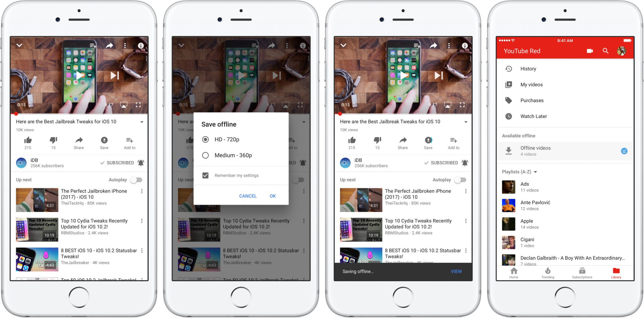
Though offering a bunch of new features is indeed a good thing that can happen on your app. However, it is important how many hands it requires to do a bunch of different tasks. Here once YouTube was fed with new features it shifted its navigation at the bottom without making your thumb travel from Mexico to Canada each time. Therefore, value your audience behavior, do not ignore the efforts it’s taking to use it. Your mobile app design must keep the so friendly that it works fluidly and give fantastic experience whole time.
Extra Tip: Keeping features available in offline mode is one of the most challenging yet favorite features to expect from apps- keep that in the bucket too.
Adopt Common Techniques
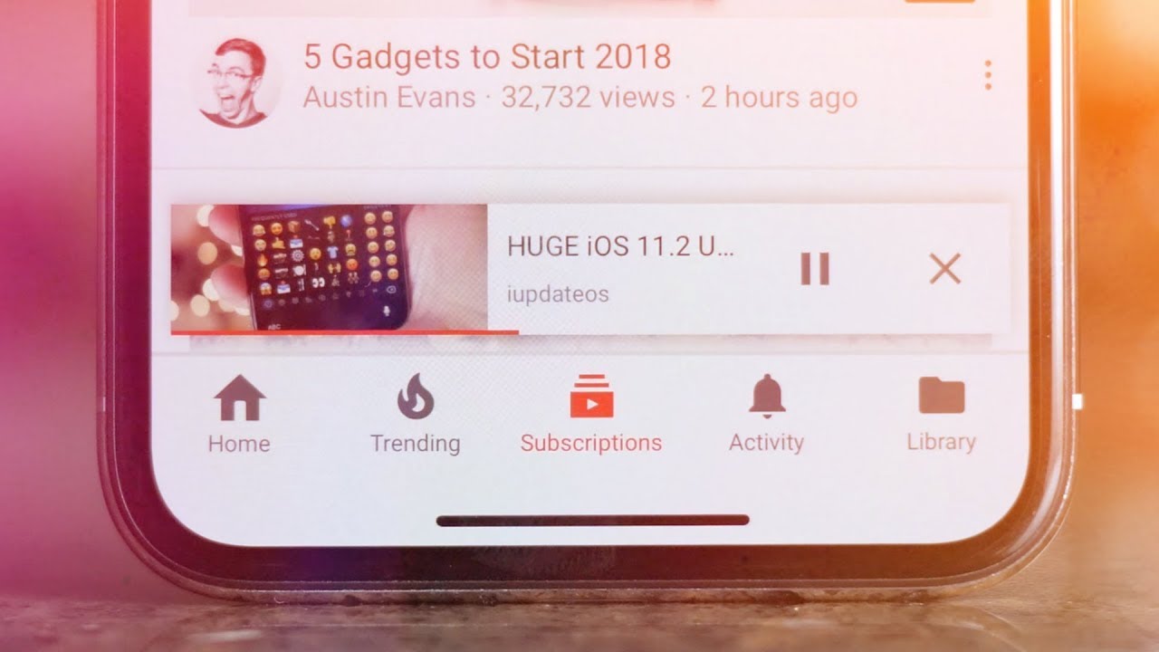
Many apps adopt similar gestures that teach end-users something new, something going in as a trend. Since Facebook worked hard to make mobile view extremely favorable to viewers, it introduced ‘swipe’ as a way to close or remove, exit the view. It gives multi-fun option to access feeds while viewing the video. Similar, swipe to remove feature was added that offers an easy option to exit video or continue to scroll the feeds while viewing the video. Therefore, professional mobile app design firms now suggest to keep it as a style for the next update not because it’s trendy but also a common practice that works efficiently.
Hues for Mobile App Design
YouTube did adopt several changes to its desktop view from header style to colors. It turned the whole website color theme into dark-cinematic to give more details to its ambiance. However, the wisest decision was to Not to change its mobile view. Keep the web dark and mobile app white makes sense as to all screen cannot hold the depth of darkness. Therefore, understand and think about hues you are adding to mobile app design as it makes your app a go-go or no-no.
Consequently, if you are constantly planning to revamp your mobile app design then keep these lessons with you that can help your app to please your audience and give ultimate user-experience.


