Introduces New Design System – Design Inspiration
FIFA World Cup 2026
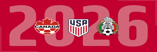
Unlike other FIFA world cups, the 2026 FIFA world cup will be hosted in three countries; Canada, Mexico and US. FIFA as the governing body of the official soccer world cup, is responsible for regulations, necessary arrangements, scheduling, and most importantly, designing an identity. The identity for the FIFA world cup reflects the spirit of the event while conveying a positive and peaceful message. Active work to improve the lives of people around the world. The message that provides comfort and relief to sports enthusiasts and overall world population.
The 2026 FIFA world cup new design was revealed in the FIFA World Cup 26TM ceremony that you can watch here. With partners like Adidas, Coca Cola, and KIA and sponsors including Budweiser and McDonald’s, FIFA introduced the official brand. The event will be hosted in 16 cities hosting 48 participant teams with a powerful WeAre26 campaign. We will further explore the new design system for what it holds and will also dive into the depths of design inspiration from the brand.
The New Design
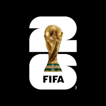
2026 FIFA world cup identity introduces new design system according to news sources. The logo depicts a golden trophy appearing in front of 26, 2 above the 6 in plain white color. Its white color will be filled by the logos of hosting cities; 11 US, 2 Canadian, and 3 Mexican cities. The campaign “We Are 26”, according to FIFA President Gianni Infantino, depicts the continent united to welcome the world. The logo not only generates a positive vibe among enthusiasts, it also provides a wonderful source of inspiration for designers. Let’s explore the design elements in the branding of the 2026 FIFA World Cup New Design.
1. The Design
Squares, semi circles, and quarter circles make up the number 26 representing the year 2026 in background of the trophy. It is an ingenious representation of the soccer field and the round ball as an essence of the event. The font is made up of 48 shapes collectively forming the numbers representing the 48 participant teams. Furthermore, the white space will be filled by the logos of the 16 cities that will be hosting the games and spectators.
2. Objects and Shapes
The trophy at the front of the numbers is superimposed with a 3D feel and golden color. Using the trophy as an object in the logo indicates the pivot and an outcome of the whole event. Sports enthusiasts i.e. the audience will relate with the concept and engage in the event’s processions. The selection of the shapes of soccer fields and soccer ball is another appeal in the logo gaining attention. The logo uses the numbers in a new way to include details once the city logos appear.
3. Typography
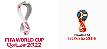
Apart from the number and the text written over the trophy, the logo uses no text except the Trademark symbol. The logomark uses a unique design to carve numbers which was a vital part of the event that comes up every four years. Instead of using the country names in the logo, using city logos is another clever tactic. Whether the city logos will contain text or not? We think it won’t because of the minute space available. However, it depends on the decision of the FIFA designers.
4. Colors
The color of the trophy is real and ultimate. Though, the white color palate in the numbers will be very vibrant and colorful. It will display the city logos having different color schemes and contrasts. The logo will appear rich in so many shades as it will be refined. How sharp or dull those colors would be? Again it depends on the board and their official designers. The event attracts a global audience and hopefully the color scheme won’t be dull or too sharp.
5. Balance
The aspect ratio of the 2 and the 6, the trophy, and the city logos will be quite in balance. Because of the limited frame, the aesthetic appeal without colors can’t be judged. Additionally, some critics don’t like the concept as they suggest it is too much detailed. Some even comment over the trophy’s image placement while others deem the design aesthetics meagre.
Design Inspiration
The 26 sign offers a great deal of inspiration for graphic designers. It needs to be exploration of the certain elements that depict the true identity of the FIFA 2026 World Cup. The design inspiration in the logo calls for studying the following aspects.
1. Concept
The logo says a lot about the idea behind its design. FIFA has been using the trophy in the logo for many years but not that clearly. In this design, the trophy is given a clear center place with its proper image. The significance of the trophy and the winning contestant can be seen clearly.
The concept holds a crucial place in any design and provides a base for adding other elements. In Nike logo and UPS logo, the swoosh and the shield is the central design element that acts as the center. A great and creative idea is the first thing in designing an iconic logo.

2. Design
The overall scheme of elements in an emblem is essential for reflecting its message. The campaign “We Are 26” is compliant with the numbers in the logo, affirming its design. Furthermore, the curves, corners, and shapes of the letters also depict the essence of the game, engaging its audience emotionally.
A designer must research and analyze the audience of a brand to align the design with their interests and preferences. It helps in engaging the audience subconsciously and emotionally by depicting an essence of the offerings. Adding appeal to the design is necessary for logo success.
3. Engagement
New design of the FIFA 2026 logo generated many positive comments and some criticism over different media. One thing is sure, it engaged a mass audience even when the event is three years away. A logo design must encourage the audience to engage with the brand and talk about it.
Designers must use elements that enhance their designs by amusing the audience through their interests. Creativity in the design also engages the audience as they appraise and discuss the novelty in the logo. Using a little different features engages more people than following patterns.
4. Inclusivity
FIFA has a history of influencing the audience and stakeholders by including them in its branding and promotion. With ads, songs, meetups, and funding trips of fans to meet celebrities, the branding is wholesome and effective. The 26 symbol isn’t any different as it also includes the cities, participating nations, and the trophy that inspires billions.
Designers must think globally beyond the lingual, cultural, or ethnic borders to use diversity. It is also essential to produce a design that includes all areas of branding and business. A logo must reflect shared interests, business ethic, and key values to attract more prospects.
5. Launch
A subtle brand launch will go unnoticed and cause problems. The launch of the brand in Los Angeles was a huge success featuring celebrities and sports stars. It conveys the importance of a mega launch that creates some noise in the marketplace. Though it is beyond the control of designers but they might request the brand to do sufficient promotion. How can a logo inspire people when it isn’t visible to them? A full-scale active launch is vital to the brand’s growth.
Conclusion
The 2026 FIFA world cup’s new design is a reflection of peace, prosperity, and unity. It conveys the message of the brand by amplifying the campaign “We Are 26”. The logo is a source of inspiration for designers and branding consultants to see a broader perspective. A perspective that includes a greater good, a global issue, and a purpose that the brand wants to serve.
Connecting that purpose with the audience through design is the core responsibility of a designer. Inspiration can originate from anywhere; you just need to see with a positive mindset, leaving all biases behind. Consult a logo design agency if you want your logo to attract and appeal to its audience fueling business growth.
Please visit Our Design Blog


